HOME | DD
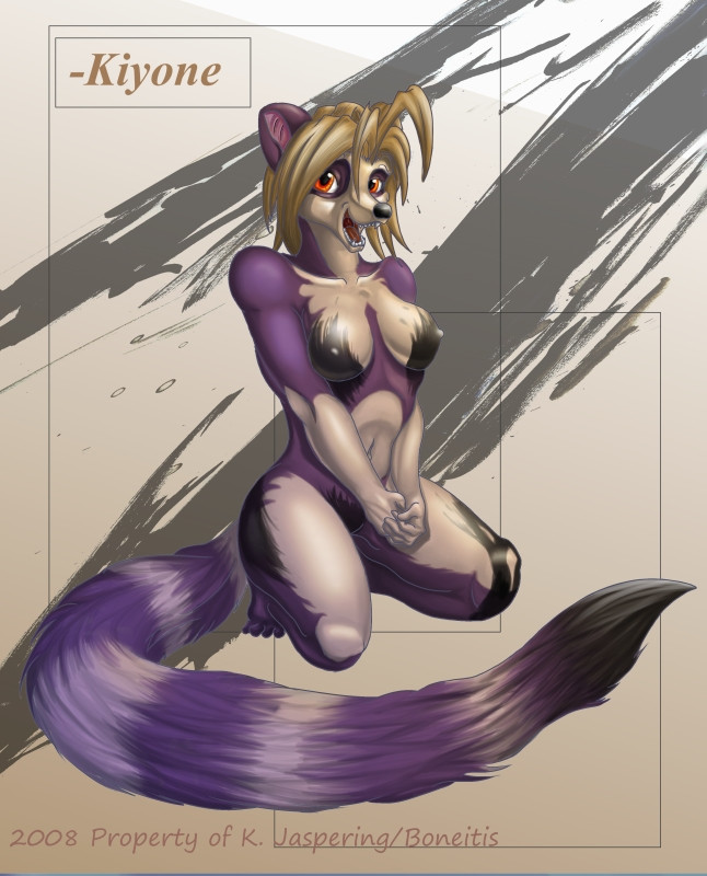
 Boneitis — Style Practice
by-nc-nd
Boneitis — Style Practice
by-nc-nd
Published: 2008-11-22 23:43:22 +0000 UTC; Views: 2120; Favourites: 48; Downloads: 66
Redirect to original
Description
Trying some new things here: outlines are back, contrast is lower, shading done on multiple layers, base done in gray-tones, colors added on top. All sorts of stuff. I'm fairly fond of the result and think it reads a little better. Obviously this is some old pencil work, not amazingly fond of it so I figured it would make for good practice. It's kind of a fun piece too I guess, stupid stuff like this is great for unwinding after a tough semester.Anyhow, tell me what you think about the new stylistic changes, a lot of people (as in four) wanted line-work back so here it is.
Love and Peace,
Boneitis
PS. THANKS TO FAGNUTS SQUARED ( ) FOR MAKING THE INKIN SHIT IN THE BACKGROUND GET A JOB
Related content


Comments: 32

lovely job ^w6 keep it up ")
👍: 0 ⏩: 1

Not right now, my own personal projects keep me too busy. If you catch me at a convention though...well, ya never know.
👍: 0 ⏩: 1
heh 
👍: 0 ⏩: 0

Well it turned out well, and to think you were doubtful in the beginning.
👍: 0 ⏩: 0

I think you should just nix the lines altogether and use value shift to show the edges.... or lock transparency on the lines and color over them so they blend in with what color/value they're next to better. If you're going to keep outlines, though, I think it looks better if you vary the line weight instead of having lines the exact same thickness the whole way around.
Also, I would try to make temperature as well as value shifts when you pick your shadow/highlight palettes. It looks like you just stepped up and down in value, which can really gray out what should be a colorful picture. When I do digital stuff I do a black and white value sketch first, then apply color on top with overlay layers, which react differently than multiply (just try and see!)...
oh durp. I don't know what else to say. I mean... I guess it depends on what you want your art to look like, you know? If you ever want to chat and oC over the break, drop me an email c:
👍: 0 ⏩: 1
I'm sure you weren't going for it but, I'm going to be blunt here, this was a ridiculously insulting/patronizing comment. I won't state why (that will only lead to internet debate, which is stupid) but if you'd like to comment in the future here are some things you should do (this applies for all art commenting):
1. Try and say something, anything, positive. Nobody likes reading a laundry list of complaints, which is what you wrote. Doing that makes it sound like you're looking down on the artist in question.
2. Read the artists comments. When you say "When I do digital stuff I do a black and white value sketch first, then apply color on top with overlay layers, which react differently than multiply (just try and see!)..." and I mention in the comments that "base done in gray-tones, colors added on top" it becomes fairly obvious that you're attempting to lord knowledge over me that I clearly already know.
3. Make sure you know the work of who you're talking to. When you say "I think you should just nix the lines altogether and use value shift to show the edges" and that's pretty much what I've done in the past twenty or so deviations it makes me feel, again, as though you're trying to sound like you know something I dont, when again, I clearly do.
You had some decent advice buried amidst all this, but for the most part it was all stuff that I, pretty obviously, knew. Be more careful critiquing so heavily in the future without knowing all your facts. Simply rephrasing half of what you said would've been helpful. As it stands, you came off as patronizing more than anything and it was fairly clear that you were more interested in showing off your own knowledge than actually helping someone out. I realize all of this sounds harsh, and it is, but I need help. Telling me things I already know, in a derogatory fashion no less, is not helpful.
Also, if this is responded to in a fashion that I see as even moderately flame-like it will be deleted, I don't do drama.
👍: 0 ⏩: 2

Seriously, don't be a stupid fucker, her critique made sense and wasn't patronizing at all. In fact, it was one of the most gentle critiques I've ever heard. Grow a pair.
👍: 0 ⏩: 1
I take critique all the time actually. Look around. Flaming solves nothing.
👍: 0 ⏩: 0

from an outsider's opinion, since i stumbled on this while i was browsing: her critqiue didn't sound patronizing at all; it sounded like a critique should. when you ask for a critique, i don't think an artist should expect a plethora of positive statements, even if the piece is great -- because critiques don't exist for patting people on the back, they're about other artists offering opinions and trying to help, which i think she was. sure, it's possible she hasn't seen your previous art and therefore her offering and critique might not help you in the way you want -- but it really doesn't validate your reaction either, which is coming off as a wee bit too defensive for a pretty harmless comment. especially suggesting that she might flame when she's providing a comment that seems to suggest nothing of the sort -- that's kind of harsh.
granted, i don't know much about the techniques involved, but i will say her tone does not seem to imply anything harmful, and i highly doubt she intended it.
buuut, that's just one random deviant's observation. :>
cheers.
")
👍: 0 ⏩: 1
This goes a tad deeper. I know this person in real life so I kind of know what she's going for, sorry you had to get involved. Your comments make perfect sense.
👍: 0 ⏩: 0

You're all fagnuts.
This is me and my hoorishness for cartoons, but maybe try making the lineart thicker? :U
I'M TRYING TO BE CONSTRUCTIVE!
👍: 0 ⏩: 1
I can do that too (it's easy) but the reason I went with ultra thin lines was due to, well, a lot of different influences. Mainly: , along with a number of other IFX influences. I'm not good enough to do without lines, but over thickening them would give me too much of a "comic" book look that I've already seen.
Still, it could be worth a try.
👍: 0 ⏩: 1

Looks really good Kit, I think the grey base works.
Ps-You both are Fagnuts!
👍: 0 ⏩: 1
Yes, I am sorry I had to be the one to tell you.
👍: 0 ⏩: 0
Luckily the line work is probably the easiest (if a tad frustrating) part. I think I'll keep it, still unsure.
👍: 0 ⏩: 1

there's always the opportunity to mix it up! Also, I need to engage in some talk with you concerning college.
👍: 0 ⏩: 1
Sure, shoot me a note if ya like. I always try to reply as quickly as possible.
👍: 0 ⏩: 0

HEY FAGNUTS YOU FORGOT TO MENTION MY MASSIVE CONTRIBUTION TO THIS PIECE
👍: 0 ⏩: 2
edit: BETTAR
👍: 0 ⏩: 1
edit edit: ME GET A JOB? MORE LIKE YOU GET A LIFE
FAGNUTS CUBED
👍: 0 ⏩: 0
HEY LOOK YOURE SPECIAL NOW.
👍: 0 ⏩: 0

wow love the colours, pose and the expretion is great
very well done
P.s. Fav
👍: 0 ⏩: 1
Well thanks, it was a lot of fun to work on.
👍: 0 ⏩: 1
no problem.........oh btw she is hot
👍: 0 ⏩: 1
well keep it up, u have a really great talent
👍: 0 ⏩: 0


Thats a pretty awesome work here! I really like the style and character design... also expression is graaand ... what a happy smile its like geeee ")
👍: 0 ⏩: 1
The smile was the most fun part to draw, easily.
👍: 0 ⏩: 0