HOME | DD
 brianskywalker — Newton Test
Published: 2010-06-17 07:20:54 +0000 UTC; Views: 1231; Favourites: 0; Downloads: 20
Redirect to original
Description
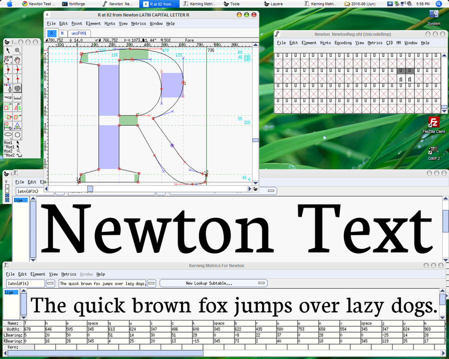
A test of my Newton font. Comment please, if you wish. (No, it's not Mac OS... I'm at my Grandma's house, and have a Mac-like theme. Mac is at home.)Related content


Comments: 19

Thanks. Actually, I do still have a few improvements, but this is basically done.  (Smile)")
👍: 0 ⏩: 1

very nice. Do tell me when it's done? I could always use another good font. ^^
👍: 0 ⏩: 1
Haha, well, the font is about to be released, I think.
👍: 0 ⏩: 1
Do tell me when it is. ^^
👍: 0 ⏩: 1
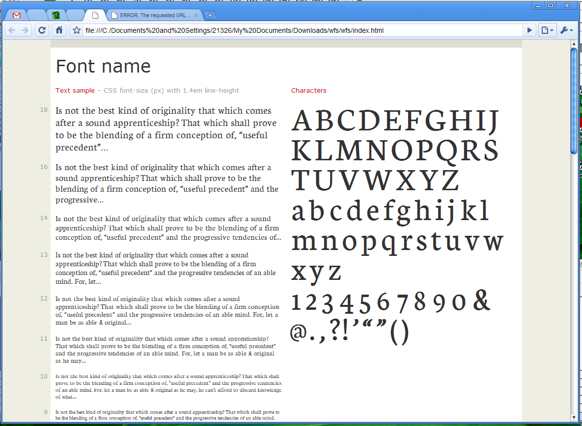
It is. code.google.com/webfonts
👍: 0 ⏩: 1
Downloaded. It looks great, from the preview.
👍: 0 ⏩: 1
Thank you! Let me know if you use it, you might find some areas for improvement. (Note: I know the spacing of the numerals needs help.... I forgot to space those.... Oops!)
👍: 0 ⏩: 1
So far, the spacing (in the letters, haven't seen the numbers) looks nice and even - I like that. And it's kind of small, which I also like. ^^
👍: 0 ⏩: 1
Ahh, thanks! Well, I spent a long time carefully spacing the letters.
Regarding the smallness, how do you mean? Does the upper case look smaller than normal? Or is it that the letters just have a look that seems small? (It's strange..., I hadn't realized it before.... probably it's because I had spent long hours staring at it...) Glad you like it, though.
👍: 0 ⏩: 1
It was a glitch in the preview... it's actually a pretty large font. (Size-wise, when I set it to 12-point, it's comparatively big.) I still like it, I just have to set it down a couple sizes.

👍: 0 ⏩: 1
Haha, well, I designed it large on purpose. The lowercase is actually proportionally larger (compared to the uppercase) than most fonts, which makes it really good for small sizes. It's also rather condensed.
If it helps any, I think it matches Arial/Helvetica almost perfectly in size.
👍: 0 ⏩: 1
I really do like the even spacing. It presents itself very nicely in smaller sizes. ^^
No, it's a lot bigger than Arial. <.<; At least, when I put it into word and fiddled with fonts on one of my little stories, it was. A single-page story with... two inches, maybe, left on the bottom of the page in 12 pt Arial ended up stretching three or four inches on to the next page. It looks very good in 9 pt, though. 9 pt Newton (Neuton?) takes about the same amount of space as 12 pt Arial, but it looks smaller because the letters themselves are smaller, and there's more space between lines, which helps to keep the small font readable.
👍: 0 ⏩: 1
Thanks!
Oh yeah, is there a lot of extra space between each line? Something odd is in my font (I think it's the accent characters) that makes the default line height in Microsoft programs too big. You can set it manually, though, so with 9 pt Neuton you can give it probably 12 pt line height. (Then, I can't see what you see on your screen, so it's hard to say.)
And, the name was changed from Newton to Neuton because the former was already taken.
👍: 0 ⏩: 1
Very welcome. ^^
Just a little. I like it with the extra spacing, though - like I said, the nine-point is smaller than 12-point Arial or Times New Roman, but takes about the same amount of space, and I really like the way it keeps the text small and neat while making it easy to read since there's no accidental skipping between lines. Want me to send a screenshot through e-mail, or post one in my scraps, or such?
I see... makes sense.
👍: 0 ⏩: 1
I see. Well yes, a screenshot would be great.
👍: 0 ⏩: 1
I'll get on that after I finish replying to comments, then. ^^
👍: 0 ⏩: 1
Okeee, thanks!
👍: 0 ⏩: 1