HOME | DD
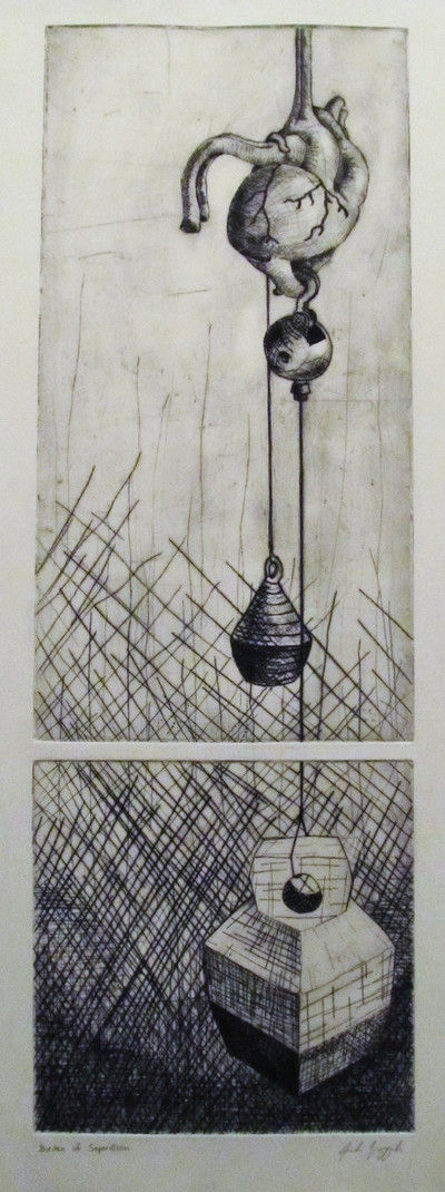
 Brokenopenseed — Burden of Separation
Published: 2011-09-18 04:34:30 +0000 UTC; Views: 859; Favourites: 29; Downloads: 4
Redirect to original
Description
Back in 2004 I did a series of prints focused on the heart, the things which burden our heart, and what that burden feels like.It wasn't really a subject/idea that I really connected with, but rather a way to focus so I wouldn't be staring at blank plates/blocks with no idea what to etch/carve into them.
From my experience, Separation is a heavy feeling. Whether its 'caused by death, break up, a long distance move; if there was a bond severed it leaves a weight on the heart. Maybe the weight is not as much from the separation but lingering regrets and what-ifs.
The split/break in the image is from two plates being used. The reason for this was 2-fold. 1) It echoed the idea of separation and 2) the school didn't have copper large enough to fit the size I wanted. (though in hindsight, the split in image separates the weight from the heart making it (in my mind) less heavy feeling)).
Related content


Comments: 26

The split was definitely an altering additive and I think it makes all the difference in this piece even though it wasn't something you could do much about.
Perhaps it makes the weight look less effective, but then again, having the heaviest of the weights appear at the bottom in its own compartment
lends more focus upon what that weight might represent and how it's JUST THAT HEAVY (conceptually) so pendulous that it needed to be contained in this way.
Just my thoughts.
I prefer the split.
👍: 0 ⏩: 1

I prefer it too. It makes it less straight forward or predictable. I also love comics and it reminds me of panel transitions.
👍: 0 ⏩: 1


this reminds me of a modernist painting I saw in one of text books in college and I can't for the life of me remember what it was called 
👍: 0 ⏩: 1
Let me know if you do. I wasn't really referencing anything when I made it, so I'd be curious to see something similar.
👍: 0 ⏩: 1
I've been tearing my place apart all day looking for that old textbook b/c it's driving me crazy b/c I can't remember it off hand XD
👍: 0 ⏩: 1
ah well. It'll show if it wants to.
👍: 0 ⏩: 1
I had it in the living room from where I had been referencing it. . . I do believe my mom is guilty of moving it
👍: 0 ⏩: 1
Moms are good at that sort of thing.
👍: 0 ⏩: 1


Thank you very much.
👍: 0 ⏩: 0

 (Smile)")

I think it is nice to see a black and white print from you (: I think this is one of my favorites out of your prints.
👍: 0 ⏩: 1
All my older prints are b/w (I was afraid of color ink). What makes the b/w more preferable to you than color do you think?
👍: 0 ⏩: 1
While I really enjoy how different and creative your colored prints are, I think I like the clarity of the black and white. I think the layered colors sometimes look a little muddy online, but I bet they look pretty rad in person, when you can actually see the true quality of the ink. Anyway I guess that is the answer (:
👍: 0 ⏩: 1
I declare it to be a good one (answer)!
👍: 0 ⏩: 1
thanks,I'm always a little wary to give someone constructive criticism for fear of misunderstanding (:
👍: 0 ⏩: 1
after this many years of art school I've been critiqued more times than I can remember. I can handle criticism like a champ! (^_^)
👍: 0 ⏩: 1
I'm on year 8 of being an active student, I had a 3 year hiatus with no classes, and I've been doing one class at a time for 5 of the 8 years. My estimations suggest I'll get my BFA at age 30! (^_^)
The nice part is, I've been working full time for the last 3 years and my student loans should be paid off completely by the beginning of this winter (or sooner)!!!
👍: 0 ⏩: 1
ya that's awesome that you won't have to worry about student loans...they really suck!
I loved being an art student, so 8 years seems reasonable to me XD
👍: 0 ⏩: 1
Totally. I don't think I'd do it much differently. Except take a shorter hiatus.
👍: 0 ⏩: 0