HOME | DD
 bronart — Untitled
Published: 2012-12-05 09:20:43 +0000 UTC; Views: 4053; Favourites: 181; Downloads: 83
Redirect to original
Description
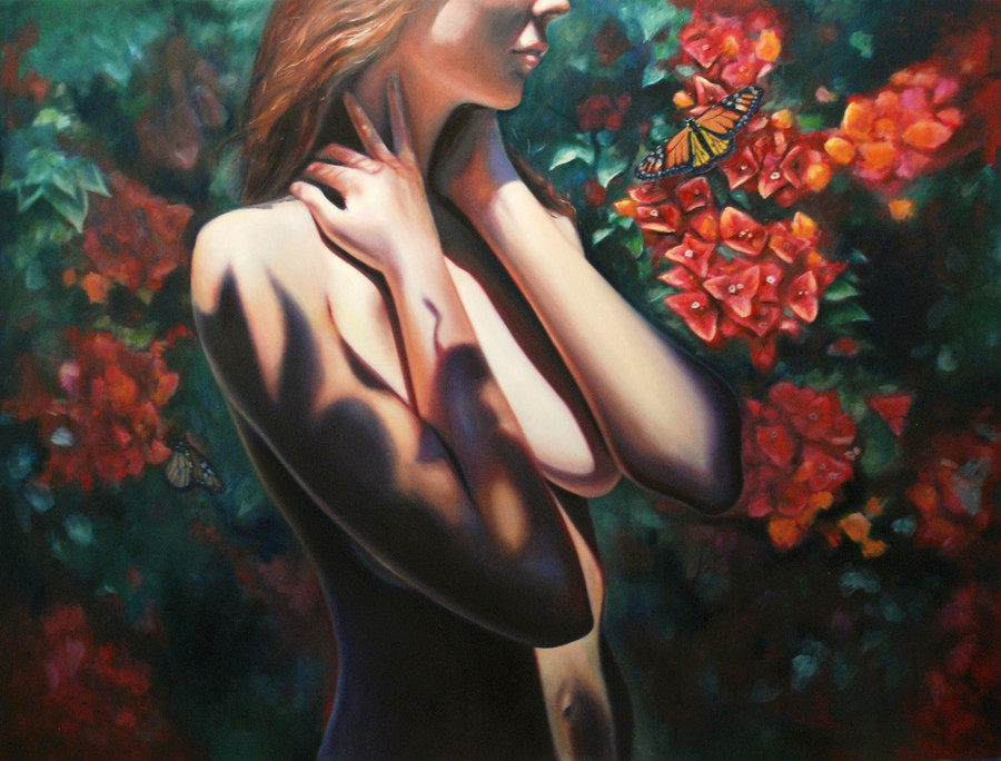
Deciding if I want to do any more to this or not, I think I am happy with it, apart from few minor touch ups here and there.I'll need to get a better photo of it as well (it's night right now)
Wasn't planning on posting another photo of this one yet, but I like the feedback so it just won't go up on my website until after my show.
Oil on ply
120 x 90 cm
Related content


Comments: 21

Wow! I'm impressed! This is so beautiful. I can almost taste the colors.
👍: 0 ⏩: 1


I love the colours that bring the summer into my head, lovely painting!
👍: 0 ⏩: 0


Hey. This is beautiul work and I always have respect for indviduals that work with traditional media.
I think the shadows/lighting are fantastic, but I was wondering whether the penumbra (partial shadow) further up her arm might be larger, with the umbra (full shadow) elements heavier towards the bottom (such as across her belly). I think that this would give a much greater sense of top-down depth to the image.
However, you say you worked from a photo ref so maybe you've got the shadows exactly right. But in art you always have artistic licence at your disposal. Just a thought, but please do not take as a criticism as this is a lovely piece.
👍: 0 ⏩: 1

Hey, thank you for your feedback  (Smile)")
👍: 0 ⏩: 1
Objects that are close to other objects tend to cast shadows with a hard edge (especially when there is one single dominant light source), such as the women's arm across her belly. But shadows cast by the foliage onto her body will be softer, becasue they are further away and are semi-transparent so transmit some light through them. I would therefore expect the shadows on her arm to have softer edges - but the shadow near the top of her shoulder has a hard edge which (to my eye anyway) jars against some of the softer shadows elsewhere (which you indcate with hints of pale blue/red in the penumbra region of the shadow).
However, this may be exactly how it appears in your reference image - and therefore mother nature rules. But I only mention this becasue it jumped out at me right away. That is not to takeaway from a beatufully rendered and posed painting/drawing. I am probably being overly picky, so just ignore me! Lol.
👍: 0 ⏩: 1
lol no I don't intend to ignore, I'm curious at what you meant, and yes in my reference image the shadows were actually sharper and darker then how I have portrayed them, it was really strange how contrasted they were, which was probably what drew me to choosing that particular shot to paint. I'll look at softening some of those shadow edges as you suggest, and see if I prefer it or not
👍: 0 ⏩: 1
I can see why you would be drawn to such an image, I too like the high contrast light and dark. Your gallery suggests a wider interest in high contrast shadows too.
I would recommend leaving the image as it is, unless of course you really think you can gain some learning from it by doing it again (would be a shame to do an over-paint too, and accidently ruin it). I find with my own art (which unfortunately is very unproductive most of the time) that it's best to move onto something new and not rehash old images*.
I've added you to my watch list, so look forward to your next image.
* Having said that, I don't know if you caught the recent draw-this-again meme on dA, which was quite good fun to look through.
👍: 0 ⏩: 1
Draw this again? is that where you draw something that you had drawn few years prior? I've seen a few people posting images like that, pretty awesome to see
👍: 0 ⏩: 0


that is beautiful!! Love the butterfly!!

")
👍: 0 ⏩: 1
thank you very much
👍: 0 ⏩: 1
your work is amazing!!
👍: 0 ⏩: 0

This is really awesome. I think this is pretty the way it is. If you add more on it, i think it will just make it overdecorated.
👍: 0 ⏩: 1
Thank you, yeh I think more detail will end up taking away from the figure
👍: 0 ⏩: 1