HOME | DD
 brushfirewolf — Complementary Colors : Theory
Published: 2004-04-25 00:16:27 +0000 UTC; Views: 54; Favourites: 0; Downloads: 22
Redirect to original
Description
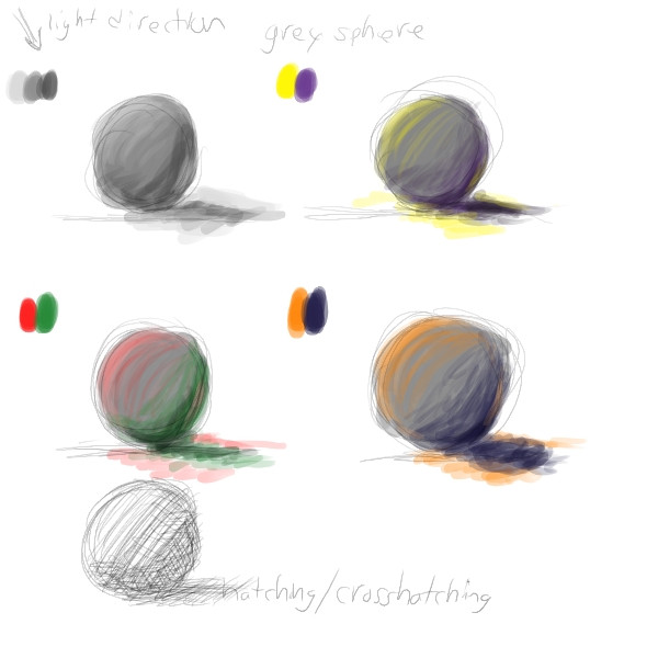
For anyone who might want some info. on shading and highlights using complementary colors:Here I showed the main three sets (and randomly did some cross-hatching xD), and I want to further explain. Of course, your light source definitely tells you how to do this, but assuming the light source is red, yellow, or orange (warm colors), you shade with the opposite color on the color wheel (cool colors). Same thing applies with using a cool color as a light source, to shade, add amounts of the opposite color, INSTEAD OF BLACK, to darken the area. I also do not use one hue of the colors, of course feel free to use lighter and darker hues xP Just some simple information on colors, I'll add more information if I think of it. Remember that a light source can hit more than the obvious part of an object.. so try to think of all the different areas a light source can effect.
Related content


Comments: 4

Neat idea, I've never tried it but I think I will now, thanks for the tip. :}
👍: 0 ⏩: 1


👍: 0 ⏩: 1
Yeah, I think I learned it...but I forgot, so thanks for reminding me
")
👍: 0 ⏩: 1
Lol, glad I can be helpful.
👍: 0 ⏩: 0