HOME | DD
 C-Puff — Jak and Dax improvement sort of thing
#jak #daxter #jakanddaxter #naughtydog #playstation
Published: 2016-02-12 13:41:58 +0000 UTC; Views: 5227; Favourites: 84; Downloads: 7
Redirect to original
Description
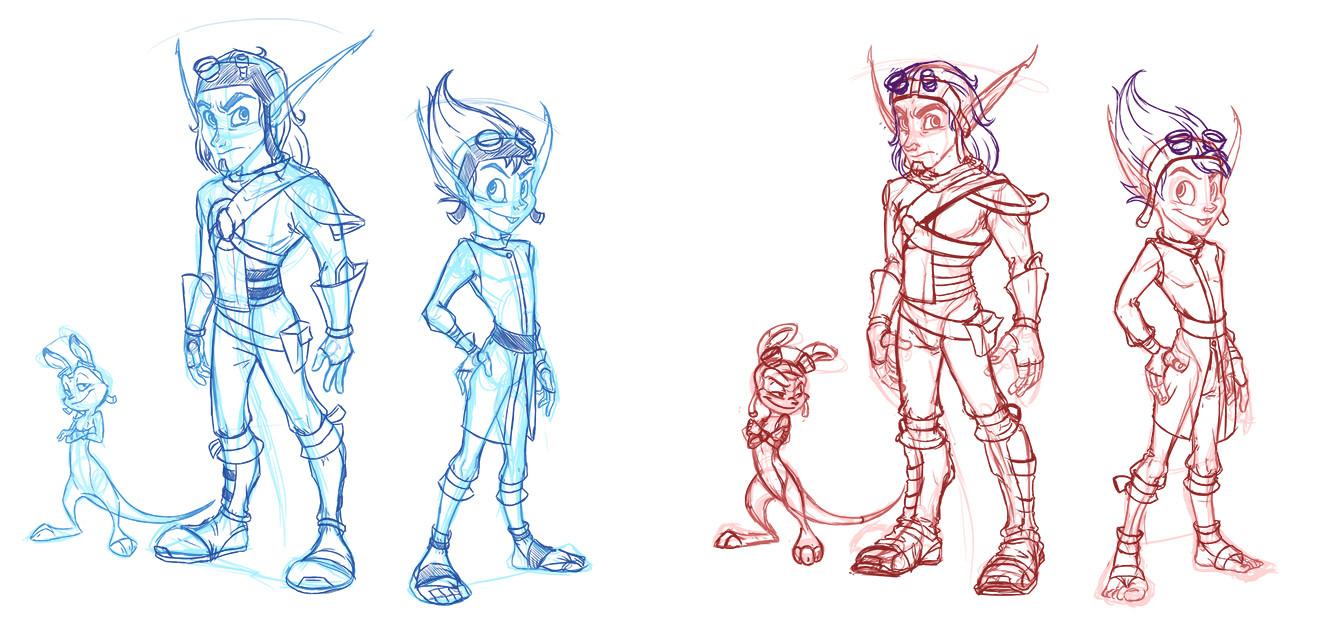
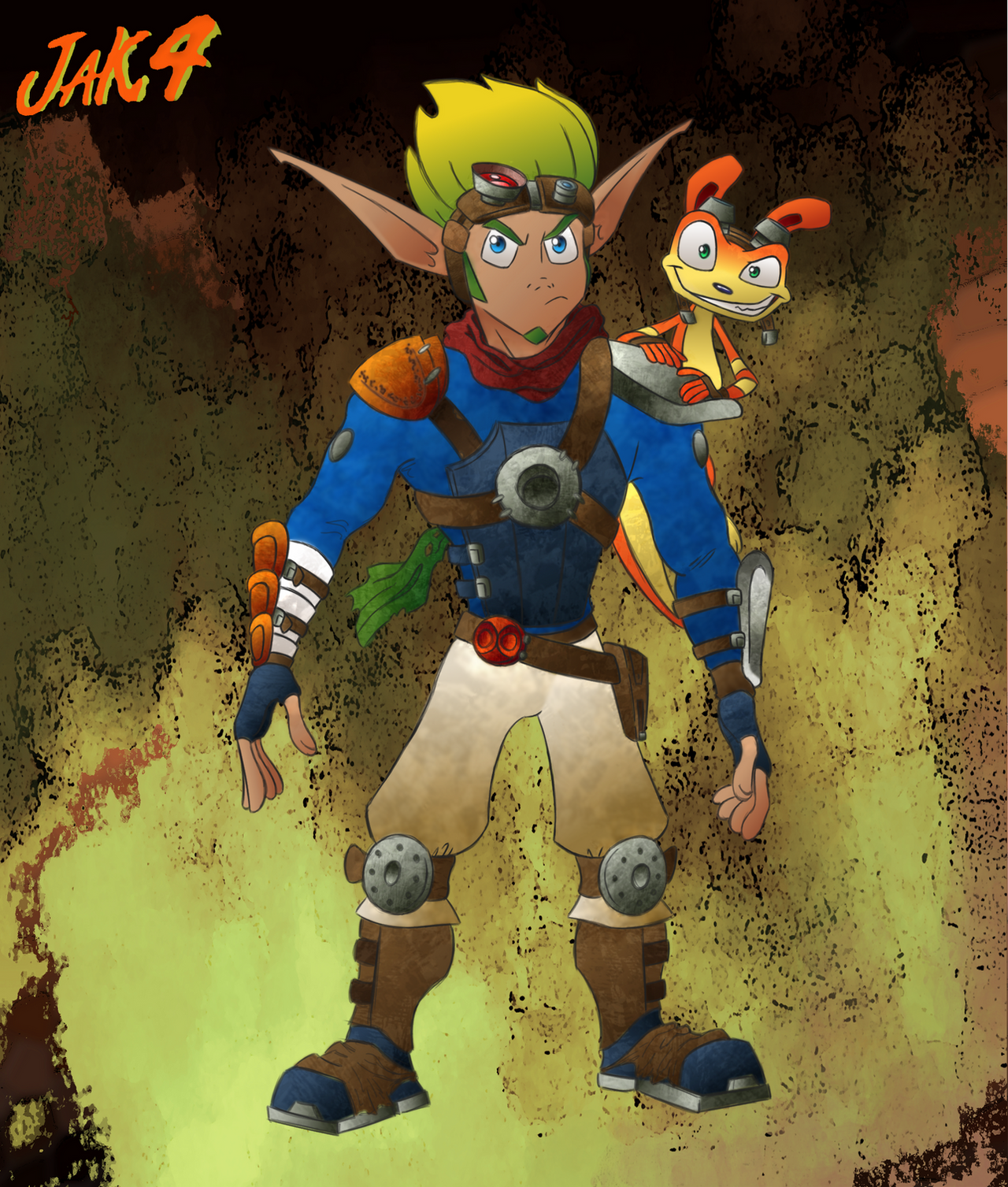
Guess who's fallen back into Jak and Daxter Hell?? 8DOf course while I'm away from home without internet or my playstation. Because that's how life works. (even though I have a few grievences with the games themselves but that's for another time)
I was feeling lazy yesterday and wanted to draw something but not like... put effort into it XD;; so I dug the picture on the left out to just ink and colour it, but looking at it after all this time I was just like "no... no this needs to be fixed. This is not ok."
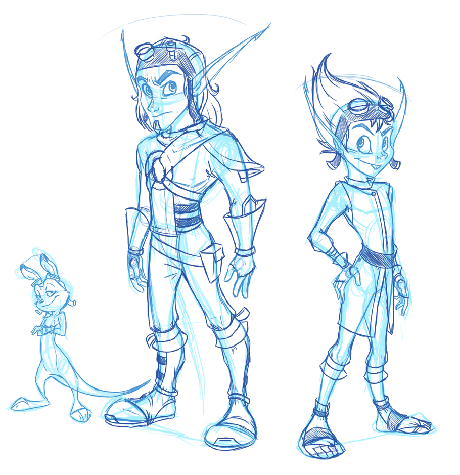
I drew the original picture at a time when I felt my art was really really stiff and lifeless for some reason. But there was enough there for me to still kind of like it up to a point. So I basically did a red-line of the whole picture and what you see on the right is the result.
Apart from things like the hands... I'm not sure if improvement? I still was lazy and used the original rough as a starting point so it's not a completely fresh drawing to compare progress, I know.
Human!Daxter is very similar to the original sketch simply because I actually really like how the original came out. So I just made some minor changes to flesh it out nicer and improve what was there. Jak I gave much more structure to his face and paid more attention to his anatomy so he looked less like he was made of lego pieces and more like a human being.... which then all got covered up by clothes of course.
Ottsel!Daxter was actually the biggest change here since I was completely unsatisfied with him and believe it or not actually gave me the most trouble in this picture. You'd think knowing how to draw Ratchet rather nicely would mean I'd understand an Ottsel's head-shape better.
....you'd be wrong.
I can't decide if I should increase Jak's head size a little. It's more accurate for hoomans but I'm wondering if I should change it slightly to closer match the game or not. I can't decide.
2013 on the left, 2016 on the right.
Related content


Comments: 8

This looks bloody awesome and its really inspiring <3 You've improved but the original wans't even that bad to begin with. I've gotta ask, are you inspired by the artist ?
👍: 0 ⏩: 1

Thank you very much
And yes! Absolutely! X'D Eno has always been an extremely big influence on all my art, but especially on Jak and Daxter stuff <3
")
👍: 0 ⏩: 1
Haha I thought so and right on, she was and still is an inspiration to me as well, especially her Jak & Daxter stuff
👍: 0 ⏩: 1


Woah I love this! The changes are subtle enough that they don't look like they aren't in your style anymore, and even then I can definitely sense the improvement! <3
Nice work!
👍: 0 ⏩: 1
Thank you so much! 8'D I'm very happy to hear that!
👍: 0 ⏩: 0

I think the head size is just fine as it is. Works for these particular characters and the style they are done in. However for the Human Dax, maybe size it down a bit. Looking at the shoulder ratio compared to Jax, Dax's head is a bit too big. You change Ostle Daxter nearly completely. I like the pose a bit better, but his head is a bit warped. I think his right brow is a tad too thick and the goggle strap in the same area goes a bit too far out for the shape of his head. But that's my guise.
But in overall things are much nicer looking and far more refined. Will you be finishing this?
and I hope you fine my critic helpful.
👍: 0 ⏩: 0