HOME | DD
 CannotTheGrammar — Save Me COLORED
Published: 2012-12-17 04:08:05 +0000 UTC; Views: 326; Favourites: 13; Downloads: 6
Redirect to original
Description
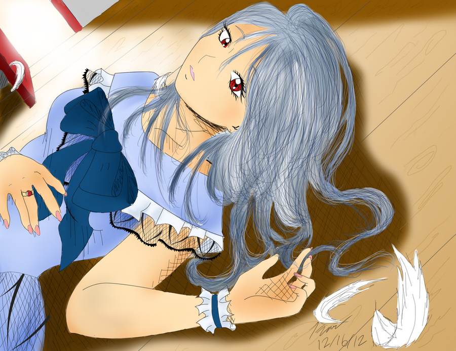
Finally! I dragged my ass on this one for a long time. I think it came out pretty good, not as good as I wanted it to though, the hair, omg it looks so terrible with the brown >: I had a lot of suggestions just to make the wood look more like WOOD, spent a long time on this ;_; Not perfect, but pretty cooool.Related content


Comments: 9
 (Smile)")

If you want some constructive critisme btw:
Dunno what prog. you r using, but in most of them you'll have some tools that can make this piece eeeeven better:
- For the hair: I'd go over with some bigger brushes first to get the colors, try different nuances. then draw some finer hair on top, in one of the nuances allready there. Finaly add som highlight and shadows on top. There are several ways to do this, one of them: use two new layers (one with black, for shadows and one with very very light blue for highlights) and then tweak the opacity untill you get the desired results. If you use photoshop you can choose merging mode for the layers, try "Darken" and "lighten"
- Just a liiitle bit more shadows and highlights would make her popp out even more. You can use the same technique as for the hair.
- If you want to give it a more "scetshy" look, i*d go over the pure lines first with a dark grey, and here you shouldnt take too much care in following the lines: exagerate the straight lines, pull them farther then they are supposed to, etc... and then redo the pure lines you have here (wich are wonderfull btw) with a darker and a liiiiiiiittle bit thicker brush/pen
Hope this was of some help, looking forward to seing your future pieces!
👍: 0 ⏩: 0

Aw thanks ")
👍: 0 ⏩: 1

Welcome *hugs* I know you did! <3
👍: 0 ⏩: 0


looks good. The thick crosshatching I don't really like.... it makes it look like kinda just skipped the shading. If you are gonna do it that way make them smaller
P.S. *GLOMP KICKS YOU* -I know you hate that
👍: 0 ⏩: 1
I don't think the cross thingies are bad,I shade but I put it over it because I like my drawings to look, sketchy? Not the weird kinna sketchy like I'm selling drugs, but you know.
👍: 0 ⏩: 1
Hahaha! Yeah I get it.
👍: 0 ⏩: 0