HOME | DD
 Caser76 — Edit it

Published: 2010-11-29 02:18:28 +0000 UTC; Views: 1169; Favourites: 15; Downloads: 5
Redirect to original
Description
CommentRelated content
Comments: 24

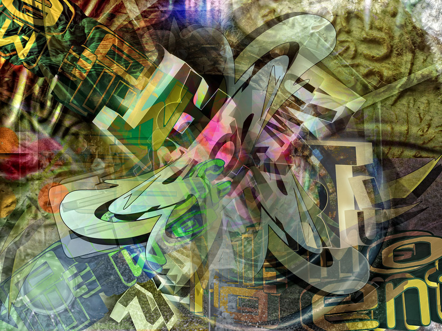
As balanced as this is, I feel this would be stronger if some of the tags weren't translucent. As it is, I feel that nothing really stands out... nice concept though.
👍: 0 ⏩: 0

very cool, I really like hoe you created the radial balance within your composition.
👍: 0 ⏩: 0

Cool typo. I like the colors and the perspective.
👍: 0 ⏩: 0

this is too awesome
congratulations!
keep up the good work
👍: 0 ⏩: 1

I love this. The age progression of ? graffiti? or rather, communicative artwork on walls is wonderful.
👍: 0 ⏩: 1

I keep falling into this piece and seeing more all the time. Your fault. Had to give a 
👍: 0 ⏩: 1

I love your artwork! Every time I see it I see something new! I see two pairs of hands, half a face, a skull, and the word art... or maybe three pairs of hands.... It's like an I-Spy game!
👍: 0 ⏩: 1

Thanks! You feel it! That`s what it is for!
👍: 0 ⏩: 1


