HOME | DD
 CdubbArt — Star Wars: Forces Revised
Published: 2011-04-29 05:26:08 +0000 UTC; Views: 7553; Favourites: 264; Downloads: 0
Redirect to original
Description
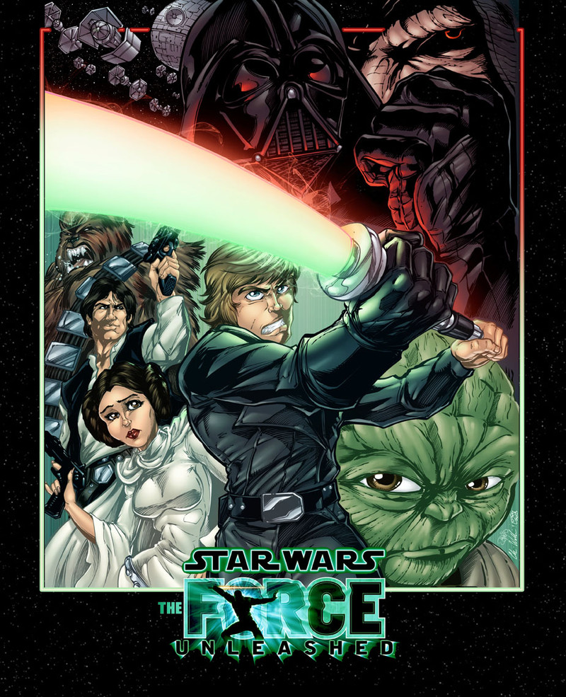
did a little tweaking to the colors of my Star Wars pic. basically, aside from the border and logo, i added a star field to the background, and i added some more reds and greens to the dark and light sides of "the force", lol. hope it looks good. hope i didn't just screw up an already good piece of art. if i did, i'm sorry Witchysaint! lol.Pencils: me.
 (Cool)")
inks:
colors:
Related content


Comments: 24

Another outstanding illustration from you, sir! The inks and colours are very well done, but the sketch is the important part; I particularly love your art style and composition. This piece has a touch of the Adam Warren about it (that's a compliment, by the way!) - which is interesting, because the great AW produced a Star Wars manga series way back when.

👍: 0 ⏩: 0


Really late here, but thanks!
👍: 0 ⏩: 0


")


thanks. wanted to give it some movement.
👍: 0 ⏩: 0


")


Goodness! The combination is like a kid in a candy store!

👍: 0 ⏩: 1
")

 (Smile)")

Yes the forse has been truely unleashed. Awesome work here
👍: 0 ⏩: 0


I think you need this a print (minus the unleashed logo) for me...ummm I mean Philly !
👍: 0 ⏩: 1
lol. i think you'll be pleasantly surprised by the spread i have at the philly con.
 (Wink)")
👍: 0 ⏩: 1
Think you can fit in a piece for me to pick up at the con bro ?
👍: 0 ⏩: 0

This really stands out now, it was lil flat before compared to this. I think you made a good call. Love the green and red on the Lightsaber.
👍: 0 ⏩: 1
yeah, that's what i was thinking. i kept thinking that some of the tones needed to be more... dramatic, for lack of a better word. but i really didn't know how to communicate exactly what i wanted, lol. glad this is an improvement and not an embarrassment, lol. and yeah, witchysaint nailed the lightsaber.
👍: 0 ⏩: 0