HOME | DD
 Cesar-Hernandez — X2 Iceman and Rogue
Published: 2006-06-02 00:11:50 +0000 UTC; Views: 10611; Favourites: 213; Downloads: 44
Redirect to original
Description
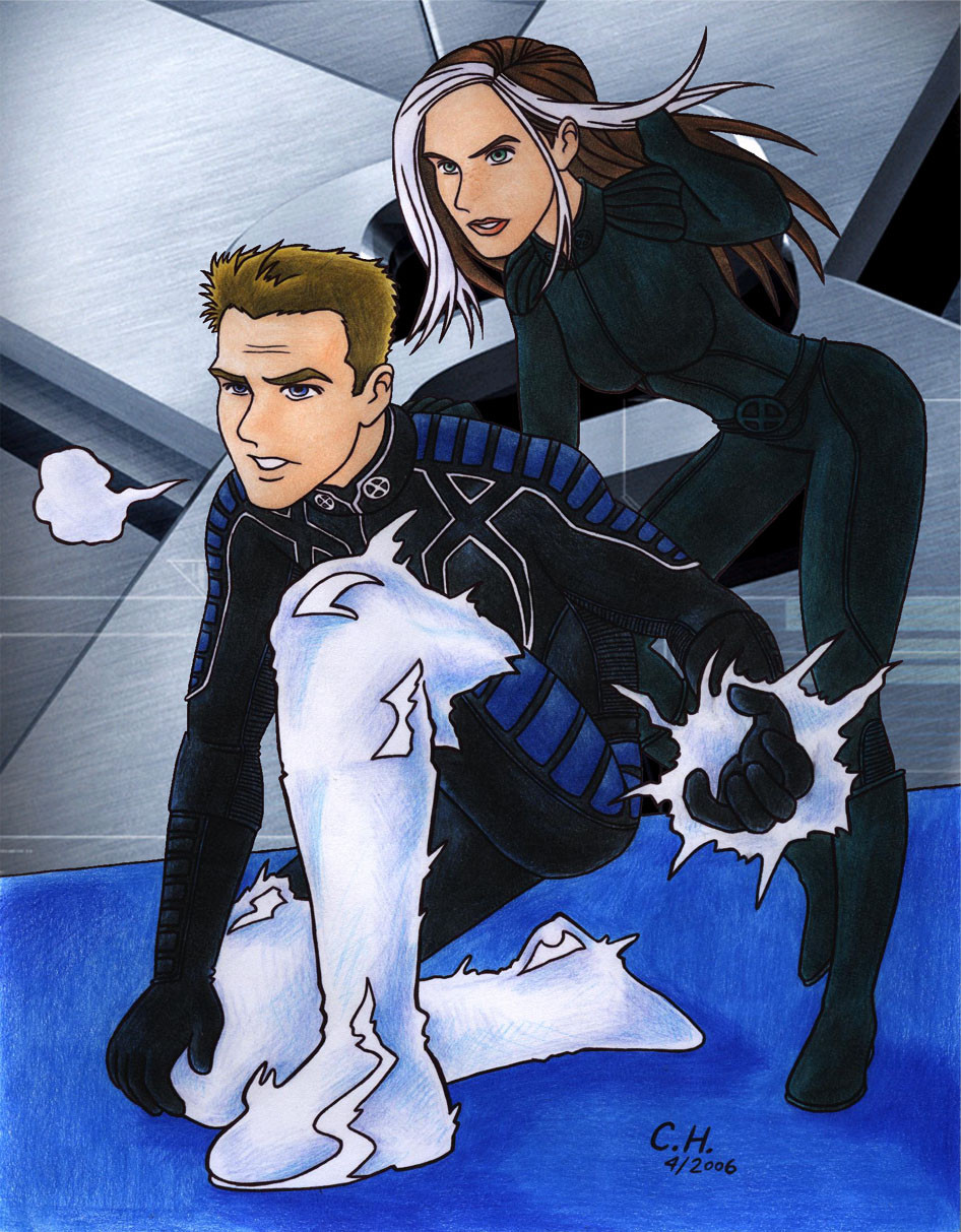
My favorite X-Man, Iceman, with his girlfriend.
Check this at my blog.
If you are interested in commissioning art from me, you can read the details here:
Commissions.Non-adult content:
1 chara: $10
2 charas: $20
Non-nude sexual/sexy content or non-sexual nude content:
1 chara: $20
2 charas: $30
Full adult content:
1 chara: $30
2 charas: $40
Details:
I reserve the right to upload the pictures here and in other sites (e.g., Tumblr, Blogspot).
The requests may only include official characters from published franchises (that means, no OCs).
I would rather not mix franchises, but let me know what your idea for a crossover is and it may be fine.
There may be cases where requests will not be accepted because of the selected franchise, either because I strongly dislike it or because I am not familiar with it to a degree where I could not produce a good enough illustration.
The images will be 1600x960. See the examples below to get an idea of how a final product could look.
Related content


Comments: 84

Dude...this is just AWESOME. If I could get my Prismas to look half that good, I'd be happy. XD And I love the freckles you gave Rogue too.
👍: 0 ⏩: 1

I get different levels of Prismacolor pics on different days... But I know that the more patience you have while coloring, the better they'll look in the end.
I'm glad you liked this, given as how you like Rogue, and all.
I do love freckles, so I use them wherever I can ")
👍: 0 ⏩: 0

Bobby's always cool! Thanks!
👍: 0 ⏩: 0

Thanks. I love Iceman and Rogue.
👍: 0 ⏩: 0

His girlfriend is so much better. GO ROUGE!
👍: 0 ⏩: 1


I reeeeally like this piece! I was reading all the critiques on this piece and came across the one I agree with....the left hand doesn't translate well and it does look stumpish...you said you had troubles working with this....it happens...one suggestion though...it appears as though they are getting ready for a battle...perhaps if rogues right hand was higher and ungloved you could make the left hand appear icey lessening the details and troubles you would have had with it if thats strictly where you wanted the hand to go.... also adding a nice effect....but overall its a nice picture...freckles on Rogues nose LOL too cute ...Subtle details is your best quality
👍: 0 ⏩: 1
Thanks. The stealing Bobby's powers part sounds like a good idea... Wish you'd told me that before I drew the pic, heh heh...
And about subtle details... nah, I just happen to love 
👍: 0 ⏩: 1
well LOL loving freckles is one thing but I was talking as a Whole...you add details that most illustrators do not even bother with...leg hair...tan lines...things a viewer Wants to see because they want to become part of this world...gets hard to do that if everyone looks exactly the same and has no flaws....and flaws is not a bad thing flaws brings life.
👍: 0 ⏩: 1
Yeah, I like those things, on different degrees on different characters, as you said.
Impulse's legs, arms, face and abs won't look the same as Wolverine's, for instance (thank God for that).
But to call tan lines and freckles "flaws"? Never, man!
Freckles are love.
👍: 0 ⏩: 1
misunderstanding and its lack of a better word for me... maybe had I said humanizing the characters...that suits well
👍: 0 ⏩: 1
Heh heh, I'm just joking. I know what you meant.
But still, freckles are a godsend.
👍: 0 ⏩: 0

This is really cool! You are very good at coloring and depicting the actors in your own style. I like it a lot. My one critique would be Rogue's left hand. Is it supposed to be running through her hair? Something about it doesn't translate and it looks like she has a stump or a really small fist. Other than that, great work.
👍: 0 ⏩: 1
Yeah, I had some troubles there. I think I should have drawn a little of one or two fingers and it might have looked differently.
Thanks.
👍: 0 ⏩: 0

Very nice job. The lineart is very crisp and clean, and the shading on the background is phenomenal.
One thing I've noticed about your art in general is that your lines all look one single depth. Therefore, it creates an image of flatness. When you ink, try to vary the strength of your lines. Lines in the foreground should be thicker and darker, while lines further back should be thinner and lighter. In some situations, especially when you're using a lot of light colors (like your beach pic), you can get away with leaving the lines off of the brightest spots (like hair highlights, bright colors, etc.). Once you learn to do that, your pictures will really pop and look even better!
👍: 0 ⏩: 1
Hey, thanks for the advice. I have tried doing the line-width variation sometimes, but it is not very noticeable. I believe I tried some of it on the Rictor pic.
What I could start doing is that part with the no-lines for shining spots. Up til now I've drawn everything as if it were for a coloring book or something, with solid lines. It'd be interesting to think ahead and do what you told me.
👍: 0 ⏩: 1
What I usually do is take a narrow-width pen and outline the entire thing with the same width. Then, I go back over the picture and darken or deepen the lines that need to be heavier. Even without colors this usually makes a big effect.
I haven't done this lately, though, since I've been trying to slide myself more into the digital scheme of art.
👍: 0 ⏩: 0

Really cool. (Pun not intended) Iceman is one of my favorites, too. And now, so is your fanart :-D.
👍: 0 ⏩: 1


OMG! Awesome work. Did you draw and color the background too, cause it looks so smooth and realistic--like you got it from the poster or something.
And this is all pencil crayons or what? What exactly do you use for your mediums cause they have a nice effect to your art?
👍: 0 ⏩: 1
Like, I got it from the 
I use Prismacolor pencils. In this case there was a small extra digital work to add the BG.
👍: 0 ⏩: 1
I've been hearing a lot of good stuff about Prismacolors. I will definitely have to go buy some!
👍: 0 ⏩: 1
I saw the 72 pencils pack at an art shop two weeks ago and literally stayed there drooling over them. I think a pair of guys thought I was looking at them at first, until they realized the true source of my extra-salivation 
👍: 0 ⏩: 1
72 pencils set??? 
👍: 0 ⏩: 1
I thought they were unaffordably expensive before, now I only think they are expensive, which is an improvement.
I've always thought they were worth it!
👍: 0 ⏩: 1
I hear that they are worth it--so I have to get some.
👍: 0 ⏩: 0
<= Prev |