HOME | DD
 CGAndro — Image Characters Jam (pages14-15)
Published: 2013-10-22 21:45:49 +0000 UTC; Views: 717; Favourites: 26; Downloads: 0
Redirect to original
Description
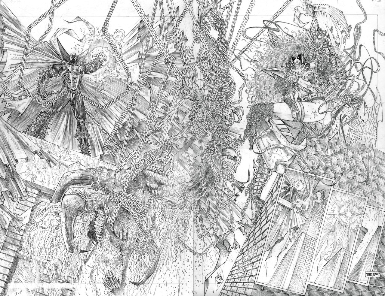
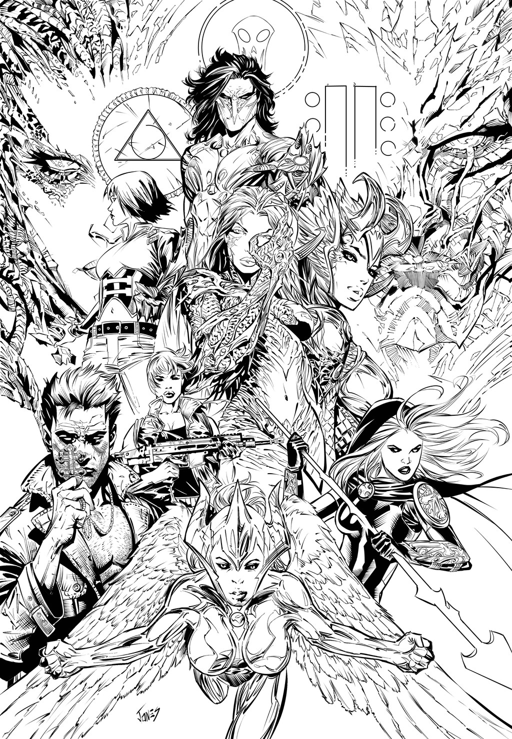
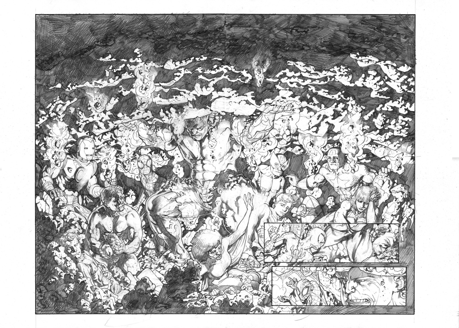
This was part of my pencil sample pages that I was planning to submit for portfolio review way back that never happened. Double splash page featuring Image Comics characters. Pencils on 17 x 22 Bristol board; 1995.Related content


Comments: 13


 (Smile)")

this is for all the pages not just these two. well i am no editor, but i have some pro work under my belt, and have been on the receiving end of many a port review from seasoned pros and editors, but my comments would be that you obviously have the focus and discipline to make it happen, and the work is super dynamic and highly appealing, its a visual feast of detail and its super clean for being that detailed... and the storytelling is good too. here's the stuff that needs a little work. the perspective is a little off on some of the pages, or its a bit stiff at times, and that could also be how tight the lines are... since you going for a gritty image style it might help to hand draw some of the arcetecture after doing the ruler work to make it a little more ragged looking and not as jarring. if you look at some of the spawn work of capullo you will see that in his lines, esp when he bent the perspective in unrealistic ways, yet was able to keep it looking right... also you are obviously doing what you are supposed to do as far as perspective goes, making the lines hit the points, but the placement of the points is a little off. and believe me i know how much of a pain that is when the vanishing point is 5 feet off your desk. secondly your figure work is a little stiff on these pages. just play with gesture a bit more before tightening things up. but you have a huge advantage is that you have dedication and patience. hope this was helpful and wasn't out of line or upsetting... i try yo be constructive and helpful in all my comments if i can.
👍: 0 ⏩: 1

Thanks hobzart for the helpful tips and advice. I really, really do appreciate it! Never had the opportunity to have these pages reviewed previously until now. It's really great to hear some great feedbacks from the pros themselves. Highly invaluable, thanks again!
👍: 0 ⏩: 0

You're certainly one patient, dedicated artist. I couldn't even imagine drawing all those chains, and that's just the tip of the iceberg.
👍: 0 ⏩: 1
Thanks Dualmask. It was painful and fun at the same time. Lol.
👍: 0 ⏩: 0

Hello! Your work is absolutely amazing, congratulations!
👍: 0 ⏩: 1
Thanks for the compliment. It really means a lot.
👍: 0 ⏩: 1
They absolutely deserved congratulations!
👍: 0 ⏩: 0