HOME | DD
 Channel-Square — Capsule Version2
by-nc-nd
Channel-Square — Capsule Version2
by-nc-nd
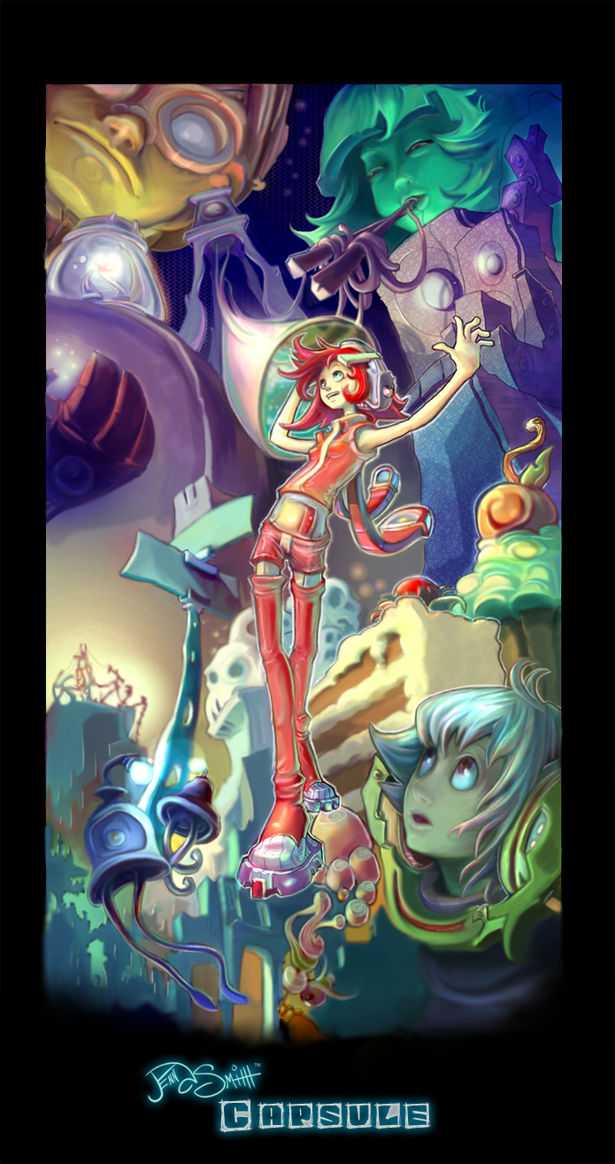
Published: 2008-04-14 06:53:40 +0000 UTC; Views: 4410; Favourites: 92; Downloads: 170
Redirect to original
Description
[EDIT 8/21/08]:Text added
 (Smile)")
Print Available over at the channel-square.com shop!
[OLD]:
I tried to make this one better but not sure if I like it or not :\
Link to the older version: [link]
Related content


Comments: 35

I kinda like the older version better because I love hard lines.
But this version looks softer. Also the characters look a little more detailed to me.
👍: 0 ⏩: 1

Fair enough
👍: 0 ⏩: 0

now that's cool B) I wish it was ;_; Thanks a lot!
👍: 0 ⏩: 0


I agree with Loathsome. I cant believe how you think of these things.
Your colouring is great and makes everything feel so soft x3
👍: 0 ⏩: 1
Oh man thank you! It really means a lot when I hear such great feedback like that. Motivates me to work hard on each painting
👍: 0 ⏩: 1
You're very welcome. I don't mind giving feedback like this if the pictures looks as awesome as yours
👍: 0 ⏩: 0

Awesome style. Simply awesome. This is one of those pieces i could just sit and look at for long periods of time trying to figure out how you did it.
👍: 0 ⏩: 1
hahaha, awesome! Well don't let it suck up too much of your time, I like seeing your work too!
👍: 0 ⏩: 1
lol thanks! I appreciate that.
👍: 0 ⏩: 0

This stands out more somehow. Like a post before mine, they do seem darker. I like that. The snacks stand out more, in the original I had no idea it was there until I read it. Now it's the first thing that stands out other than the outfit, which I'm still kinda trying to figure out if it's showing her belly or not.
👍: 0 ⏩: 1
[sorry for the late reply]:
haha we shall never know if her belly is showing...but I bet that there is some material overing her belly cuz I left out the belly button and it's a different tone than the skin color
👍: 0 ⏩: 1
(no worries, you prolly had like a million before mine)
It's like a tootsie pop. I loved the colors and still do. So very vibrant and happy.
👍: 0 ⏩: 0

")

I adore your art - you're so creative *A*/~ 
Personally speaking, I like the clarity in the first version better, but I love the changes you made to the colours and the eyes of those in the background.
👍: 0 ⏩: 1
[sorry for the late reply]:
Wow thanks a bunch! You have no idea how much your feedback means to me
👍: 0 ⏩: 0

I love both versions! Though the innocence showing in the characters face below and the depth in the character with the chopsticks is just more powering in this version. Seems like the colors are slightly brighter. =3 Either way, I love this and your mad skills.
👍: 0 ⏩: 1
[sorry for the late reply]:
Haha awesome!! Super cool, and I totally agree with you, the othr piece had some weak spots in it that needed major touch ups
Thanks so much for the feedback! It means so much getting comments from ya!
👍: 0 ⏩: 0

i like the differences between them, this one is great 2! i cant decide what one i like best!
👍: 0 ⏩: 1
[sorry for the late reply]:
Haha awesome!! I think the other piece had some weak spots in it that needed major touch ups but there are a few things in the other one I like better
Thanks so much for the feedback! It means so much getting comments from ya!
👍: 0 ⏩: 0

Personally, I like this version better, theres a better suggestion to where the point of interest is
Also, your artwork is always AMAZING. Its kind of a mix between fantasy and sci-fi
Street-light aliens. Awesome.
👍: 0 ⏩: 1
Street-light aliens sounds right up my alley ")
👍: 0 ⏩: 1
no problem, I love looking and critiquing you work
👍: 0 ⏩: 0

Hmm. I like this version better. Everything feels much more focused towards the center.
I love your clothing designs. They have such a unique and future-esque feel to them.
👍: 0 ⏩: 1
Yea? Thanks! I'm definitely into that futuristic genre and it's good to hear your feedback on this piece
👍: 0 ⏩: 0

I like this version better. The boy in the corner has a more interesting expression, the colors have a bit more tone while being a bit darker, and overall the redux has more flair than the older version.
Both are nice though.
👍: 0 ⏩: 2
Awesome! Thanks for the feedback! It's good to hear that the second version was a step up rather than a step back from the original
👍: 0 ⏩: 0
Also, the older version is a little more crisp. The newer one has a bit more of the painted effect and the slight blurring adds a surreal or dreamy feel to it.
👍: 0 ⏩: 0

I love your coloring! Seriously. And the concepts.. all your concepts are so artistic, I have no idea how you're able to come up with all these o:
👍: 0 ⏩: 1
Thanks buddy! I'm always feeding my brain new information...I just put things I like into my work
👍: 0 ⏩: 0

I love your style so original! I like this version better, it doesn't look so "flat". The only thing i miss, is the expression the guy (with white hair) had in the first picture. Otherwise, this is so much better.
👍: 0 ⏩: 1
I totally agree, that guys facial expression is better in the first version ")
👍: 0 ⏩: 1