HOME | DD
 Chromamancer — Stained Glass
Published: 2010-01-13 03:50:14 +0000 UTC; Views: 7748; Favourites: 310; Downloads: 263
Redirect to original
Description
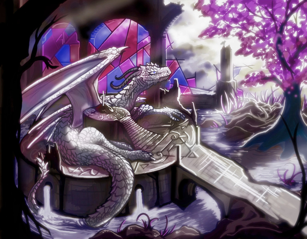
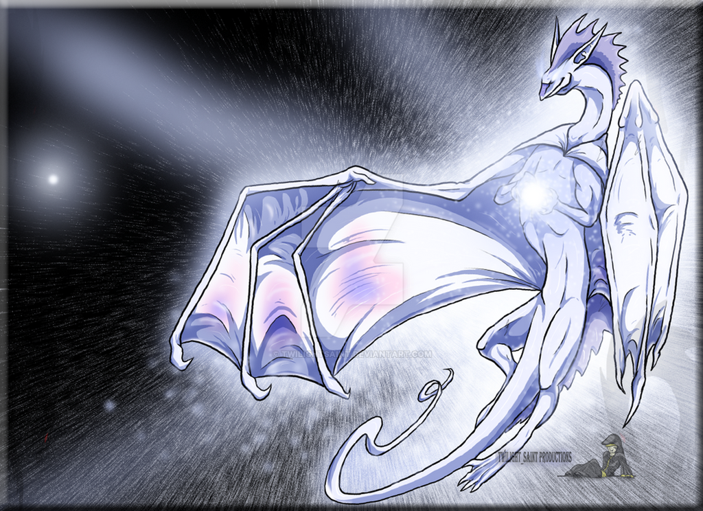
Last week was definitely a daily challenge fail.However, I got a fun idea, and needed to spend the time to fully develop it. It's also my first attempt at drawing stained glass windows. That was an adventure.
 - :P")
The setting was partially inspired by that water temple in Secret of Mana. I'm attempting to put some more thought into the setting and details, to try and push my art up a level.
The dragon is mostly blind, but has the ability to see people's hearts, and is waiting for the right person to arrive. It has been a rather long wait already.
Also, my crusty old tablet is no longer a concern. I recently got a Modbook. It's like an Apple Macbook, with a tablet screen. It's rather neat, and has pressure sensitivity, so now I can draw on the go.
 - :D")
Now that I've worked this idea out of my head, maybe I'll get around to those daily challenges.
 (Wink) - ;)")
Related content


Comments: 80

Thanks again for the great critique.
I think the two words you were looking for are inspirational and imagination.
Critique is always handy. It doesn't make much difference if you're a beginner, or experienced artist. When I was a beginner myself, some of my friends that are not artists gave me some great advice.
I did most of the work for this picture with Photoshop, instead of Oekaki. That's probably why it has that different feeling. I'm not as familiar or experienced with Photoshop. I always appreciate your critiques.
👍: 0 ⏩: 0

You have a unique style and a lot of talent.
Thanks.
👍: 0 ⏩: 1
You're welcome.
Also, thank you. It's quite encouraging to hear that.
👍: 0 ⏩: 0


Thank you.
I'm glad you enjoy it.
👍: 0 ⏩: 1
 - =p")

Great! IMHO Your best drawing drawn in this specific style  (Smile) - :)")
Congratulations on the idea. A blind dragon searching for human hearts. Mystical
BTW. Is this a catholic temple? There is a cross inside…
The dragon is very good. Drawn in Your style, but detailed, with good anatomy and cute smile :3. I like him
About the background… Nice work with that stained glass! Looks like a stained glass should look
👍: 0 ⏩: 1
Thank you.
That cross thingy is supposed to be a sword stuck in there, for someone to take. So, apparently the right person hasn't arrived yet.
I did definitely mess up the perspective on the bridge. It is a raised arch, so water can flow underneath it, but the perspective mistake does make it look like it is tilted. Fixing that would take a rather major retouch... There are also a few issues with the relative sizes of things in the picture. I'm quite happy with how the stained glass turned out, though.
I may completely re-draw this one some day, and take a second shot at the idea.
👍: 0 ⏩: 0


love everything about this pic! which system is secret of mana for? iv only played dawn of mana for the ps2, which is awesome btw.
👍: 0 ⏩: 1
Thank you.
Secret of Mana is for the SNES.
You had control of three party members, and you could play the game in a multiplayer manner, with two friends. It was a lot of fun.
I've played Secret of Mana, and Legend, but not Dawn...
So, it's rather good, then?
👍: 0 ⏩: 1
dawn is really short (you can beat it in a day, if you played nonstop) the battle system is a little different, but the charas and the cut scenes/videos more than make up for it, esp the videos with the flammie in them. oh, some of the 8 spirits voices are a little odd, their not that bad but i cringed when some of them spoke and i don't know if it was my copy of the game or if it applies to all the games but mine had some interesting glitches, interesting as in funny, not the ones that damage/ruin your game play. i still love the game!
👍: 0 ⏩: 1
I might have to see if I can rent it some time, then.
Secret of Mana is a relatively long game, especially if you're playing it with friends.
It looks like it was recently re-released for the Wii, with that Virtual Console feature.
👍: 0 ⏩: 1
awesome! *runns off to blockbuster to rent*
have you played it on the wii yet?
👍: 0 ⏩: 1
I haven't. I've only played it on the SNES.
I was visiting a friend today, and noticed that he had it on the Wii.
It was a download, so I'm not sure if blockbuster will have it...
But, it was nice to see that game again. It's one of my favorites from the 16 bit generation.
👍: 0 ⏩: 1
oh well,i guess that it will be a good game for me to be on the lookout for then.
👍: 0 ⏩: 0

I think someone already mentioned it, but I totally dig the scale textures on the tail. Really, really cool. Your scenes always make me smile, too.
Hmmm, if I had to nitpick something, I'd nitpick the perspective on the front bridge area (it appears to be pointing down) and the scaling on that beautiful background tree. The tree would be redwood or Yggdrasil-sized compared a normal human, although I'm sure that was probably intended and I should leave well enough alone
I'm so jealous of your Modbook XD
👍: 0 ⏩: 1
Ah, I see what you're talking about on the bridge, there.
That is a decently serious perspective error.
As for the tree, I wanted to make it rather large, to hopefully give the impression that the location there has been in ruins like that for a decently long time. I don't know if it worked as well as it could have. I probably should have added some more vines and undergrowth.
That Modbook is a lot of fun to use.
I still have to load my music on it. Once I do, I'll be able to draw with music all over the place.
👍: 0 ⏩: 0

I especially love the lighting on the water, so beautiful!
I also love the glass you tried out, it's always hard for me to figure out how the light flows through like that on the glass, but you pulled it off nicely
I'm kind of wondering though, if there's really strong lighting on the dragon, would there be strong shadows as well? or is there light coming from a few different directions? The really dark tree on the right has me a bit confused.
I see new scales again
👍: 0 ⏩: 1
Thank you.
I did this one in black and white first, then added in the colors later. That was the only way I could think of handling those in a manageable way. I think it worked out rather well.
I was trying for some decently strong lighting, but also a white dragon. Most of the time I try that, the dragon ends up looking rather dull, and off-white. I might have taken it a bit too far this time, though.
I do see what you're talking about with the tree, though. I probably should have added a few more highlights on the trunk. Maybe I'll make a minor edit and fix that up.
I was trying a few new things with the scales, and the type of horns is new, too. I tried to make this dragon a bit less generic than many I have done.
👍: 0 ⏩: 1
You're welcome!
Dull? Well there is light coming out of the colored glass, maybe you can get purple colored shadows on the dragon or something
👍: 0 ⏩: 0

very nicely done. the highlights and shadows are amazing. You are really gifted
👍: 0 ⏩: 1

Thank you.
I'm glad you enjoy it.
👍: 0 ⏩: 1


So very pretty.
So how was it using the Modbook?
This picture has a unique style to it and is delicate in meaning. The use of colour is limited (awesome!!) but you couldn't tell until further examination. You used textures so wonderfully, on the dragon, tree, water, etc. The stained glass is great for a first attempt.. that seems something that would be quite challenging. Nice touch with the broken edges.
Although the anatomy is nearly perfect (front claws... eh, not bad but look rough) I would have liked to see more detail on the dragon, especially head and right wing. Though I can't say it takes away from the picture, since there's a sense of simplicity that makes it feel, hmm.. more mystical perhaps? I also love the subtle silhouettes outlining the foreground.
Blue eyes have a much greater prevalence of blindness.
👍: 0 ⏩: 1
Using the Modbook was rather awesome.
It's like drawing with a pencil and paper, except with the full power of Photoshop. It was rather magical.
Pen pressure was really nice to have. I didn't have to switch brushes all the time, like I do when I draw with the mouse.
It was really interesting, though. Aside from that pen pressure thing, my lines have the same accuracy with my mouse, and with the Modbook. I just have plenty of mouse experience built up.
I'll be using that Modbook plenty more for art.
When I was experimenting with the color scheme, I found that it looked rather flat until I used a warm yellow for the light. That adds in a bit of color in areas that wouldn't have it otherwise, and adds that little touch of green that keeps the color scheme from falling flat. I am glad to hear that the silhouettes look good, and that the composition works as a whole.
I think it turned out rather well, but not quite as well as I was picturing it... That probably means that I'm at least improving with my concepts, and that there should be some nice improvement in my art to follow.
I actually have heard about that thing with the blue eyes before. I chose them both because of that, and because they fit well with the color scheme. If not blue, I would probably have picked a light gray to give that milky cataract look.
👍: 0 ⏩: 1
Very good.
I know you'll get good use out of it.
The concept is a fair improvement. I'd say anatomy isn't, but it's also not the focus of the picture. Hmm... if I could choose the main thing for improvement at this point, I'd have to say attention to detail. That's kind of vague since level of detail depends on the style of drawing... in this case more you wouldn't want to clutter the picture either. So... it's tough to say.
Very good still of course. More, I say!
👍: 0 ⏩: 1
Indeed! Always more!
I picked up a neat book a few days ago. "200 Projects To Strengthen Your Art Skills"
It has some really neat projects and advice in there. I'm sure it will be especially helpful for someone like me, who hasn't really been taught through classes. There is plenty of stuff in there that I haven't seen before.
I'll keep improving, and become super awesome eventually.
👍: 0 ⏩: 1


Thank you.
I'm glad you enjoyed it.
👍: 0 ⏩: 0

Nice, I love the concept in this <:! Those shimmering lights are beautiful too, gorgeous work <3.
👍: 0 ⏩: 1
Thank you.
I tried to get that shimmery look in there. It was rather tough trying to make the light look good, but not overpowering.
👍: 0 ⏩: 0

i love the color scheme and idea, but were you going for thick lines? it dosnt look bad though! just more unrealistic
👍: 0 ⏩: 1
Thank you.
I wasn't originally going for the thick lines. I blame that one on Photoshop.
The more work I do in Photoshop, the thicker lines I seem to have. I'm actually much better when drawing on oekaki.
A bit of practice with different types of brushes in Photoshop may help resolve that little weakness, though.
👍: 0 ⏩: 1


woow... is so crazy beautifyl <3 the colors are so soft an the entire picture has a peaceful air. You did a great job with the glasses and the lights. There's something in the three that takes all my attention

👍: 0 ⏩: 1
Thank you.
I'm glad you enjoyed it.
That glass was rather tough to work with. I tried to make the lighting appropriate with the soft colors...
I might have to draw stained glass again some time. It's a challenge for me.
👍: 0 ⏩: 1
| Next =>