HOME | DD
 cogwurx — Foundation
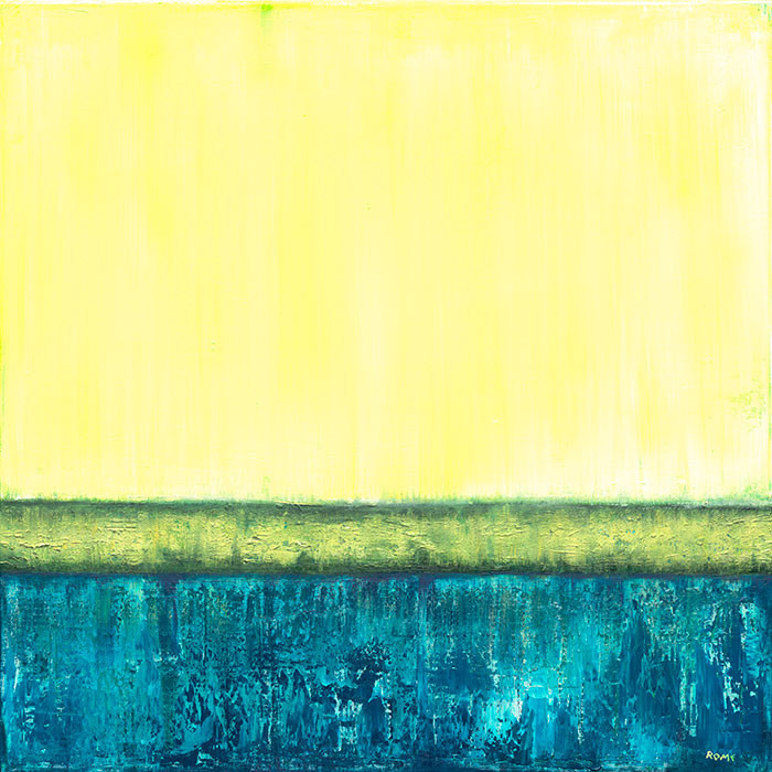
#abstract #blue #cogwurx #expressive #green #grid #intuitive #lime #texture #textures #yellow #intuitivepainting #abstractart #minimalism #oiloncanvas #oilpainting #turquoise
Published: 2016-07-08 17:44:30 +0000 UTC; Views: 828; Favourites: 37; Downloads: 0
Redirect to original
Description
24″x24″ Oil on Canvas
The naming of this piece was really bothersome to me. Struggled really hard with it and I’m not sure why. It could be that the composition is one that has been done before to the point of this being derivative. However, it’s something that I’ve had in mind to do for a while and wanting to play around with differing types of textures I went with the muse. Plus I really like using these yellows and blues.
Buy the Original www.etsy.com/listing/483758085…
Related content


Comments: 14


congrats! you have been featured in summer feature! fav.me/dacvq30
👍: 0 ⏩: 1

Yes, it is reminiscent of Rothko but in a more modern way. The color use is totally different and puts out a different vibe than Rothko. It is always hard to see the textures on a photo, but it looks like the textures in the blue section are nice and rough and the yellow section has less texture. It's a nice contrast
👍: 0 ⏩: 1

Indeed! The blue has some really strong textures, the green area has really tight textures, while the yellow is smooth. I wanted to create that sort of weighted tension between the shapes and textures.
My craptacular skills as a photographer don't really show the textures well. Hopefully, that will change when I get new photos taken for prints and everyone can see the textures better.
👍: 0 ⏩: 0

I love the colours and the bleeds! It reminds me of Rothko in some sense
👍: 0 ⏩: 1

It can be a cross section of whatever, but this is not the point. For me it´s the balance of the three shades of different colors, the composition of colors and finally the fine structure to make it vivid.
👍: 0 ⏩: 1

I personally am really drawn to this piece. I'm hesitant to write a critique because the whole x/5 star thing seems way too simplistic for critiquing art. Or, it turns a critique into a rating and I don't like that.
The texture is a little hard to judge from the resolution, but I love the way the green bleeds just slightly into the yellow. The blue texture is very strong and almost echos the green's texture, but is more exaggerated. The yellow almost seems rushed or incomplete, but the hint of blue behind it and its juxtaposition to the textured blue and green makes it a really nice, quiet complement to the chaos of the other two layers.
It kind of reminds be of that decorative wall style where there's wall paint above a carved wooden board that tracks around the room, and beneath it is wallpaper.
I can see the struggle with the name. To me 'Foundation' implies that this is you working on the foundations of texture work. Maybe I wouldn't think that if I hadn't read your description, but the connection might still be there.
I think you should definitely work with texture more. Texture can be such a powerful element in oil paintings! It'd be interesting to see this as a series, or do others in different colors with slightly different compositions
👍: 0 ⏩: 1
Thank you so much for this critique! Really appreciate that you took the time to write this ^^
The photo that I took doesn't do the painting justice; the textures aren't represented well and the colors are off a bit. But I'm happy with the end result of the painting and that something about it draws you to it.
Thanks again!
👍: 0 ⏩: 1
You're very welcome, critiques are so important!
I know what that's like, I can't photograph my work to save my life, especially when texture is an important part of the piece
👍: 0 ⏩: 0