HOME | DD
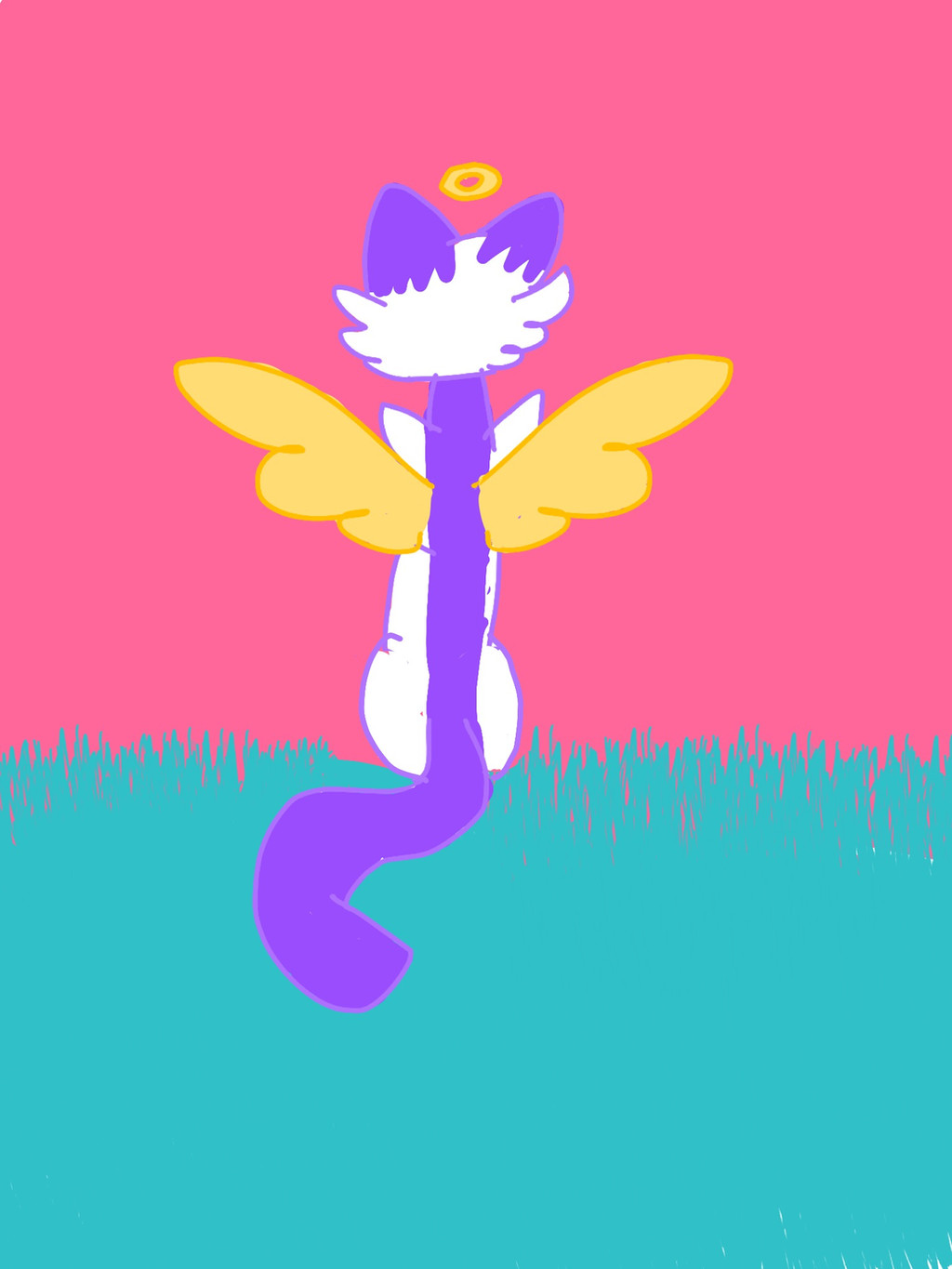
 colaflare — Take to the skies

Published: 2017-12-11 06:00:04 +0000 UTC; Views: 122; Favourites: 6; Downloads: 0
Redirect to original
Description
A vent drawing.Also, This is Gray Rose, but i redesigned her.
I drew this in November so its a little old.
Related content
Comments: 3


So, first of all, I love the back view. I really often see artists draw from front or side, rarely back, so that's a plus.
Now, the anatomy, it isn't the best neither the worst. For example the tail is slightly too thick, considering rest of its body it quite small (gives me a feeling the cat is underweight or small). Like Husky said, references will help, and even suuper talented people use refences, those are never harm!
The colors are wondeful, but you should pay little more attention so it goes in right places, and doesn't go over the cat itself.
The lineart is nice, colorful. But it seems very sketchy, was it on purpose? If no, I suggest taking more time on it. Lineart might take me 30+ minutes sometimes, so I know it's better to do slow and careful rather than fast and messy.
The background is cute, actually. Light and bright colors, but some shading or more colors could give a better idea of where this is happening. And on some places (ex. right corner down) is a little white left, I am not sure is it on purpose but it would look nicer to have it fully colored.
But personally I like this art really much, and am sure little improvement will make it amazing. Also the little angel crown is adorable.
Please remember that every artist started somewhere, but with enough practise we all can become great.
Good luck <3
👍: 0 ⏩: 0


First of all i wanna say that i realllyyyy love your art and style , and i hope with this critique you can grow and improve!
Anatomy: First off i wanna focus your view on the body , the cat's torso is very skinny and makes them appear like their starving , They also sit straight up and if you study cat anatomy you will find that that's not how the back of a cat works. Also from the positioning of the shoulders you should be able to see the front legs. I suggest using a reference picture like this: www.google.com/search?client=f… ! DONT be ashamed of using reference! Its how artists grow and improve~! The wings look like they should be places higher up on the body , and the size of the wings would prevent the cat from flying , although this could be what you were going for. I know this excellent guide on how to draw wings here: design.tutsplus.com/articles/t…
Lineart:The lineart for the most part is smooth however in alot of places the lineart crosses over and is jagged , I suggest taking more time to do the lineart and cleaning it up afterwards~!
Coloring:I REALLY love the colors you chose! They all fit together super well! Like srrly i cant even- Anyways. For the most part you keep the coloring inside the lines , but in some places like the left wings the coloring goes over the lines , this gives the appearance of being sloppy and quickly drawn. And in some places by the grass like the bottom right and where the pink and blue meed you can see white lines. Once again take time to color so it doesn't look sloppy~!
Once again i really love the color choice and i can see what your going for! I'm really looking forward to seeing you improve and go forward with your artistic abilities !
👍: 0 ⏩: 1

Thank you so much!
and fun fact actually,
this is a sort of old drawing, drawn in November
so i had to change some things
for some reason when i drew this first i drew the legs really round???
also. I've been trying to work on lineart for a while now.
Anyways. thank you so much for the critique~!
👍: 0 ⏩: 0


