HOME | DD
 Cosmiksquirel — Xaroht
Published: 2008-07-02 01:10:42 +0000 UTC; Views: 1119; Favourites: 33; Downloads: 12
Redirect to original
Description
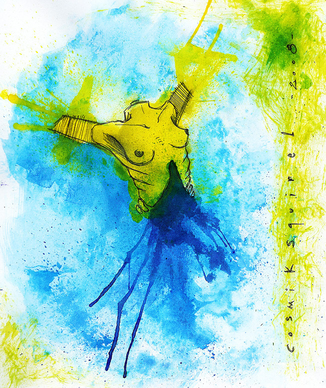
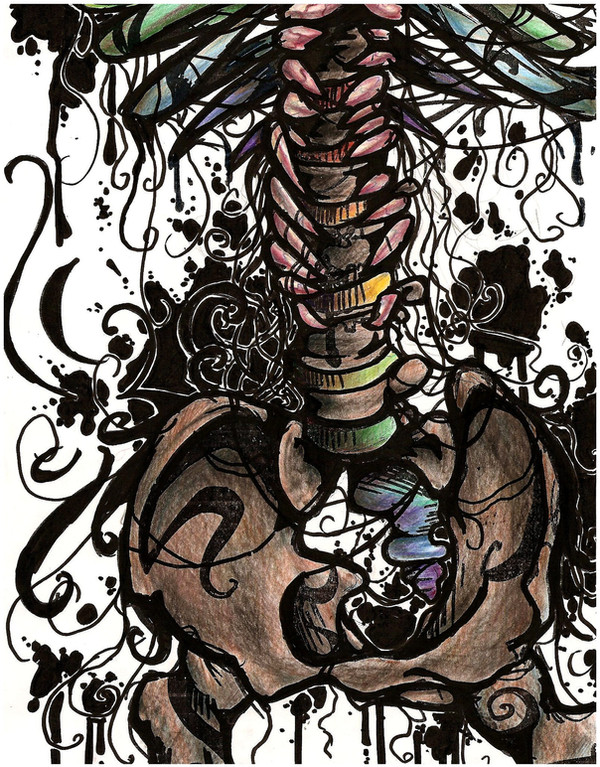
I know I've done better ones but I think that's all I could actually make before losing my mind and ruining the piece like I did about 20 minutes before starting this one. GHUH. You can see I started losing it with the yellow-green-ish things on the right of the piece, right where my signature is.Related content


Comments: 9

Hot damn, the simplicity of this piece screamed at me as soon as it loaded onto my screen, the blaring colors are like train wrecks, you can't even act like you want to look away. It is all on the verge of perfection, and the nudity isn't even close to provocative, really, the ribs peeling back from the torso is perfect. And the bleeding is spot on, I have followed you stuff for a while now and like shimmyshammy said, your stuff, no doubt, is looking professional.
👍: 0 ⏩: 0


Serieusement, tu me fais un truc du genre sur toile, j'suis fckng acheteur.
J'adore.
👍: 0 ⏩: 0
shimmyshammy [2008-07-02 16:40:28 +0000 UTC]
Another very strong presentation of traditional work that continues to express how your work is amounting to a professional status quickly. What has always made you work so vibrant and catching is the slick presentation of colour splattered upon the paper. These vibrant colours, connected with the inking, give such charm to the work and allow the surrealist to shoot out of the design.
You have not presented a vast understanding of colour, but also improvements in your anatomy and design. The torso displayed here is well drawn and detailed and with the feature of inks that merge from the torso, it creates the illusion of bleeding perfectly.
In total, you have really shown a talent that is growing amazingly and continues to explore more and more areas.
👍: 0 ⏩: 1

Have you got any advice on how I could improve with colors? My tints are pretty basic I admit, but I don't want to overcharge the piece with thousands of colors... Although it could be interresting to learn new ways to use them. I only have 6 colors but I always mix them in water to get new tints...
👍: 0 ⏩: 1
shimmyshammy In reply to Cosmiksquirel [2008-07-04 10:46:25 +0000 UTC]
Hard to say? I mean, there are many ways you could improve with inks (if that's what you use) such as mixing different hues with another to make a select tone instead of taking it from the packet. Quickly over lapping one tone while still wet with another so they can clash might be one.
Perhaps even trying different materials such as acrylics or oils. If you working only with inks then just try over lapping, mixing up tones to create new hues, merging a watered down tone with another on the paper and let them naturally connect.
👍: 0 ⏩: 0

I can't really see where you got frustrated. It looks so rad to me
👍: 0 ⏩: 0


Perdre son esprit est ce qu'il y a de mieux pour la création!!! Jadore
")
👍: 0 ⏩: 0