HOME | DD
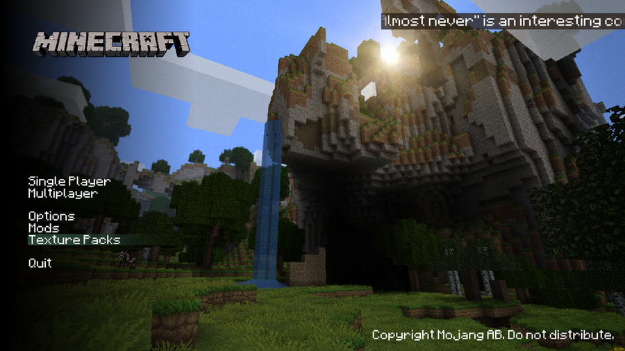
 Craig-38 — Minecraft Alt Menu Concept
Published: 2011-07-30 16:08:13 +0000 UTC; Views: 7915; Favourites: 61; Downloads: 350
Redirect to original
Description
A redesigned menu for Minecraft that I personally think looks quite cool.I'm working on making this actually real by modding minecraft, but it might take some time.
The bar in the top right is the replacement of the splash screen with scrolling text instead of the current scaling yellow text. The background is currently an image, but if possible could be an actual level chunk, with moving water, clouds etc. The image is a screenshot by ~SolidAlexei and the texture pack is one of his own.
Hope you like it, and please leave a comment if you have the time. Any (constructive) suggestions for improvement would also be appreciated.
Related content


Comments: 62

I would seriously love you if you get the Mod to work as i dont really like the current Minecraft menu.
👍: 0 ⏩: 0


It would be amazing if you were to make this :3. Because I like this a lot.
👍: 0 ⏩: 0

I'm in love with this. Doubt we'll ever see it though.
👍: 0 ⏩: 0


It reminds me very much of Valve's menu screens, which isn;t a bad thing. I would change the ticker in the top right back to the bouncy yellow text, but I like it overall. ^u^
👍: 0 ⏩: 0

The concept is just excellent.
The "Minecraft" title should be a little bigger and center on the top.
The bar in the top right should finish by a gradient on the left side.
"The background is currently an image, but if possible could be an actual level chunk, with moving water, clouds etc."
This would be really awesome ; at least you need to put a "moving" picture (like in the current menu).
Have you thought to make the picture changing according to the texture pack ?
P.S. : please excuse my really really bad english, i feel like i haven't speak english for so looong.
Great continuation
👍: 0 ⏩: 0


well done! i think that someone at mojang has seen this
[link]
👍: 0 ⏩: 0

this is an amazing concept.
Things to add/rethink
Background to be a real world going its normal day night cycles.
continue button(topmost world on your list)
If a texture pack/mod was applied the background world would apply it and refresh.
that's about it I think.
Great work
")
👍: 0 ⏩: 0


i may not be a premium member but i can be a critic at times,and as a guilty pleasure minecraftia is one of my top ten worlds(N.3 actually)if this were to be the permanent menu,it would be AWESOME its somewhat mixed with HL2 Menu stuff and more or less like most shooters
its awesome in every aspect i have seen and the sun rise is awesome,please show this to notch he would be pleased
👍: 0 ⏩: 0


*cough* You know you can change both the mojang and minecraft logos now. should be interesting...
👍: 0 ⏩: 1
You can change the background, logo, and mojang logo of the official client via mods. it should be too hard to replicate this to a degree. Even the menu buttons can be changed.
👍: 0 ⏩: 0

very nice I like the concept, especially the level chunk idea. As for the the scrolling text I think it should be wider... from the MC logo all the way to the the right edge
👍: 0 ⏩: 0


I love it <3 It's simple and elegant and really shows off the beauty of minecraft. The bar on the top right does sort of ruin it though.
👍: 0 ⏩: 0

looks a lot like fortresscraft's menu, don't you thing?
👍: 0 ⏩: 0

This is actually an ingenious idea,
I'm tired of looking at the same old brown dirt wall whenever I log on.
👍: 0 ⏩: 0

Love it mate. Simple, and up par with the original, yet so much "sexier"
👍: 0 ⏩: 1

Good menu. Maybe a random screenshot (like the splash)?
👍: 0 ⏩: 0


Texturepack is alot, if it's not, "John Smith"  (Wink)")
👍: 0 ⏩: 0

The texture pack is a custom pack by ~SolidAlexei . If you want it, you'll have to contact him for it.
👍: 0 ⏩: 1

"The bar in the top left is the replacement..." I think you mean top right
Other than that I really like the illustrations people make about this idea. I really like it!
👍: 0 ⏩: 0

Beautiful. Hope you manage to make it work in the game. I have a similar picture but I'm no modder, and I used the Valve menus as a reference too
")
👍: 0 ⏩: 1
Edit: I don't really like the lick smiley here. It look so rude
 (Smile)")
👍: 0 ⏩: 1
Yeah, I think I've seen your picture before. I kind of based this upon it slightly so thanks.
P.S It's not that rude
👍: 0 ⏩: 0

Very cool, though it should look like there's no texture pack on - it should look regular, howver crappy it may be. Still, this picture is amazing!
👍: 0 ⏩: 0
empty-anatomy [2011-07-31 16:55:58 +0000 UTC]
i like the design. and the texture pack lol what is it :3
👍: 0 ⏩: 1
The texture pack is a custom pack by ~SolidAlexei . If you want it, you'll have to contact him for it.
👍: 0 ⏩: 1

Very very BADASS.
Tweet this to Notch, maybe he'll like it :3
👍: 0 ⏩: 0


I think you mean top right...
But this looks very cool; nice work!
👍: 0 ⏩: 1
Good point, I did mean top right *facepalm*.
Thanks for the comment
👍: 0 ⏩: 1

I dont like the bar on the top right corner. Without it, it would be amazing minecraft menu. WAY BETTER then the current 1990's one xD
👍: 0 ⏩: 1
| Next =>