HOME | DD
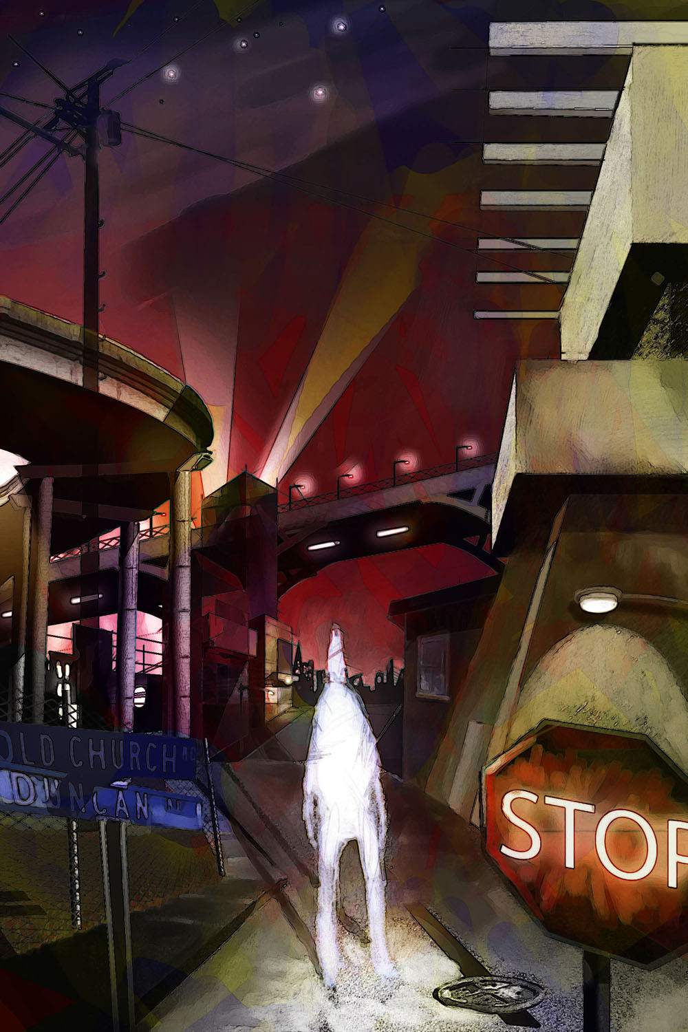
 crAZe2 — Crossroad2
Published: 2005-08-08 17:27:24 +0000 UTC; Views: 2539; Favourites: 44; Downloads: 293
Redirect to original
Description
This is my first attempt at digital painting. It took one weeekend. It is painted/composited in photshop and painter.Related content


Comments: 28


fantastic style and composition, I love this so much.

👍: 0 ⏩: 0

This is a pretty good start for a first digital painting. Impressive
👍: 0 ⏩: 0

Very nice work. I'm surprised it hasn't gotten more comments!
👍: 0 ⏩: 0

Nice work. ")
👍: 0 ⏩: 0

whoa! For a second I really thought that was in oils. very great modernistic view, has somewhat a cubist and impressionist view to it. Nice job, have to fav it!
👍: 0 ⏩: 0

this is very cool. the whole scene feels like it's "in" another building, through the way you've done the lighting around the sky.
when i opened this, i immediately thought of radiohead, i don't know why. but i guess that's a good thing, because i like them. good work

👍: 0 ⏩: 1

Thats cool...Radiohead is my favorite
👍: 0 ⏩: 0

Oooh but i love it! It's got the same feeling of anonymity I tried to capture in mine, plus your perspective gives the piece depth and... just wow! I'm going to have to +FAV this one for sure, great job! Your character looks like he's been torn out too, an effect which I really like. And thank you

👍: 0 ⏩: 0

woah, sweet, and holy cow that's freaking cool looking! its like... woah! ... daaaaaamn!! its just so stylish, how its all laid out!
👍: 0 ⏩: 0

whoa....
i LOVE this!!!!
keep up the digital painting, its really great!!! very original

👍: 0 ⏩: 0

is this prerendered in a 3d suite? interesting concept, for the uncoloured person -as in untainted/coloured by others perceptions of him?
👍: 0 ⏩: 1
thanks for the positive comments. No...its not rendered in a 3d suite. Although I do have another work I just posted that is. This one is just drawn pretty much from scratch, with some photo references. The perspective stuff I just layed out with the pencil tool though.
👍: 0 ⏩: 0

Wow, this is beautiful in it's own eerie way.
I love the style chosen for this! The colors are well picked too. I especially like the sharp edges and contrasting colors. The perspective and depth here is well captured, giving it a really amazing effect. Somewhat surreal. Great job on all the buildings! I personally can't draw buildings for jack, so I doubly admire you
Also, that person in the middle is very well done. I like how he can stand out, even amongst the hectic colors and structures. And the textures really add to the picture.
+devwatch. This is your FIRST digital artwork? You put us all to shame
👍: 0 ⏩: 1
thanks a ton...now that is the kind of comment I have been looking for. Very helpful and informative.
👍: 0 ⏩: 0

I love the angle at which you painted it. The rough lines work excellently with the feel. Great job, keep it up.
👍: 0 ⏩: 0

Very nice composition, I like the abstract feeling!
👍: 0 ⏩: 1
Thanks for the comment, by the way...I really enjoy your blitzkrieg painting. I think it has a really cool look to it.
👍: 0 ⏩: 0

i think its great  (Smile)")
some screwed up perspective sometimes too for a change
👍: 0 ⏩: 1
yonaz,
thanks for the comments. It is nice to get some feedback from a talented artist like yourself.
👍: 0 ⏩: 0
How does one get more people to look at their page...to me it seems like there is just too many other people...this thing is impossible to find.
👍: 0 ⏩: 1

hey, i had this problem at the beginning, too. you just need patience and continue submitting paintings and your pageviews will increase...
there is also the possibility to show your work in the thumshare forum...
happy painting!
👍: 0 ⏩: 0

For your first try its damned nice keep up the good work
👍: 0 ⏩: 1
Thank you for the feedback and the compliment
👍: 0 ⏩: 0
the composition is good, indeed. but i'm not a big fan of surrealistic paintings. i just don't like screwed up perspectives and unrealistic colours, i'm afraid. no offence intended, really.
 (Wink)")
👍: 0 ⏩: 1
im highly offended...i thought my perspectives were accurate! Just kidding...your comments are greatly appreciated.
👍: 0 ⏩: 0
thank you. Thats the kind of comments I need. I wish I could get more people to view it and comment. I just need some feedback!
👍: 0 ⏩: 0

Fabulous composition, with excellent contrasts of shape and form.
👍: 0 ⏩: 0