HOME | DD
 criminalart — macro

Published: 2006-03-26 20:56:35 +0000 UTC; Views: 5554; Favourites: 141; Downloads: 705
Redirect to original
Description
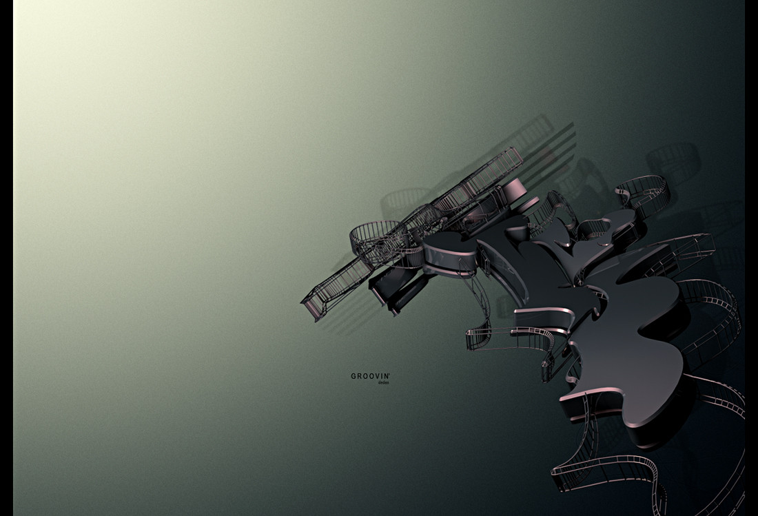
Experimenting...Really wanted to try one of these with the wooden floor.
Related content


Comments: 52

This is brilliant. You are one of the few people that understand the concept of art in macro shots.
👍: 0 ⏩: 0


Well I think that's awesome, colour banding or no.
👍: 0 ⏩: 0

 (Smile)")


high speed ")
👍: 0 ⏩: 0


e ficou mt bom, o conjunto de cores, o efeito blur, as sombras...
merece mais um 
👍: 0 ⏩: 0


oi. the wood looks fuckin hot.
wonderfull work. crazy colours.
I fuckin love it.
+fav
👍: 0 ⏩: 0


Ficou demais com esses tacos de madeira!! xD msm! Da-lhe bixa...
👍: 0 ⏩: 0

love the concept, something i really wanted do to in the past.
Good colors and 3d model.
I just don't understand de black line at de bottom under the text..
👍: 0 ⏩: 0


very good.. i would like more typography elements to be added
👍: 0 ⏩: 0


tight work, the floor looks really nice and real, only thing I dont like is that it seems you stroked the render once?
or am I totally wrong?
👍: 0 ⏩: 0

go criminal art
i diddn't know you are back ^^
well this is as ussuall a lovely piece
👍: 0 ⏩: 0

I love it. You submit so little, but never get rusty, it's amazing!
👍: 0 ⏩: 0


great experimenting work mate!! looks great
👍: 0 ⏩: 0


I love the perspective on this, but the 2 stripes mess up the depth of the render.
👍: 0 ⏩: 0


")


Oh daymmm that is sEXyyy!! real slick, gotta love the clean crispness of it all.
awesome composition, everything goes together so well.
👍: 0 ⏩: 0

That's amazing!!
👍: 0 ⏩: 0


Aw crap, I hate replying after affekt because he points out everything everyone wants to say haha. Anyways, i love the perspective and feel of depth in this, and i actually like the postwork you did with the stripes. The one thing (and probably the only thing) that bothers me a bit is the color banding at the top as khaoticsex said. Other then that, the lighting/material/blurring is awesome.
+fav
👍: 0 ⏩: 0


Well you certainly pulled this off better than most others. Then angle in this one is sweet, kinda emphasises the fragmentation of the object. Material is nice too. I'm not sure about the two stripes over the main forms though, but the other subtle 2d parts worked into it are cool.
👍: 0 ⏩: 0


Yeah, but i can't help it...
It's the jpg
")
👍: 0 ⏩: 0

thats pretty sick man, I only wish there wasnt the color banding
👍: 0 ⏩: 1
Thanks bro
Well yeah, but i can't do anything about it...
It's the jpg

👍: 0 ⏩: 1
actually i found a way to stop colorbanding. How are you creating that background? with photoshop gradients or was it the render itself? And if it is gradients, is it the color -> transparent one or solid -> solid?
👍: 0 ⏩: 0
| Next =>