HOME | DD
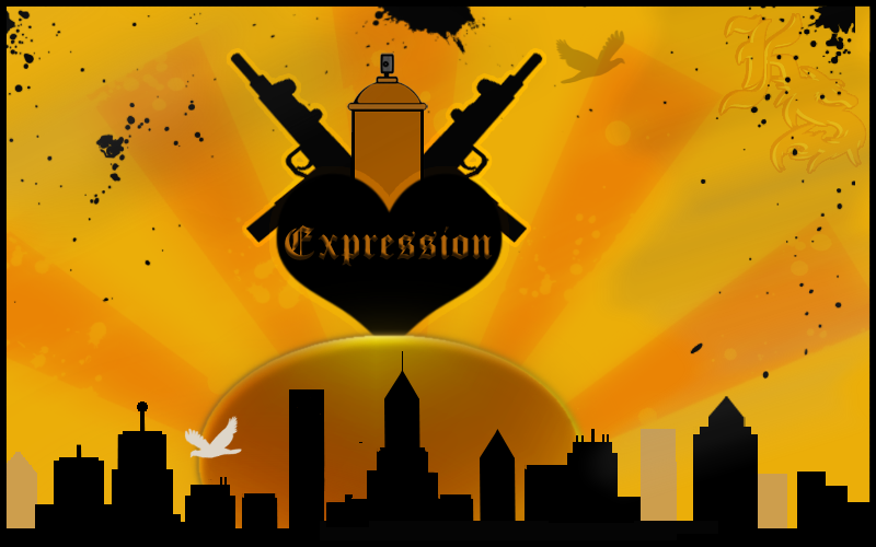
 D--Ment3d — Expression
Published: 2006-11-11 14:34:30 +0000 UTC; Views: 232; Favourites: 0; Downloads: 1
Redirect to original
Description
90% Pen tool.Two Brushes, not sure who to credit. O_o
First Attempt at this style, also I've never used the pen tool before.
2-3 Hours, Didn't watch the clock.
This sht ain't easy!!
--Edit
Just realized it's not center... I'm not fixing it either. lol
Related content


Comments: 10


This came out really well! I hate the pen tool and am currently boycotting it but it's nice to the work of people who can use it
I personally like it being off center
")
 (Smile)")
👍: 0 ⏩: 1

Now that I look at it, its not that bad. I 've been messin' around with the pen tool all of about a week, so I'm being hard on myself! I don't like it much either btw.
👍: 0 ⏩: 0

Lovely use of colours, and I luv the sharp contrasts, especially the white bird. I do think you ought to have let the sunrays stray the whole way to the edge though...
All in all a great work though^^
👍: 0 ⏩: 1
I was thinkin the same thing about the rays, but there will be more to come since the first try came out good. Thank you though.
👍: 0 ⏩: 0


the bird and the blood splats are the brushes?
Try to stick with the pen tool and forget the brushes !
Cheerz !
👍: 0 ⏩: 0

Nice- I like the color scheme, and I think it is good you didn't center the logo- however, I think it would look even better if you moved the logo and sun even more off center. What is the logo all about btw?
👍: 0 ⏩: 0