HOME | DD
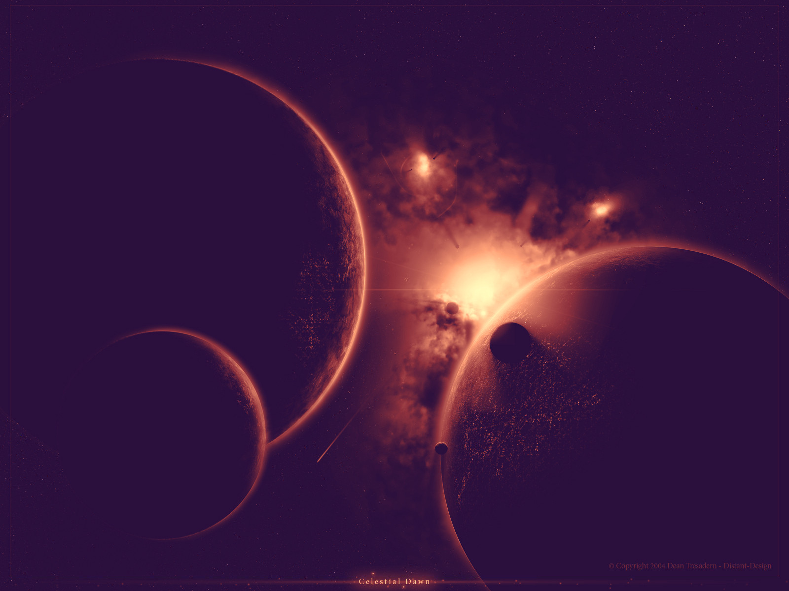
 D-Design — Transcendent
Published: 2004-02-10 16:16:21 +0000 UTC; Views: 1251; Favourites: 17; Downloads: 313
Redirect to original
Description
EDIT: vital spelling error, thanks alyn for pointing that out so i could update it (Smile)")
we love people like you
") hahah
hahah 
well a few things need explainin here
i know i know...its small and hasnt got that much on it lol and i made a big fuss about it in me journal too (i is teh silly)
anyway please do fullview it, theres still lots of detail you cant see in the thumbnail
i know its got alot of empty black space..and..the black space needs filling up, but i tried..i did..but it just didnt look right, anyway if i had gone and splashed too much on it it would make it too chaotic i think
and i made this with a single focal point, so i dont think i need anythingelse i here
starfield: theres only stars in the purple myst because the black that you see are actually thick clouds blocking the light so any stars behind or in that you basically cant see
") (good excuse lol)
(good excuse lol)anyway sorry its not as spectacular as it should be, but i had to finish it so here it is
:/
Related content


Comments: 40


nice, but i dont think i like the black electricity stuff
")
👍: 0 ⏩: 0

heheh, yeah alot of people felt it would have been better without the lightning streak thingies, i just thought i would try them out anyway but ill avoid them in the future
 (Wink)")
👍: 0 ⏩: 0

This piece is awesome man, love the choice in colors. And I also like how it's not to busy, ya know? Could do w/o the light streak things, but looks good nonetheless. The planets are positioned perfectly, however I do think you could add a little bit more depth with a planet above the nebula. Great work man.

👍: 0 ⏩: 0


The black space is perfectly valid. It's beautiful and artistic. I like when negative space is used to make the image stand out more. Really good, the detail is top-notch too.
👍: 0 ⏩: 0

hey, great work man
but those black strokes in the nebula aren't fitting, don't know what they should be. kind of lightning?
memod
👍: 0 ⏩: 0

woot.. very nice! like the bolues/purples in this one.. definately a 

👍: 0 ⏩: 0

ooh pretty
notice how i always give bimbo replies to your art? well yea.. it's kinda above my head, but i still like it!!!
👍: 0 ⏩: 1

who... it looks like my kind of nebulas!
so for that i +fav it

👍: 0 ⏩: 1

thanks for the comment moab
👍: 0 ⏩: 0

its great
GOOD: the colors, the planets, the lighting effects(very much so) and even some of the blackness that adds to the overall effect
Not-too-bad: the black space... i agree that if there was more 'picture' that it would be anarchy and chaos but I think that if it was kinda smaller w/o the black space it would look better.
👍: 0 ⏩: 1
thanks for the crit im hoping to get a little better inspiration for a possible v2 and work on the idea longer, thanks again
👍: 0 ⏩: 0

I love it except for those hard spindly black tentacle things
👍: 0 ⏩: 0

It is beautiful in it's simplicity. Love the purple color.
👍: 0 ⏩: 0

i dont understand why ur not extreamly proud of this piece of work..im sure everyone will agree that it is spectacular and you dont give yourself enough credit for it
👍: 0 ⏩: 0

Yaknow D, i gotta say, i think this is my favorite thing of yours so far. Dunno why, not to say that the others were bad, but this is just...enchanting.
👍: 0 ⏩: 1

👍: 0 ⏩: 0

wow! +fave for me you happen to have a 1280x1024 or a 1600x1200?
👍: 0 ⏩: 0


I don't believe that black empty space always needs filling, and definately not in this case.
Leave it black and screw everyone who dosn't like it.
Excellent!
👍: 0 ⏩: 1
thanks for seing the image as it is

👍: 0 ⏩: 0

lookin very good. Like aksu sais, it could use a little work but then again, maybe you'd just ruin it. overall very good job

👍: 0 ⏩: 1


it's gorgeous EXCEPT for the lil lighting streak thingies, would be fine without them. But woooo, pretty work indeed matey
👍: 0 ⏩: 1

yup there is a lot of black space...but the rest is great.lots of nice details.I like the planets and the small stars.Overall a great piece.I think you should have worked on in a bit more
👍: 0 ⏩: 1
heh, well i planned it to be a bit more than this but..just couldnt pull it off so i kinda gave up on it and just submitted it ")
👍: 0 ⏩: 0

