HOME | DD
 dAKirby309 — Windows Explorer Concept 2.0 v1
Published: 2014-09-19 04:58:38 +0000 UTC; Views: 3463; Favourites: 12; Downloads: 64
Redirect to original
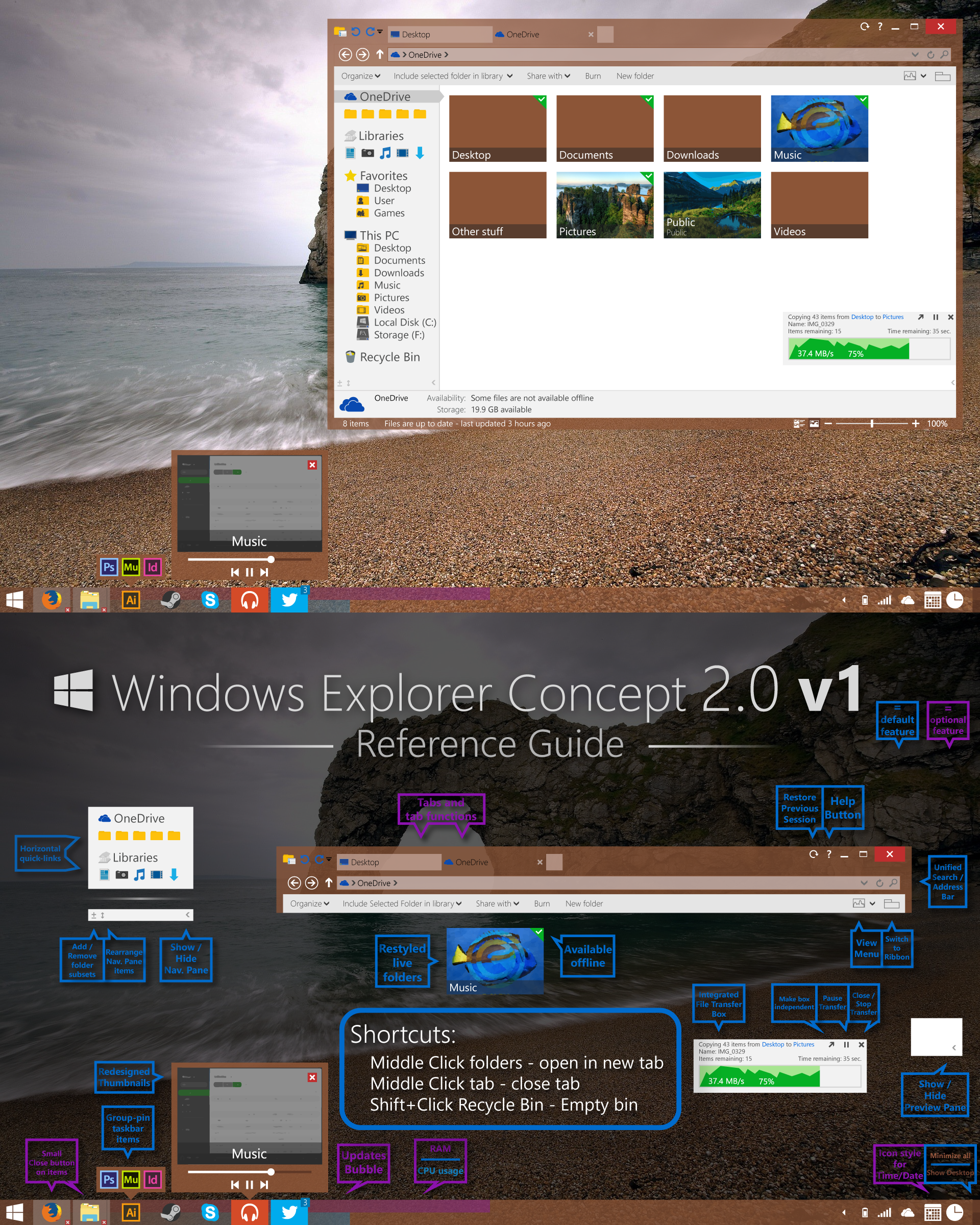
Description
 If you want to see a much better File Explorer concept I've made that I'm pretty proud of, check this out: dakirby309.deviantart.com/art/…
 ")
VERSION 2 HERE:
Windows Explorer Concept 2.0 v2
This is a totally recreated concept I have for Windows (no particular OS version, just Windows) based off of my original Explorer concept, made back in 2012, (broken up into two parts) that can be seen here:
My Windows Taskbar Concept 1.0 My Windows Explorer Concept 1.0
Icons used:
Simply Styled Icon Set - 312 Icons | [FREE]
What do you think?
 (Smile)")
Related content


Comments: 19


One thing, this is concept 2.0 v1... I made a v2 that can be seen here: dakirby309.deviantart.com/art/…
Another thing, mind telling what you find 'very bad' about it? Criticism and comments/opinions are good, but what good are they if they're not helpful at all?
👍: 0 ⏩: 0

good job,but I don't know how to use.Can U help me ?THX
👍: 0 ⏩: 1
Sorry but this is just a concept. Not a real program
")
👍: 0 ⏩: 0


Great stuff. I only would like to see the tab functions besides the adress bar. Maybe it is only me. Anything else looks realy fine.
👍: 0 ⏩: 1
I could do that, but most people are used to tabs at the top cause of Google Chrome, Firefox, Opera, etc. But I based the design off of Internet Explorer. And I see the Win8 explorer window and see a totally empty titlebar at the very top, so I thought "tabs would look good there..." Thanks for the feedback
👍: 0 ⏩: 1

Honestly I'm not a fan of the sidebar content icons, the yellow and black ones. I'd rather have clearer icons with some size to them.
👍: 0 ⏩: 1
Yellow and black ones? Are you referring to the (yellow) folder icons and the (dark grey) drive icons?
Either way I was just using the icons from my Simply Styled Icon Set dakirby309.deviantart.com/art/… instead of the default Windows icons.
👍: 0 ⏩: 1
Yeah, when shrunken down to that size (From the look of it, 24x24 or so) with the actual icon bit being only half of that icon, it becomes a little tedious to see. They'd probably be better off as flat icons based on the originals instead of folder icons.
👍: 0 ⏩: 0

Nice concept I like it a lot! Though the tabs look kinda out of place.
👍: 0 ⏩: 1
I will be making a different style for the tab and address bar to make the tab bar look a bit more uniform with the rest
👍: 0 ⏩: 1

I have to say that I like all of this. The Process + Ram is useful to me, the "condensed" libraries + OneDrive icons that take up no extra vertical room, but as a horizontal list is awesome, just all of this is awesome and all in all great ideas. Good work!
👍: 0 ⏩: 1
You have a LOT of great ideas. MS needs to pay attention.
👍: 0 ⏩: 0

I've changed the annotation style for optional features.
👍: 0 ⏩: 0
Thanks for the feedback! And I should've said "Optional" on some of the features cause the CPU/ram bars and small close buttons I want as options. I will go back and fix that!
Glad you like the concept overall
👍: 0 ⏩: 0