HOME | DD
 DanRabbit — Mouse and Touchpad Plug
Published: 2011-08-20 21:50:32 +0000 UTC; Views: 6890; Favourites: 15; Downloads: 73
Redirect to original
Description
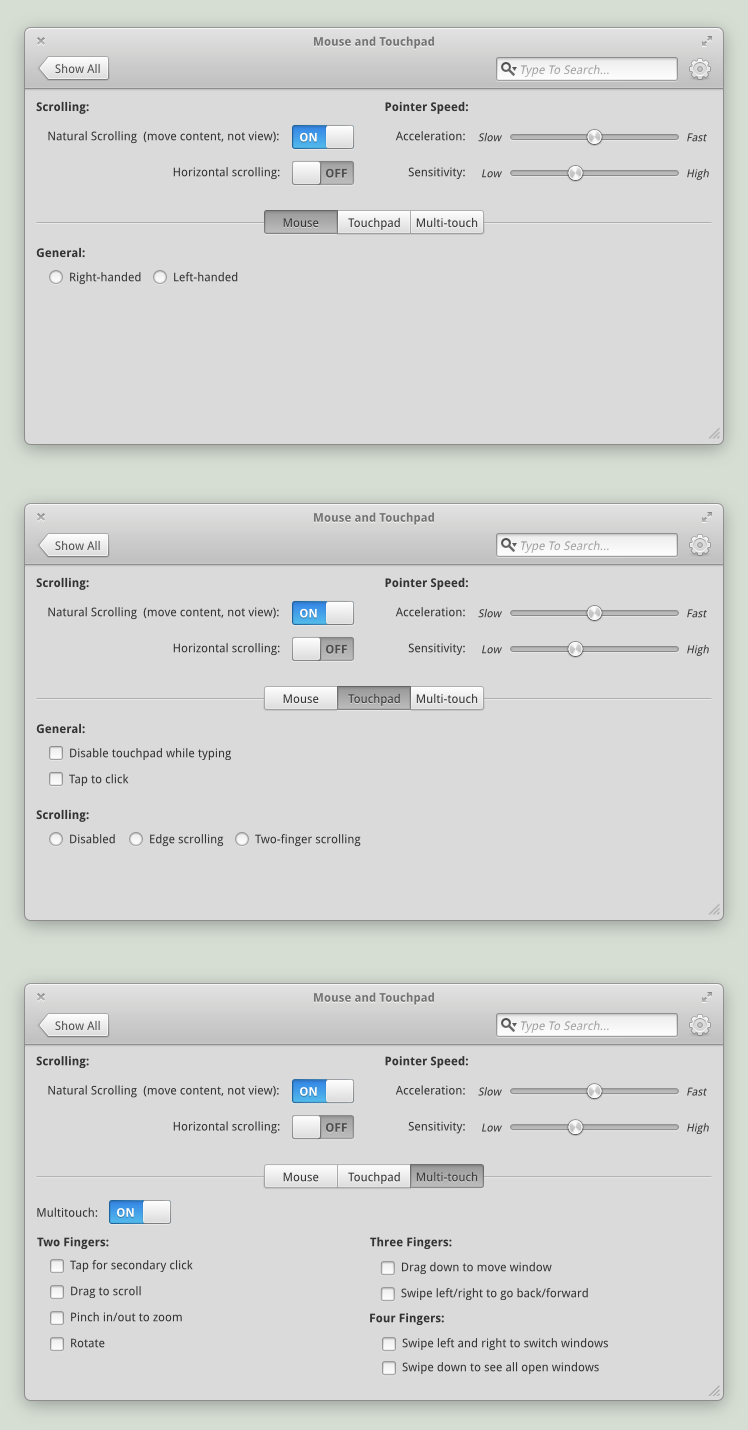
Here's a plug for Mouse and Touchpad settings (including multi-touch).Related content


Comments: 52

Whoa, what's this "Show All" button doing in the toolbar? I still think a Home icon makes the most sense; "Show All" could mean show all mouse options, etc, whereas I think home is clearer that it'll go to the home screen. Just my thoughts.
👍: 0 ⏩: 1

That's an interesting thought. I didn't think about that. I'm not sure "Home" really makes sense to me here ")
 (Wink)")
👍: 0 ⏩: 1

Just tossing in my two cents; unless I'm much mistaken, you'll only be able to reach specific plug panels via the main Switchboard window, yes? If this is the case, then "Show All" makes sense in that, you were just viewing a list of all plugs, and would like to go back to the view.
If this isn't the case, perhaps "Show All Plugs" would be evident enough? I'm in general agreement that a home icon feels out of place here.
👍: 0 ⏩: 0

Maybe add images of two, three and four fingers and divide into three columns
👍: 0 ⏩: 0
Generally I love it. Though I think that the the switches and their labels waste a lot of space - especially in the multitouch pane, where it's not overtly clear that the switch is placed so far right so as to line up with the "Natural" switch in the pane above. I've gone ahead and done a quick re-arrangement of the panel that I think makes better use of whitespace, and makes the alignment a little more clear - and I'm about 95% sure it follows the elementary HIG
See it here: [link]
 (Smile)")
👍: 0 ⏩: 1

You would only want to disable a certain multitouch gesture if you could make it do something else. Since you can't do that (or am I missing something?) it doesn't make much sense to allow disabling these gestures. It would make sense to get rid of all those multitouch checkboxes and add a (?) (like your About dialog mockup) to show the list of gestures in a support article.
👍: 0 ⏩: 1
Not necessarily. There are some people that simply get annoyed by activating certain gestures accidentally. Especially, I can understand that there are several two-finger gestures (pinch, swipe, tap, rotate) that could be misinterpreted. The difference between a pinch and a rotate could end up being really subtle.
That could be a good idea though about a help button in this case, though. I can see it being helpful to explain gestures for those unfamiliar. Sometimes we all forget when we're so familiar with something that not everyone is
👍: 0 ⏩: 1
I agree, but I've only experienced having pinch/rotate misinterpreted. Then again, I'm going by how well gestures work in Windows, which is probably better than in Linux. I only get two finger scrolling and tap for secondary click with my touchpad in Linux, and that's because I set a script to run on startup. Ah, Linux...
Also, what HIG are you going by when you place radio buttons horizontally like that?
👍: 0 ⏩: 1
Hmm I don't think there's anything in HIG that says you can't put radio buttons horizontally
👍: 0 ⏩: 0

Huh, I think if you want to make it look any simpler you'll just have to remove some options or change the concept entirely. Personally, I don't find this overly complex. It feels like some of the headings are repetitive, however- both Scrolling and Pointer Speed only have two settings. If you could find some way to condense them under one heading or remove the headings in the upper portion altogether, that would be nice. Not sure if that's in line with your HIGs, though.
👍: 0 ⏩: 1
Oh, and what's with the forward and back button on top? What would forward do, other than switch to the next available settings dialog? I can't see a lot of people wanting to do that, and an 'up' might make sense for more users. Of course, this would make the top a bit imbalanced.
I'm also curious as to what could be in the menu on the very right? It looks very nice as is, but I think it could feel a bit more logical. GNOME's System Settings has an "All Settings" button where you have arrows, for instance- it's very clear and concise. I think an 'up' icon would be far easier to look at than words, though.
👍: 0 ⏩: 0

Loving the look of the sliders! ")
👍: 0 ⏩: 1
Never mind ... I saw your response from earlier
👍: 0 ⏩: 0

No settings for double click and no test field? Not all use a "mighty mouse".
👍: 0 ⏩: 1
Yea, I'm not sure about including double-click because (personally) I don't see double click as a prevalent theme on the desktop.
Marlin is single-click by default as is Plank, Slingshot, the entire Internet, and just about everything else.
👍: 0 ⏩: 1
You're right, it makes sense. Double click rarely used in applications nowadays.
👍: 0 ⏩: 0

The Pointer Speed sensitivity circle knob is awesome, but I will say it does look a tad rough around the edges (as in pixelated).
👍: 0 ⏩: 0

I think horizontal scrolling need to either be underneath 'Natural [...]' or aligned to something, at the moment it seems to just be 'floating'
Also for headings in bold, I would either include the : or leave it out, it seems there is a mixture
Also I would leave the : out after the On/Off Switch items
'Use Multitouch' should just be 'Multitouch'
Also it seems like a lot of whitespace is wasted down the bottom, maybe instead of the togglebar, have a sidebar from which the user selects a device. Then into this you could incorporate the images people have asked for.
👍: 0 ⏩: 1
oops, that's a typo. The headers should always be ":"
No, it's a HIG thing. We need the ":" between the label and widget. It helps connect them.
Hmm yea you might have a point here. Everywhere else, it's in noun form isn't it? I Might have to make an HIG entry about that.
The problem with the sidebar is that a significant amount of widgets aren't affected by what kind of input device you're using. Having the sidebar implies that they are a child of whatever is selected in the sidebar.
👍: 0 ⏩: 0

I wonder how are the windows going to have rounded corners from all sides. Is it currently possible? Also, I have a question, is Elementary-OS going to run under Gnome 3?
👍: 0 ⏩: 1
No, not currently. But I think a sort of "mask" could be implemented in the window decorator and there should be enough padding that nothing important would be cut off.
No, we're building a new GTK3 based DE called Pantheon
👍: 0 ⏩: 0

those speed and acceleration sliders need a color at left side of the button I think and maybe you could try adding indicators or such like little stripes so it will be more clear on which speed it is exactly.
👍: 0 ⏩: 1
Do you know of any place that talks about when there should be coloration and when not? I feel like there should be some kind of rule somewhere but I haven't seen one.
👍: 0 ⏩: 1
Are there any rules then?
Only one I know from myselfs is that using colors can make stuff more standout with the oncolored elements.
For teh rest I don't knwo about such rules but I think those exist.
👍: 0 ⏩: 1
I'm not sure, that's why I asked
My gut instinct would be to use the color when you're measuring a quantity like decibels or px or milliseconds or something and to keep the through clear when you're doing on arbitrary value like more or quieter or faster.
But yea I'll have to search around and see if I can find anything about it.
👍: 0 ⏩: 2
I think that sounds correct, or at least it sounds like that's the way is should be. In this case, you're positioning the slider between two arbitrary things (Slow and Fast), but measuring a quantity would be its value from 0, so you'd color the trough on the left.
👍: 0 ⏩: 0
yeah and for ui stuff I also suggest to take a look at how other people do it like apple or microsoft ^^, it makes it easier to think about required elements and items
👍: 0 ⏩: 0

i don't find it very complex to understand, i mean its really simple
👍: 0 ⏩: 0

Take out the on/off sliders and put in checkboxes. Those sliders are confusing to almost everyone, I can't tell if you have the settings as on or off.
👍: 0 ⏩: 1
It most definitely says "Off"
👍: 0 ⏩: 1
Yes, but it might say off to ask the user to slide it over into the off position. check out some of the UI testing that's been done around those.
👍: 0 ⏩: 1
Can I get a link to some testing? I can't find anything about it and I'm curious to see the concerns.
👍: 0 ⏩: 3
I actually like the On/Off switch and would prefer them over check boxes. I read it as it says it's On and glowing, so it must be on and off and not glowing, so it must be off. The iPhone does this as well and I find most users don't find this confusing. I didn't when I first used one (I primarily use Android). I think I like it this way primarily for the reason DanRabbit gave:
"A On/Off button says "Enable or Disable this"
A checkbox says "Include this"
Additionally, all users have to do is learn how elementary does it once and go from there if they're uncertain or I'm assuming it would be easily figured out by just turning the Multitouch from on to off assuming that will gray out the options.
👍: 0 ⏩: 1
Yea, GTK does it the same direction as iPhone (off with the slider left, and on with the slider right) and I agree with you that the coloration should make it pretty apparent which is which.
So really, that lowers the entry barrier to "users who have never used GTK3 or iPhone"
👍: 0 ⏩: 0
I think the concerns are because there are two possible ways to perceive the state of the switch from first principles. If your guess is right; then you see no problem with the element. if you guessed wrong; then you have to learn the other method and that takes time. Either way causes the brain to pause while it tries to work out what will happen.
Effectively, the UI forces users to flick the switch on and off a few times to see what happens before they understand which of the two contradictory mechanisms is being provided. I'll to dig up the link for you.
👍: 0 ⏩: 0

I don't know about the studies but I do agree with his concerns. The problem is that different programs use different standards when it comes to switches where as a checkbox is a fairly universal standard.
Other than that, i can't think of any way to make it any less complex, great job ^^
👍: 0 ⏩: 1
Well this is a widget built-in to GTK3 so all apps on elementary should be using the same standard. And the The GTK sliders are the same direction as the ones on iPhone. I'm not sure what apps would be different unless they're misbehaving and not using the native toolkit
👍: 0 ⏩: 0

A quick question on GUI in general: What's the difference between a checkbox and an on/off switch? Don't they accomplish the same thing?
👍: 0 ⏩: 1
A On/Off button says "Enable or Disable this"
A checkbox says "Include this"
👍: 0 ⏩: 1
+1,000,000
Perfect explanation, sir.
👍: 0 ⏩: 0

Should the multitouch section even be clickable unless the user has it activated?
👍: 0 ⏩: 1
That's probably a good point!
👍: 0 ⏩: 0

Change those toggles from rounded corners to circles. They look nicer: [link]
👍: 0 ⏩: 1

It should have more images, the look is too complex
👍: 0 ⏩: 1


to make it look less complex... maybe use a more visual aproach, with images I mean.
but maybe it will look rather lame, I don't know.
👍: 0 ⏩: 1
| Next =>