HOME | DD
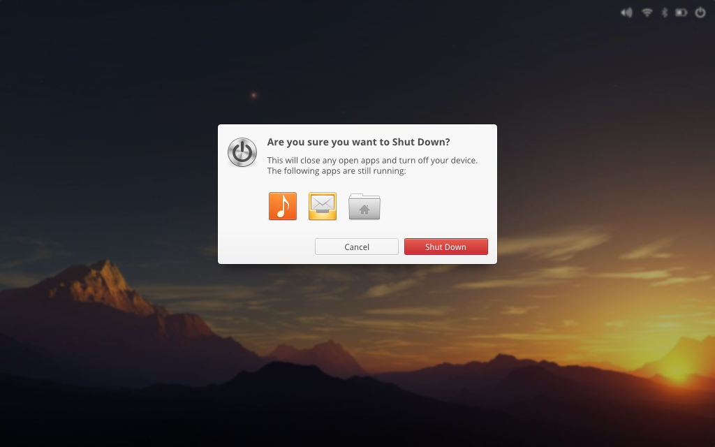
 DanRabbit — Shut Down Dialog
Published: 2012-02-20 20:54:00 +0000 UTC; Views: 11827; Favourites: 56; Downloads: 139
Redirect to original
Description
Playing around with the Shut Down dialog.Related content


Comments: 45

The only thing i don't like is that big red icon in the left corner.
👍: 0 ⏩: 0

Very good.
But I guess a little heavy for elementary
👍: 0 ⏩: 0

The shutdown icon in the top left corner should be changed.. I'd be happy to provide some alternatives! Can you tell me the size of that icon? Then I'd send make and send you some and see how it looks!
Also maybe the running programs icons should be a taddd bitt smaller.. They take too much space, especially if you have a bunch more apps running.
👍: 0 ⏩: 0

I think something is not quite right about this dialog... I mean... there's too much colors I think, at first sight it just split my focus. It would be better with a monochrome shutdown icon, and/or the app icons should have a little transparency (around 48-64%... I'm from tablet now, I can't try it myself but tomorrow I will).
Er... the situation isn't that bad as it seems from my feedback... actually I love this mockup,
👍: 0 ⏩: 1
Nah, accidentally i send it while i was writing. -.-" so i just wanted to say that i love this mockup, and i think its clean and elegant enough in this stage already, i just mentioned some ideas about how it could be even better (in my opinion).
 (Smile)")
👍: 0 ⏩: 0

Please Dan, tell me where you got the 3D Plank theme. I have not been able to find it yet. It's bugging me.
👍: 0 ⏩: 1

it's only a mockup, that theme doesn't exist and is impossible to use something like '3D dock' in Plank, you can use Docky if you want something like this
👍: 0 ⏩: 1


That blur is so addicting, great hope you guys implement it into elementary
👍: 0 ⏩: 0

")

the red icon on the left always irritate me because I try to click it instead the button "shutdown".
Never loved those dialogs "are you sure...". I prefer shutdown in two clicks.
Suggestion:
This will close all your open apps and turn off your device.
👍: 0 ⏩: 1
This will close these apps and turn off your device.
👍: 0 ⏩: 0

Too much icons, you'd better have to know what do these icons means. Use some text, it'll be clearer.
👍: 0 ⏩: 1

Well you'd probably know what those icons are since they're your running apps.
 (Wink)")
👍: 0 ⏩: 0

Very nice. What if there are more than (from the space I counted, 7-8) apps running? Does it allow you to see all your open apps, or does it show the most recent?
👍: 0 ⏩: 1

I don't see why the dialog couldn't expand to a reasonable size and then start scrolling.
👍: 0 ⏩: 0


I'd prefer if the dialog's background was black & semi-transparent or the same color as the chrome of application windows.
👍: 0 ⏩: 0

So, Luna is not going to save the runing applications for the next login? it should have that option.
👍: 0 ⏩: 1


Hey Dan, when will we see this dialog? Luna?
Oh yeah, and when will Luna come out? I can't wait.
👍: 0 ⏩: 1

wow this is really different. I really like it.
👍: 0 ⏩: 0

I love this, but I think that the icons of the programs should be better a little more separated.
👍: 0 ⏩: 0


May I ask, why is the Me indicator up in the corner?
👍: 0 ⏩: 1
I borrowed the panel from an old mockup
")
👍: 0 ⏩: 0


This works with standard applications with icons, but what about background processes, e.g. bluetooth-applet?
👍: 0 ⏩: 1
Bluetooth has a standard app icon as well. Panel (status) icons and app icons should use different names.
👍: 0 ⏩: 0

I think the running apps stuff should be more informative... I'm not sure.
👍: 0 ⏩: 1

I think the idea is that the icons should be informative enough. Really the user should only be told what apps they have been interacting with as obviously there are many other processes that are still running.
I would say that bluetooth should only show if there's an active connection because it's a standard service that is usually running anyway.
👍: 0 ⏩: 0

I like the use of red in the shut-down button, will this (the use of red to denote terminative/serious decisions) be a common-place feature in elementary (Luna or Luna+1)?
Something does look a little 'unbalanced' about the dialog as a hole though. I can't quite place it though. I'm probably just not used to seeing the 'current running applications' in there. It's very busy (icon wise) but certainly a useful reminder.
I also like the general idea of blurring out the background when a dialog appears. Although I would tone down the blur a little, so as to be a little less 'drugged hippy' and a little more 'smoked glass'.
👍: 0 ⏩: 1
Yes I would like to have the red button show up in more apps where serious decisions are made. Especially when we're talking about decisions that could lead to a loss of data. I imagine that it wouldn't be a really common thing until more like L+1, but the CSS class for the style is already in place, so we just need to get apps to start using it.
Yea, I agree. I'm wondering if maybe I should center the icons or use smaller icons or something.
👍: 0 ⏩: 1
Yes, it definitely looks better with the running apps icons centered.
I also noticed that snap uses a red 'capture' button. A little outside of the brief there I think (image capture not being a critical action, although red is/was the traditional colour for 'record' functionality). Snap does look pretty none-the-less.
👍: 0 ⏩: 0

Indeed, get rid of the [X]. It's redundant having a CANCEL button and a CLOSE button in the same dialogue.
👍: 0 ⏩: 0

Get rid of the X. What does it do? Close the dialog and shut down? Close the dialog and return to what I was doing before?
👍: 0 ⏩: 1
I've often questioned the wisdom of this particular 'feature' of dialogs. Although, if memory serves, the dual presence of both a cancel button and a close window control is mandated in the GNOME HIG (I'm not sure if it's a feature of elementary's HIG). The fact that, in this mock-up, the close window control is non-standard (i.e. doesn't look like your common-law garden-variety window control) only serves to increase the ambiguity here. So probably a good idea to either scrap the window control or else make it look like the standard window controls seen elsewhere.
👍: 0 ⏩: 0

