HOME | DD
 Dantert — UPDATE- Gully - Comicon Challenge
Published: 2014-03-06 23:18:54 +0000 UTC; Views: 2064; Favourites: 46; Downloads: 15
Redirect to original
Description
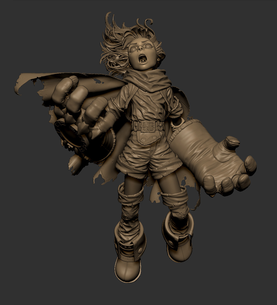
A new update, I've refined the cape and started the detailing of some pieces, I think that I will not ruin the gloves since they are made by") pure magic(draws a rainbow in the air with his hands) so they will not be affected by the battle, also the gloves protect Gully but not from powerful attacs so she's a little beaten up.
pure magic(draws a rainbow in the air with his hands) so they will not be affected by the battle, also the gloves protect Gully but not from powerful attacs so she's a little beaten up.Also I tried to use the Darksiders style for all the scratches and things so it's all stylized and not realistic.
Related content


Comments: 14

i love this model so much, I just can't stop looking at it. Really nicely done
👍: 0 ⏩: 1


Just very cool work! I love the folds, the hair, the expression. Top notch, all that is left is some nice lighting and a final beauty render!
👍: 0 ⏩: 1

That is sooo awesome! I really do admire you and your art!
👍: 0 ⏩: 1

Lookin' good so far dude. My critique would be to push that pose a little farther. He looks like he is floating in space, but you want rising uncontrollably against gravity's will right? To get this look down a little more I suggest adding some bend to the spine, push out the chest as if he is being lifted. Pop that chest out a bit and I think you will have instant weight.
👍: 0 ⏩: 1

Hum interesting! I'll try it!! Actually I want her face to be visible so I have to see how and where bend it
👍: 0 ⏩: 1

Looks cool although I find the depth/strength of the folds seem a bit too uniform, mostly on the shirt. I feel there should be some more areas of rest and areas with less/more folds.
👍: 0 ⏩: 1
Thanks for the comment!
Today I'll see what I can do about the folds on the shirt, maybe smoothing out some of the folds will work..
👍: 0 ⏩: 2
That could help and no problem, I enjoy giving feedback where I can.
👍: 0 ⏩: 0

I was about to say the same thing about the folds. It almost look like she is wearing wet leather (If you have ever worn a leather jacket in a rain you know how it behaves). I would recommend the age of trick that was taught to me in art school: "Take a basic cotton shirt, Throw it against the back rest of your chair - get your pen out and draw it. Repeat until you understand it - then do it again"
Also I assume there is wind in the scene because of the hair flow. It should be taken account when doing the folds. Let it push the cloth fabric a bit. It adds to the scene's flow.
But I would like to you to look that emblem on the gloves. I assume you have it as separate object? Look at it's angle and compare it to the flow of the glove's material. It is slightly off the flow of the glove. I understand fitting something like that is hard specially to a pose like that. But there are many ways to fix it. Flatten the knuckle bit of the gloves a bit. Drop the detail studs a bit. Change the pose a bit so the hand is angled more steeply. There are many ways and I recommend that you look in to them.
👍: 0 ⏩: 0