HOME | DD
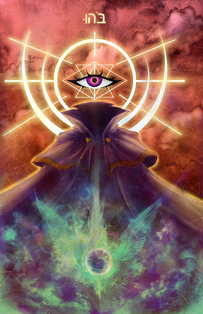
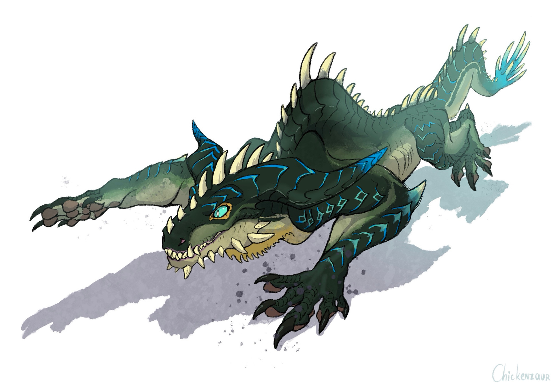
 Dark-Fenrir — The Last Nephilim: Beelzebub Fly Form

Published: 2013-03-22 22:40:14 +0000 UTC; Views: 2258; Favourites: 17; Downloads: 12
Redirect to original
Description
Beelzebub in his true demonic form! I wanted to keep the more traditional incarnation of this demon as the lord of the flies with my own twist.Related content


Comments: 7


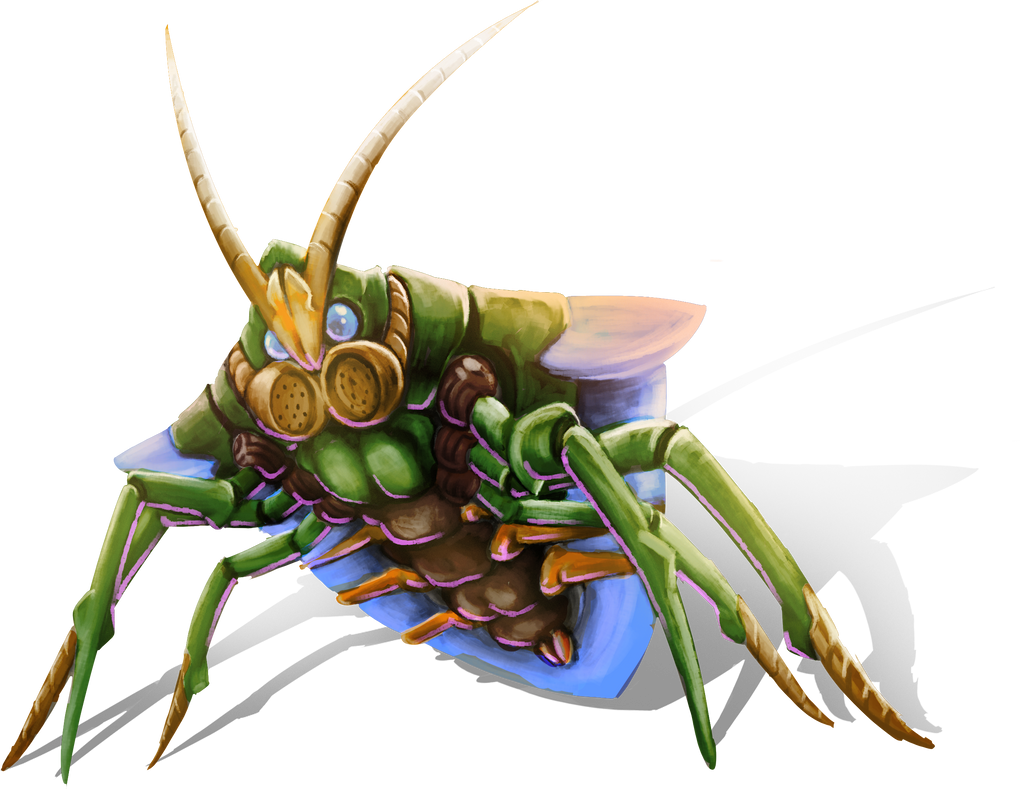
Awesome work, I love the double mouths. Have you played the game Dark Souls? This reminds me of one of the boss creatures x x x
👍: 0 ⏩: 1

Yeah I have, cool game that I wish I had time to play. I always have thought extra mouths were really creepy and weird
👍: 0 ⏩: 0

Painting: Well done. I thought it was watercolor and copics/markers, but it is actually digital. The effects are great with that.
Composition: The texture of the background is interesting, but I think a little distracting. The eyes and designs on the wings really jump out though, because the green/blue is so bright and bold, especially in contrast to the desaturated colors of the body.
Well done gradient tool - normally it feels awkward/artificial. This feels like actual light. It mostly works because bugs are highly reflective, which would behave in light like that.
Outlines on the left side are a little thick for me - it looks like a shadow right there, which is inconsistent with the light
Eyes and teeth: The eye on the right (the left eye) is too light for something in the shadow - is it meant to seem like it is glowing? They also feel flat, because the variation in the variation is a little low.
The teeth are flat as well, as there is not change in value. For something that small, you can just do a light/dark color contrast with no gradation.
👍: 0 ⏩: 1
Thanks for the crit, I see what you mean about his teeth and the bg especially, it is a bit busy. I really appreciate you taking the time to look over this and I will make the changes you suggested
 (Smile)")
👍: 0 ⏩: 0

Awesome design, and I like the coloring in this. The choice of color for the eyes works as well...somehow green and purple work together to make it slightly creepier. Love it
I can't decide how I feel about the background though...I think the texture takes away from the character a little bit. I like the way the colors interact though.
👍: 0 ⏩: 1
I agree the bg is a bit strong in comparison
👍: 0 ⏩: 0