HOME | DD
 davechisholm — lgtu 04 and 05 re scan
Published: 2007-09-14 21:36:54 +0000 UTC; Views: 2849; Favourites: 15; Downloads: 37
Redirect to original
Description
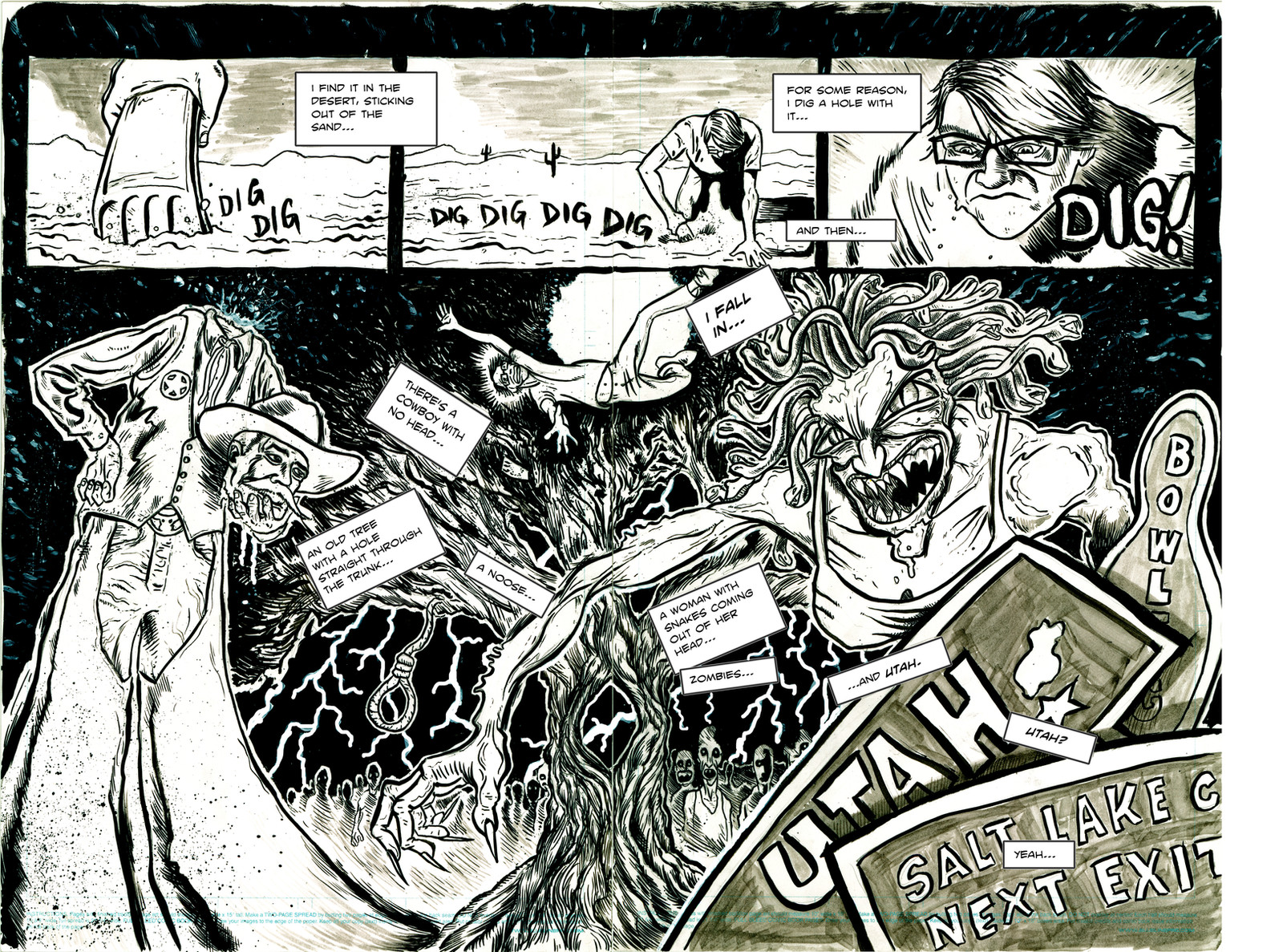
04 and 05ooh! dream sequence!!!
page 1
page 2
page 3
page 6
page 7
page 8
page 9
page 10
page 11
page 12
page 13
page 14
page 15
page 16
page 17
page 18
page 19
page 20
page 21
page 22"
Related content


Comments: 25

")

thanks! it gets WAY better.
👍: 0 ⏩: 0

thanks!!! keep on reading. it gets better...
9 issues of goodness.
👍: 0 ⏩: 1

I have to say, Utah is a pretty bad nightmare... nah I joke, but I love the way you fit everything without it looking too crouded...
👍: 0 ⏩: 1
thanks! keep reading...you are right at the start...
👍: 0 ⏩: 0

. . . . and this feels very Tim Powers-ish, come to think of it . . .
👍: 0 ⏩: 1

Ahh, I came back to this after the first few pages of #6. This belongs in my faves as some of the best pages. There's another to add too... page 8 I think.
👍: 0 ⏩: 1

Wow, this is just incredible...
I wish I had the time to read this whole comic (i've bookmarked it so real soon I may well).
But your style is amazing and your ideas are original and innovative.
This shows real dedication
👍: 0 ⏩: 1
thanks! be sure to read it all.
4 issues and 5 pages up...
it will blow your mind out of your ass.
 (Smile)")
👍: 0 ⏩: 0


This doesn't have nearly enough comments. I love the ice scraper in the desert visual, and I am such a fan of dream sequences. This one, especially. When executed correctly, they are creative hard-ons.
👍: 0 ⏩: 1
thanks!!!! i'm glad i could give you a hard-on.

👍: 0 ⏩: 0

Nice use of both pages/ Ive seen that layout before though.
What I like most is the selective color with the blue, did you try that as the sign instead of the green?
👍: 0 ⏩: 1
yeah...uhhh...it's supposed to be b&w, i'm just retarded!!! thanks, though!
 (Wink)")
👍: 0 ⏩: 0


OxO
Oh, I so LOVE your style!! Very very neat! There's no misstakes at all in this comic; all expressions are great and the perspective -so NEAT! Good work!!
👍: 0 ⏩: 1
thanks very much!
keep reading, it gets better!
👍: 0 ⏩: 0

Great work, man! I am loving the lettering as well.
👍: 0 ⏩: 1
thanks, man! it's a free font i downloaded on blambot.
👍: 0 ⏩: 0