HOME | DD
 DAVIDGMILEY — Close to Dark
Published: 2012-02-11 01:55:15 +0000 UTC; Views: 823; Favourites: 8; Downloads: 6
Redirect to original
Description
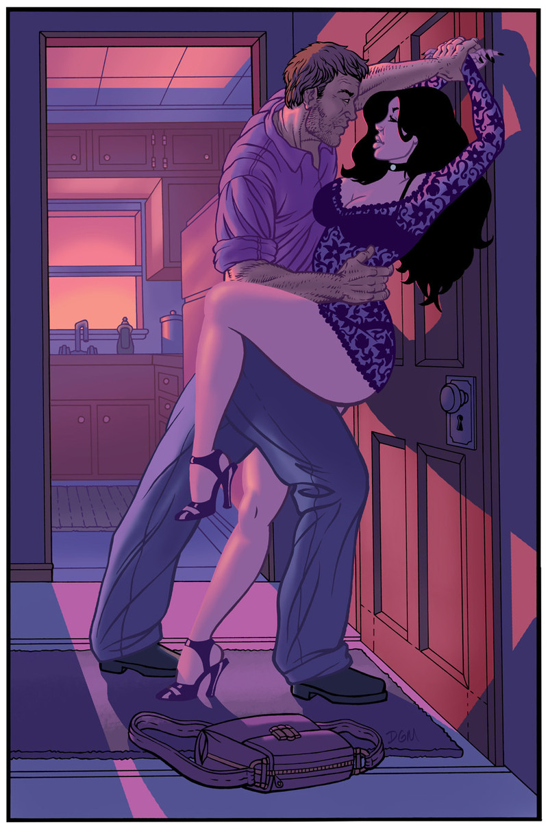
I wanted to do a Romance novel spoof cover. Including, I wanted to work on other different color palettes.Related content


Comments: 6

This is awesome!! I really like the way you colored this. Are you choosing a color palette before you work, or do you choose the colors as you go?
👍: 0 ⏩: 1

Before I start roughing an idea. I like to have an idea in how it should be colored. Lately, I've been thinking about it while I draw.
Sometimes my idea would change after I'm done flatting a piece. I would select all the flats and scroll on the Hue bar to see what looks good on both sides of the spectrum.
Then I'd go back in and find colors that don't pass the "Too Saturated" boundary. Sometimes it's best to see it 2 or 3 different other ways before you finish it.
👍: 0 ⏩: 0

great work. does this guy's name rhyme with smiley?
👍: 0 ⏩: 1
Lol. Nah, man. I drew a sketch of a couple without thinking and constructing a background.
That's why I happened to make the mistake of having the guy look like a giant. I'll sometimes have those moments on paper where I'll have the sketch really rough and then sort out the rest of the space later.
👍: 0 ⏩: 1
I think it's totally sweet
👍: 0 ⏩: 0