HOME | DD
 denull — Nufabric Studio

Published: 2008-07-05 13:58:49 +0000 UTC; Views: 2289; Favourites: 19; Downloads: 83
Redirect to original
Description
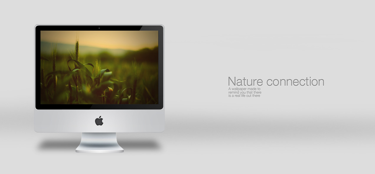
Nufabric StudioDimo Trifonov / Nikolay Vanchev / Kaloyan Toshev
Nufabric is an unfinished visual orgasm. We leave the opportunity of the finishing touch to our viewer. We engage him intellectually and visually, so he can finish what he sees. We are slaves of the simple and effective forms, mixing them with mostly ironic and direct concepts illustrated with the usage of abstract and minimal shapes in co-operation with typography, soft or pale color combinations and negative space.
[link]
we@nufabric.org
Related content


Comments: 13

should be obvious i guess, but it took me a while to work out what it says ....really nice tho : )
👍: 0 ⏩: 0

clean look, but hard to read tho.
And you have a new boy to the team
")
👍: 0 ⏩: 0

 (Smile)")

slick matey!! The only thing that bugs me is the 'I'. I know super simplified type can be a bitch to make readable, but I think it wold work better with a small cutout each side in the top section, ihinting more at the dot... if you know what I mean.
Either way, still slick and sexy  (Wink)")
👍: 0 ⏩: 0


haa prosto si igrah nishto seriozno
")
👍: 0 ⏩: 0


you guys really know how good design looks like.
your style always impresses me a lot, please keep that up.
and of course, i wish you best luck and many happy clients with nufabric

👍: 0 ⏩: 0
arcticTransfuse [2008-07-05 14:30:27 +0000 UTC]
I read it as 'Auf Alrue', but I still love the presentation of it, colours, layout, etc.
Very nice.
👍: 0 ⏩: 1

Agreed. I read "AUf ALrUE." Maybe this is too creative for me
👍: 0 ⏩: 1

Haha, for me it reads: Nuf Nuerve
👍: 0 ⏩: 0