Comments: 23
 depthskins [2007-05-05 00:31:45 +0000 UTC]
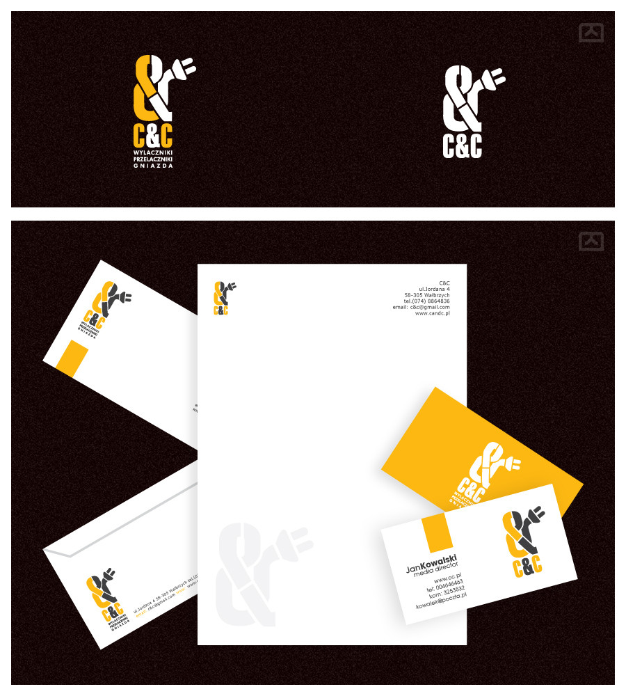
U know, this looks COOL and all but I gotta ask...
what's the idea with the ampersand?
👍: 0 ⏩: 0
 desee In reply to WebRules [2007-05-04 07:55:07 +0000 UTC]
Thanks dude ! ;D
👍: 0 ⏩: 1
 WebRules In reply to desee [2007-05-04 08:39:54 +0000 UTC]
welcome
👍: 0 ⏩: 0
 karmapilots [2007-05-04 04:38:18 +0000 UTC]
nice work. really like the innovative use of ampersand.
👍: 0 ⏩: 1
 lefthand-design [2007-05-04 03:55:15 +0000 UTC]
This is a great looking package.
👍: 0 ⏩: 1
desee In reply to elusive [2007-05-04 07:53:58 +0000 UTC]
Thanks bro ;D
👍: 0 ⏩: 0
 niponwar [2007-05-03 21:42:57 +0000 UTC]
very nice man... that logo and colors remember me the logo of CAT industrial ships.
👍: 0 ⏩: 1
desee In reply to niponwar [2007-05-04 07:53:50 +0000 UTC]
nice to hear it ;D
👍: 0 ⏩: 0
 morrisonsn [2007-05-03 20:14:35 +0000 UTC]
very good dude!!
👍: 0 ⏩: 1
desee In reply to morrisonsn [2007-05-04 07:53:33 +0000 UTC]
thanks man
👍: 0 ⏩: 0
 Bloomy021 [2007-05-03 18:43:40 +0000 UTC]
it's very smart ! class
👍: 0 ⏩: 1
desee In reply to Bloomy021 [2007-05-03 19:02:25 +0000 UTC]
thx ;D
👍: 0 ⏩: 0
 zoltan [2006-12-09 22:24:12 +0000 UTC]
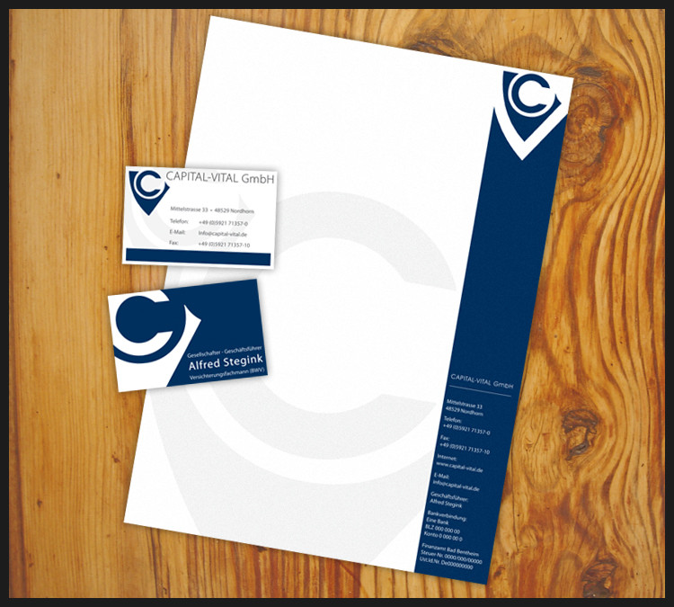
great logo and the different elements are eye-catching and work well together. The letterhead is the weakest element, maybe try using a yellow band at the top?
👍: 0 ⏩: 1
desee In reply to zoltan [2006-12-10 08:08:19 +0000 UTC]
Thx ... I'll try xD
Grettings
👍: 0 ⏩: 0
 Jonnotie [2006-12-07 09:39:21 +0000 UTC]
Wow, that looks just amazing!
👍: 0 ⏩: 1
desee In reply to Jonnotie [2006-12-07 12:29:03 +0000 UTC]
thanks alot x)
👍: 0 ⏩: 0
 desee — CC ID


")

 (Smile)")
 (Wink)")
