HOME | DD
 designgised — Simple Winamp Skin
Published: 2008-08-18 18:42:14 +0000 UTC; Views: 10087; Favourites: 29; Downloads: 1771
Redirect to original
Description
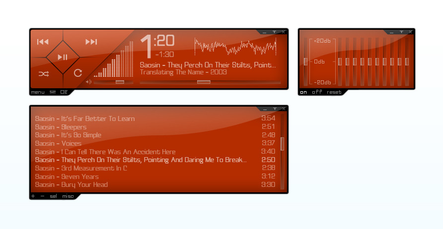
A simple Winamp skin I made in Photoshop. It's not coded yet. It's still being coded by someone at the moment.Related content


Comments: 15


looks great, hopefully you'll add color variations as well
 (Wink)")
👍: 0 ⏩: 1

Thanks. I probably will add different color choices, but I still need to find someone to code it first. xD
👍: 0 ⏩: 0

 (Smile)")
")

love the idea! if you'll excuse me, i'll be the usual pain in the ass and make some personal comments, which should always be taken with a grain of salt. they are in no way intended to be unbiased, but i find that having different eyes laid on our work can often be rewarding.
first, how about using another font? typography has gone a long way in the past couple of decades and i'm sure there are a few options that you could consider with greater anti-aliasing and less overused than tahoma. off the top of my head, i'd recommend 'delicious', a free font available on [link]
check out [link] as well for more inspiration. johno has made a quick list on the far right that can make navigating through so much content a bit easier when one's simply looking for type recommendations. they're not always free ('delicious' is), but if you dig around enough you'll find some interesting (and often inspiring!) typography.
i like the glassy look and the sharp edges, so i kinda wish the seek bar would use that same concept. how about making it 'integrate' with the main window a little bit more? perhaps an indented look? i'd also go for something bigger in size than the bullet point you used, so that it's easier for the user to click and drag as wished. as a final note, i think the bullet itself also stands out being elliptical rather than squared, not to mention the different possibilities provided by those basic geometric forms. they can be explored as to provide a more iconic look rather than just being flat and filled with one color.
as a personal preference, i'd go for bigger icons for the functions on the left. making them bigger can provide better usability as the readability/intuitive would also improve. plus, they can also be modified as your creativity sees fit, providing a greater overall (artistic) value for the skin.
keep up the good work! i'm sure that this would go a long way with proper coding and similar style for the remaining winamp windows (such as the playlist, equalizer and whatnot). Skin-Consortium's work [link] can be a source for inspiration if you're going for that kind of look and functionality. good luck!
best regards,
.a
👍: 0 ⏩: 1
Hey, thanks. I enjoyed reading your comments and I will remake it with your suggestions in mind.
👍: 0 ⏩: 1
looking forward to it!
👍: 0 ⏩: 1
Hey, I made a few changes. Tell me what you think.
👍: 0 ⏩: 1
i liked the seek bar a lot. i think it blends in with the rest of the window better than the previous one. i'm still unsure about the bullet itself, but that might be just my personal taste. i kinda stands out a little, since it's the only 3d object in the window (everything else looks/feels touchscreen to me).
about the typography, i liked the numbers, but i'd still go for a modern font with no serifs for the text. for the menu on the left, that looks like non-anti-aliased tahoma as well. how about trying this [link] ? i think the word 'menu' looks great on that font and feels a little more techy (which i assumed to be your concept, based on the sharp edges/glassy look).
i decided to hack the image myself and make a rough draft based on some of the adjustments i suggested. it felt kinda cheap making so many comments and not doing anything myself, so i spared you the effort of trying them out just to see if you like them or not. check it out [link]
and please, i only mean to help out with some new ideas. feel free to reject them as you wish. you're the author anyway
👍: 0 ⏩: 1
I really like your idea for the bullet. I tried to combine your bullet with my seeker bar and I think it turned out pretty well. This time I chose a more modern font.
I know the "shuffle" and the "repeat" buttons don't look too good and I'll fix those soon. I'm just a bit lazy right now.
I might even change the volume bars.
Thanks again for your comments.
👍: 0 ⏩: 0

Hey, thanks for the favorite. By "lets do this," do you mean code it? If so, I have no idea where to start. I've never made a skin or coded before.
👍: 0 ⏩: 0