HOME | DD
 designslave — Sprout
Published: 2006-08-17 16:44:28 +0000 UTC; Views: 14013; Favourites: 190; Downloads: 85
Redirect to original
Description
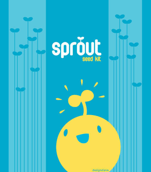
The front of my paper bag packaging design for seeds, and we're supposed to work with only 2 colours (white isn't a colour, it's just the paper). There's a range of these for different types of seeds.. I'll most probably post up final photos of my assignment after the studio photography's done. (Smile)")
Hrm.. the colours are seriously weird when I did this on my Mac. It's supposed to be greenish, but on a PC's monitor it's.... blue. o___o;;;;
EDIT : Problem solved! It printed out fine and I've already learnt about colour settings and pre-press! w00t
Related content


Comments: 92

This is charming. I would buy the product just to save the packaging. Adorable!

👍: 0 ⏩: 1

Haha I do that a lot too ")
👍: 0 ⏩: 0

very very cute, damnit he looks so happy to be a seedling - makes me wanna be one!
a fav for me

👍: 0 ⏩: 0


Woah, fav + time! This is so cute
👍: 0 ⏩: 1
Yeah, I changed it to blue instead
👍: 0 ⏩: 0


👍: 0 ⏩: 0

WAH! Good job! Imma betting you are going to get full marks! ^____^
Don't worry about the colours. It looks just as fine being blue! Can wait to see your series of finished products!!
👍: 0 ⏩: 1
Hope I can get full marks! ^o^ I still gotta make a few more in different colours.. hopefully the finished set will look nice together :3 Thanks!
👍: 0 ⏩: 0

that's cool!
I'd make the smiling seed a little bit larger, that's all, and I really like the logo!
Screen calibration sucks! I have a lot of problems with it even with same-gen Adobe programs! or maybe I'm just stupid.
👍: 0 ⏩: 1
Ooh, maybe I'll scale the seed up, eh? Won't hurt to see how it would look like at a larger scale
Meh, I really hate working across platforms.. so frustrating!
")
👍: 0 ⏩: 1
You're welcome!
by the way... I meant 'color management', not 'screen calibration', wich also sucks.
👍: 0 ⏩: 0


yes i echo the above comments - very cute design! i like the concept.
👍: 0 ⏩: 0


lucky i read the description. if not i'll be like commenting wut u oledi mention. i tot it's suppose to be green hahahahahha *rofl. ogie kidding kidding. the title make me think of pea sprout. ooo those are tasty. I like the sprouts on each side. those are cute and slim heheheh
👍: 0 ⏩: 1
Well it was intended to be green, but blue works out okay too. Somehow the green didn't look as good on a PC as it did on a Mac when I tried to change it back to green. ")
👍: 0 ⏩: 1


👍: 0 ⏩: 0


I'm on a Mac right now too (iunno if that matters..) and it's looking a little blue here too. I kinda of like the blue, because blue and orange are complimentary colors? lol I can't remember, but they're opposites... ya know?
OKAY ANYWAYS, I'm sure the green looks good too
👍: 0 ⏩: 1
Boo, the file's colours messed up when I opened it on a PC ")
👍: 0 ⏩: 0

Really good design, you did a woderful color choice by using complementary tones, that always will work and it helps to create visual impact.
👍: 0 ⏩: 1

👍: 0 ⏩: 0


I can't wait to see the final outcome
too cute! great job and concept!
👍: 0 ⏩: 0

I think it's the most adorable thing I've seen in a while, and I find it absolutely amazing.
👍: 0 ⏩: 0

aww! i like the colours your chose. They do well together, and also, i like the alignment of seed kit under Sprout and that Sprout is centered and that there is a sprout.. comming off the o! but as for the happy face sprout, i'm glad it's not aligned to the center and is offset to the right.
oh! also i like the tall skinny sprouts on the sides!! it looks fun and cute! very well done.
👍: 0 ⏩: 1
I was worried about the alignment of 'seed kit', but I might still move that around to experiment a bit more. Hehe, I kinda like the little sprout on the 'o' as well.. thought that the typeface was really boring so I added it

👍: 0 ⏩: 0


i'm on a mac, and their still blue to me.
i like his little expression, and the angle of his face.. the cut of his jib, if you will.
👍: 0 ⏩: 1
Yeah, it's actually blue now. 

👍: 0 ⏩: 1
No prob! -- yeah, i like them too.
👍: 0 ⏩: 0

great job you did... i love the colours
and its sweet
👍: 0 ⏩: 0

Ooo, very visually appealing. That would definitely catch my eye in a store.
I think the colors are a good choice-they are bright, but not too overpowering.
Not to mention that face on the little sprout. That made me smile.
👍: 0 ⏩: 1
Aww the sprout made you smile!
")
👍: 0 ⏩: 0


<= Prev |