HOME | DD
 DestinyMew — Just Practicing
Published: 2009-09-27 20:33:28 +0000 UTC; Views: 559; Favourites: 16; Downloads: 4
Redirect to original
Description
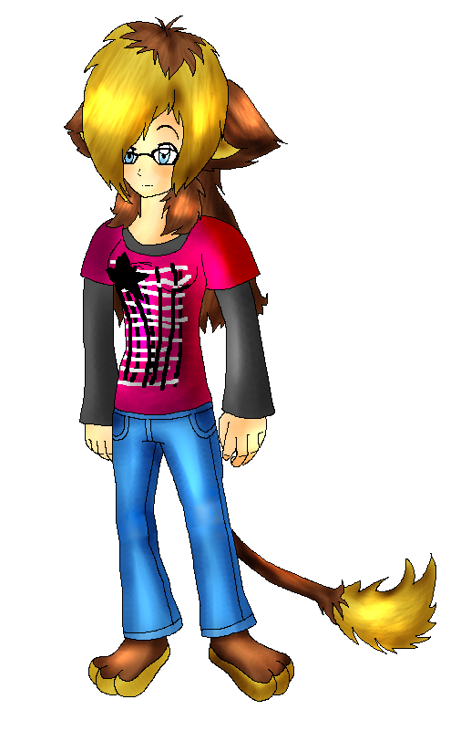
Just practicing on anatomy and took 2 critiques from chatrooms.I had to use Dodge and Burn tools, trying to drag myself back to main program, Adobe Photoshop of course.
I'm still not very happy with the way head came out. :/
EDIT: Made legs longer
---
Critique!!
Critique!!
Critique!!
Critique!!
Critique!!
Critique!!
Critique!!
Related content


Comments: 28

Overall

Vision
Originality
Technique
Impact
[link]
I'll be honest, I'm not all that good at drawing women, especially thin women, but I'll try to point out what needs to be fixed.
Anatomy wise, the hair is much too large. It makes it appear that she has a giant forehead.
Legs are much too short. Keep in mind that the length of the legs from the groin area to about the ankles should be around the same size as the torso plus the head, give or take.
Shoulders are too straight and broad for a girl. Shoulders tend to slant downward somewhat.
Tail appears to be growing out of the knee and is too stiff.
As for the coloring, it looks like you used dodge and burn to shade and highlight. Do not do this, as it makes the drawing look really crappy, for lack of better words, 95% of the time. Try shading an area with the opposite side of the color spectrum at a lower opacity (example: the blue jeans would be shaded with a light orange). When it comes to shading grays, blacks and whites, don't use gray to shade, use another color such as a slate color (bluish gray).
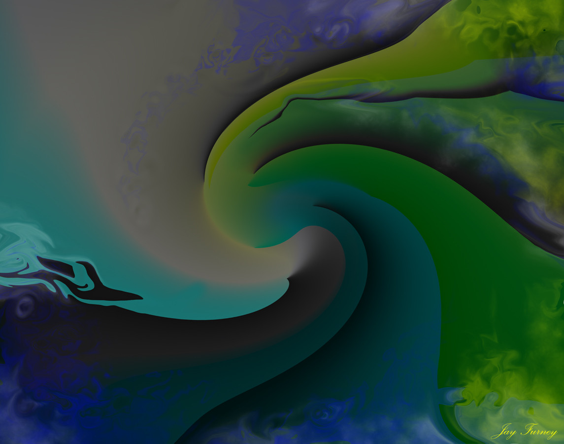
It's hard to tell where the light sourcing is from this picture, so I scribbled up an example:
[link]
Hope this helps.
👍: 0 ⏩: 1

Probably top one of the best AND helpful criticism I got! I learned so much about the shading part. I learned a little bit about anatomy as well, those links are very helpful! I really appreciate your critique and thank you so much!

👍: 0 ⏩: 1
 (Smile)")

well you seem to have lots of critique for anatomy and such and i don't want to be redundant, so I'll give you a few coloring tips:
Dodge and burn should NOT be used for shading and highlighting. you CAN dodge a little for the eyes though.you need a more definite light source, because right now you can't tell where the light is coming from. you did a good job with the textures of the hair and clothes though
I am personally not very good at coloring on the computer, but this is what i know from my traditional style and what i know from photoshop, sai, etc. good luck with your drawing =3
")
👍: 0 ⏩: 0

the hair seems kinda big but that might just be my taste in hair X3 wonderful job otrherwise :3
👍: 0 ⏩: 0


Well, one thing. Do not use burn and dodge. ^^ Have the colors each on seperate layers, and lock the transparency. Then just shade with a darker shade, or with a dark blue or some other dark color at a low opacity and just keep going over it for the seperate tones.
Also, the hair comes up wait to high. The hair shouldnt poof up almost two times the size of the head. ^^'
Hm... The shoulders are a bit too broad for a girl. They should also have a slight downwards curve?
Also, hands should be smaller and feminine/slender. ^^
Also, some of the tail should be seen between her legs, I think.
A tail is an extension of the spine, keep that in mind. ^^
👍: 0 ⏩: 1
Ok, I'll try these critique! ^^
👍: 0 ⏩: 0

very nice ok lets seeeee
you seem to made the hands a little big try using your own arm as a ref and makes the width more to the arm not the clothes
hope this helps
👍: 0 ⏩: 0


for starters, the shading is quite excellent, but i don't think your Cat feet doesn't really suit your design desprite the fact that she has cat ears and a tail
👍: 0 ⏩: 1
True, but I just like paws!

👍: 0 ⏩: 0


Hey, not bad at all for practice! I like how you've done the hair and tail, the main suggestion I would like to make is to also try using the brush tool where possible. When the dodge gets the point where it won't go any lighter (as it has on the hair highlights) so using the brush tool will make it easier for it to go lighter. If that makes any sense XD
It looks very 3D and you've done the highlights very well, it's awesome! X
👍: 0 ⏩: 0

Never use burn and dodge
Ever.
Seriously, it makes everything bad.
The head is also way way WAY too big for her neck to support. Other than that, it's quite alright. Better than my humans.
👍: 0 ⏩: 1
I know, I don't usually use those tools, didn't you read my artist comment that, I uses them to try get myself back to Photoshop as my main program instead of MS paint?
And thank you for the critique. ^^
👍: 0 ⏩: 1
Don't use them to get back into it. It's really not a pretty road. If you want to get back into it, use the pen tool, or air brush it. Practice with messing with layers, clipping masks, etc.
Mr. Dodge and Burn are never your shading friends. They are more for slight touch-ups (I use them in Sonic adventure-style shading to brighten the highlights).
No worries~
👍: 0 ⏩: 0

Hm,Pretty good,maybe the shoulders are a bit to broad but besides that,looks fine.


👍: 0 ⏩: 1
Shoulder too broad in as too wide? Or just correct me. xD
👍: 0 ⏩: 1
Yes,I think that's what i mean.Sorry I suck at critquing and whatnot.
👍: 0 ⏩: 1

I agree with ~feelioncat but also you should of shaded her face a bit darker
👍: 0 ⏩: 1
Too much burn on her face make it orange-ish.
👍: 0 ⏩: 1

i think youve done an aweosm ejob there destiny! all I can say Is i think the legs should be longer, other than that she looks brilliant!
👍: 0 ⏩: 1
I made her legs a little longer. Check it out!

👍: 0 ⏩: 1
awesome! Looks a bit better now dont it ^^because legs are actually the longest limbs in the body, so they should be longer than everything else
👍: 0 ⏩: 0