HOME | DD
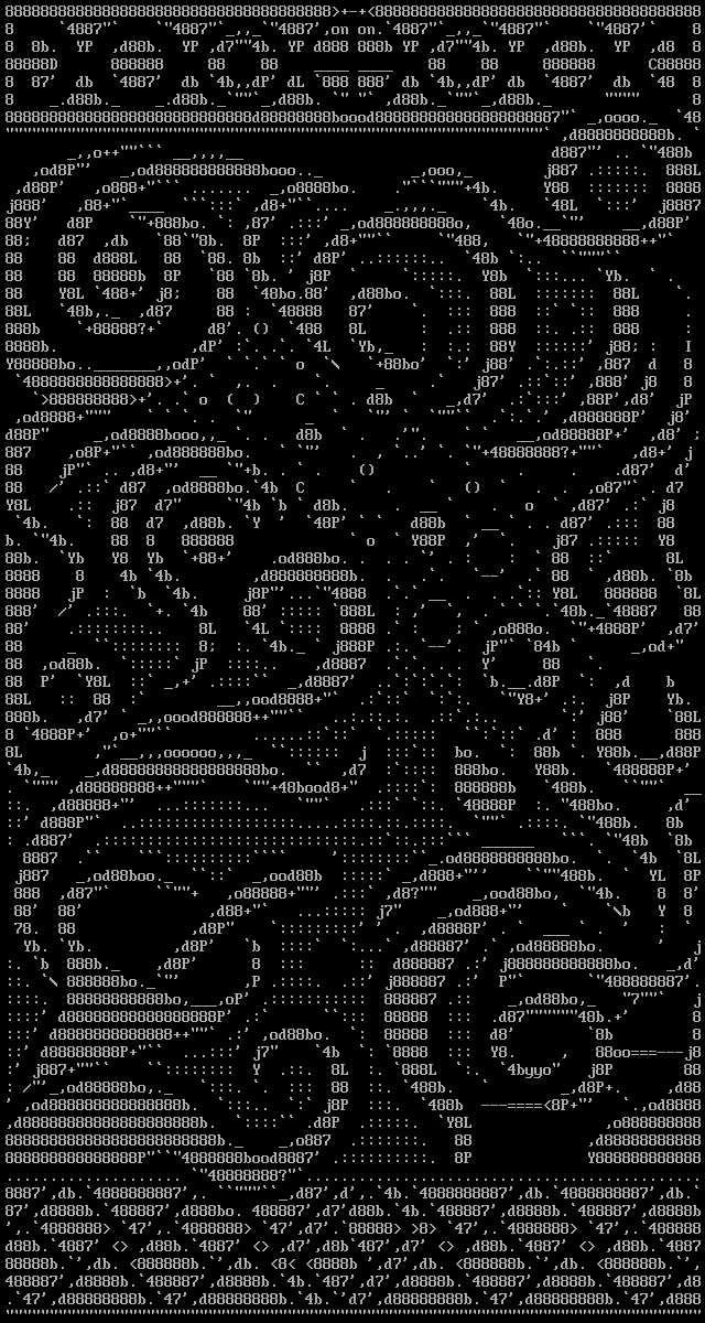
 diamondie — Springbreak
Published: 2005-09-22 11:35:21 +0000 UTC; Views: 6311; Favourites: 63; Downloads: 508
Redirect to original
Description
This is a collaboration between me and ~jSepia . We begun planning it originally a few months ago and started drawing in mid August I think. PabloDraw has a collaboration feature for drawing with someone else online, but I'm not used to Pablo and besides the time difference between us is rather big, so we ended up just taking turns at drawing and then sending the piece over. I did my part with ACiDDraw and jSepia used PabloDraw.We were originally going to submit this to the Argentinan Flashparty held in early September, but ran out of time. I submitted something else I quickly whipped up from an almost finished picture I had made in 2003, but the organizers messed up and it wasn't shown in the compo.
In the end this was our entry to the ANSI/ASCII competition held at the Pilgrimage demoparty in Salt Lake City, Utah last weekend. I find it cool to think that we entered a US contest with a Finland-Chile collaboration. We won the compo, which means we should be getting a Dark Domain DVD (which goes to me) and Zoo Tycoon 2 (which goes to ~jSepia ). Then again there were only four entries, so it could have been a more challenging victory, but nice nonetheless.
The piece is loosely based on a Paint sketch I did back in July, but there really isn't that much in common with the pictures, though it gave us some ideas to begin with. Some of the shapes were drawn by jSepia, others were designed by me. The frames were his idea and made by him, though I changed the top border because it felt too angular the way it originally was. The picture was originally going to be 80x50, but the frames were so large we made it 80x75 in the end. Both of us participated in the antialiasing, though I think jSepia probably did more of it. The title is mine and I rather like it.
All in all, plenty of workshopping, experimenting and some compromises (but only in small things, like antialiasing). I'm not entirely happy with the bottom right corner (above the frame) nor the bubble part and the composition could probably be better if we had planned it better before starting drawing, but overall I'm rather satisfied and it was a pleasure to work with him. Don't forget to check out his gallery!
Related content


Comments: 42

Seeing this takes me back, way back. Nicely done
")
👍: 0 ⏩: 0

Wow, impressive
Very nice text art
It's amazing the media that can be used to create beautiful designs
 (Wink)")
👍: 0 ⏩: 0

Very nice, so smoothly all the shapes go together.. definent favourite
👍: 0 ⏩: 0

oh god, how long does this take to finish it?
it looks great !
ASCII will always rock,always !

👍: 0 ⏩: 1

I think we worked on it for several weeks. Hard to count the number of actual work hours. Perhaps 20-25? Thank you for the comment and the favorite. :->
👍: 0 ⏩: 0


wow, this is definitely one of my favorite ascii pieces I've seen.
👍: 0 ⏩: 0

I'm always fascinated with ASCII art, and this is no exception. It's a lovely abstract design to begin with, and you did an excellent job on the anti-aliasing. The curves are all perfect. However, I'm not too fond of the bottom border; the straight lines of the rectangles don't seem to fit in with the curves of the rest of the piece.
👍: 0 ⏩: 1
Thanks! You might be right about the bottom border, but it doesn't look that distractive to me - in fact when I look at the picture now I'm more bothered by the flaws I see in the top border. Heh.
👍: 0 ⏩: 0

AGH! this is awesome! you are the best ascii artist i have seen
👍: 0 ⏩: 1
Thank you! Though I think there are many better artists, just check out my collaborator ~jSepia for example. But I do believe I'm just about the most varied ASCII artist there is.
👍: 0 ⏩: 1
and thank you for informin about jsepia, i wll check him/her out
👍: 0 ⏩: 0


Holy Crap!


👍: 0 ⏩: 0

I usually like ANSI better than ASCII (well I mean the big blocks from ANSI better than normal ASCII) but this one makes a very nice use of the characters avaible, and unlike some other ASCII images it looks very clean with the outlines.
👍: 0 ⏩: 0


Remarkable work. Now i think any thing can be done in ASCII
👍: 0 ⏩: 0


That ACSII Art is fantastic....
If you want to eliminate the banners in your webpage [link] you have to put this code in your HTML editor
Thank you for your coment in my deviantart Nachomat or visit my webpage, my webpage is in spanish....
👍: 0 ⏩: 0

omg its the most kikassest thing ive EVER SEEN!!!!
its absolutly amazing
props
👍: 0 ⏩: 0


I think this is the biggest non-automated ASCII art I've seen so far. But, more important than it's HUGE size, it's the smoothness you guys achieved. The circles are circular (lol) and the curves run very natural. I do have an issue, though, with the rectangle thingy at the center of the lower "frame", looks distorted
👍: 0 ⏩: 1
Well, my "Follow Your Heart" is bigger than this, it's 80x100 and this is just 80x75. I've seen some ASCIIs as big as 80x200 and even more. But yeah, it's not the size that counts. Thank you, your comment (and the favorite, of course) are much appreciated.
👍: 0 ⏩: 1
lol, i like how you say "just 80x75"
👍: 0 ⏩: 0

Wow, both of you did a great job, I like this piece.
To be honest I usually don't pay too much attention to ASCII art, but the abstract composition and the fluency of this design really caught my eye.
I can't make a critique because this is already a good piece, but I was thinking that this could look even better if you add it some color.
👍: 0 ⏩: 1
Thank you, I'm glad you liked the piece. Adding color is definitely an interesting thought, but I honestly have no idea how I'd go about doing it (each element in solid color, gradients, textures?) as I've only made one colored ASCII piece before. I believe that would easily make the picture "less abstract" - now people can see many different things in it, but color would reduce the amount of possible intepretations. I'll have to think about it and ask *jSepia , perhaps I/we'll make a colored version in the future.
👍: 0 ⏩: 2

It would be hard for me to think about colors for this piece, but still fun.  (Smile)")
(I haven't had time to finish my description. I'll probably submit it to my gallery this weekend.)

👍: 0 ⏩: 0
You're welcome.
And I see your point, adding color may change the "meaning" it has for someone else.
👍: 0 ⏩: 0

I like the bells and what looks to me like fire.
I'd like to try the 2P online version out sometime.
Its a lovely original talent both you guys have.
👍: 0 ⏩: 1
Heh, I don't see any bells or fire, but the picture is abstract so it's fully open to viewer's intepretation. I'm glad you like it and I take the favorite as a honor.
👍: 0 ⏩: 0


nice nice! congratz, I really dig my copy of Dark Domain.
👍: 0 ⏩: 0

again you amaze me with your abilities. tell your friend that the two of you kick ass
👍: 0 ⏩: 0


👍: 0 ⏩: 0

Looks good up close (nice antialiasing), looks good from far away (nice design). It certainly deserves to win the compo.
👍: 0 ⏩: 0

Very very CUTE!!
I think it's more of a Springoutbreak!

👍: 0 ⏩: 0

Ah, so this is the collab *jSepia told me about. You guys did an amazing job... congrats on winning the contest!
👍: 0 ⏩: 0

Very nice! Incredible, in fact! +fav!
Sincerely,
~Reb29
👍: 0 ⏩: 0

Your ascii art is always so nice to look at
I really like your style of solid rendering, and I love your ability to shade.
👍: 0 ⏩: 0
you cats win the geek prize
i'm throwing in the towel
if you squint, it looks like you carved it or something
fucking incredible
👍: 0 ⏩: 0