HOME | DD
 dinyctis — Commdev SS - Dinyctis
Published: 2003-08-05 21:22:55 +0000 UTC; Views: 3219; Favourites: 25; Downloads: 1038
Redirect to original
Description
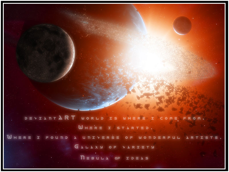
I got back from vacation and found out that i was already late to be part of the senior commdev for "what does dA mean to you," So i opened up photoshop and came up with this. Took me about 3 hours to compose and all.Yes i know my poetic skills suck, but the idea is there
 (Wink)")
Related content


Comments: 45


3 HOURS?! OMFG! for my first planet im doing right now, ive been working like 5 hours a day for the past 2 weeks, and im noet even done with the planet let alone other rhings like stars
👍: 0 ⏩: 0


oh my!!!
O.O
the bright light attracted me to this!!!
👍: 0 ⏩: 0


Oh my god.
That is amazing.
The colors and the lighting are awesome.
+fav
👍: 0 ⏩: 0

super  (Smile)")
")
Lo digo de nuevo, maravillos, impresionante su trabajo, y una colaboración buenísima para el SS


👍: 0 ⏩: 0


The words aren't that bad...
Well done. I agree...this would make a kickass wallpaper.
")
👍: 0 ⏩: 0


3 hours, and that's the best you could do?
Looks great man. Love the hint of blue in the bottom left corner. Great job.
👍: 0 ⏩: 0

Sweet design... i like the colors... the poem isnt bad at all either... nice piece
👍: 0 ⏩: 0

ey ke chido se ve,
dejando de lado esas palabras, ke no estan tan mal la neta
la imagen esta super chida, esos colores asi medio rojos o naranjas son los ke mejor se ven en tus trabajos
te kedo muy bien
👍: 0 ⏩: 0

hohum juju
he's actually thinkin all bouts me
👍: 0 ⏩: 0

")

awesome work. very dedicated it seems- i like your style!
👍: 0 ⏩: 0

Beautiful artwork as always.
But you're right, shit 'poetry'.
👍: 0 ⏩: 0

Very nice work as always with space-themed deviations you have submitted. I don't like the font used in the writing though, it looks so cheap .. no offense of course
Glad to see you managed to get one done for the commdev though 
👍: 0 ⏩: 0

As usual a gret piece from you. You really have a flair for making those planets, and that poem isn't too bad, considering you aren't really a poet.
Good piece. Just what I expected from you!
👍: 0 ⏩: 0

Looks great as usual the poetry isn't that bad but still who cares when the picture looks this good, nice font too. good job
pat
👍: 0 ⏩: 0

Cool stuff. As is see it, both violent and calm. I like. yep. i do.
👍: 0 ⏩: 0

keijoepú!!!!!
Esta barbara la explocion... la forma en q usas los colores es magnifica!!!
👍: 0 ⏩: 0

very cool. great as always. keep up the good work.
👍: 0 ⏩: 0

^_^ awesome
👍: 0 ⏩: 0


the asteroids glowing red from the sun look weird in front of the blue planet, but that's the only bad thing I could say about this one
great lines
👍: 0 ⏩: 0

Wonderful expression of deviousness! Great idea to share your portion with the idea based on the type of art you're specialized in 
Absolutely spiffy
👍: 0 ⏩: 0


If you would only show me your planet making secreats 
And I don't think your poetic skills suck, It still brings the message clean and clear. We all know how much you love this place.
👍: 0 ⏩: 0

I would knock your poetic skills. You maintained your idea and imagery throughout the read (which is more than I can say for most of the 'poets' I come accross).
I particularly liked the last line

👍: 0 ⏩: 0

that's awesome
you should show me how to do rings and asteroids in photoshop
i give you big hug if you do
👍: 0 ⏩: 0

the poem works fine! and the image would win easily enough!
good work m8, +fav
👍: 0 ⏩: 0


I love the look and feel of it. The image is very awesome...100% awesome. I love it! I like how you use different colors as well. And the font is awesome! (what font is it?) The poem is pretty good...I like the meaning in it. Great work!
👍: 0 ⏩: 0


👍: 0 ⏩: 0

Your right, that poem is a little rough. But its you!
👍: 0 ⏩: 0

awesome picture, you should make a wallpaper out of it ")
👍: 0 ⏩: 0

Can we say...Kick ass! As usual man, your work is great. I can't wait to see that Commdev, keep it up man!!
👍: 0 ⏩: 0