HOME | DD
 DizzieFox — 'Hold on Tight...' -Commission
Published: 2011-08-25 23:53:41 +0000 UTC; Views: 2702; Favourites: 19; Downloads: 0
Redirect to original
Description
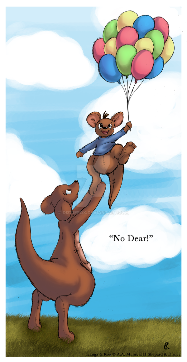
"... and don't get go!"My second commission
") ! Though admittedly, I felt rather awkward doing this one, since it's for my boyfriend, =PinkFloydYoshi XD;. I told him i'd be happy to just do it for free for him, but he put the DA points into my account before I could argue, so blah XP;.
! Though admittedly, I felt rather awkward doing this one, since it's for my boyfriend, =PinkFloydYoshi XD;. I told him i'd be happy to just do it for free for him, but he put the DA points into my account before I could argue, so blah XP;. Anyway, he requested a full colour pic of Kanga and Roo from Winnie the Pooh and gave me freedom to do whatever I wanted from that. I made a few sketches and thumbnail ideas, and eventually this silly idea came up. I must still have balloons on the mind after the last thing I made or something XD;. It's fairly simple, and didn't take me all that long to do, but I still had a lot of fun with this
 (Smile)") . Experimented with a few different shading techniques too.
. Experimented with a few different shading techniques too. The quote in the pic came from a conversation we had when I showed him the thumbnail sketch and is what he figured would be what Kanga would say in this situation, so I felt it were appropriate to include XD.
Kanga and Roo © A.A. Milne, E.H. Shepard and Disney
Related content


Comments: 6

yipe!
save yourself, get the pistol and shoot the ballon lol
fantastic art
👍: 0 ⏩: 0

Your gallery is slowly rekindling my love of Winnie the Pooh C: , this is so sweet!
I love the colours you've used to shade, and in general, the picture is calm and mellow
I just read the previous comments about your lines, sure they're sketchy but it doesn't detract
away from the picture itself so no worries about that, style cannot be helped and as long as
the commissioner loved it and your happy with it, it's all good right?
I quite like the sketchiness <3
👍: 0 ⏩: 1

I love scratchy and sketchy lines! I have an affinity for the style used for Yoshi's Island's assets and it's one of the reasons why it's one of my most favourite games! I think the reason for this is the same as why Hayao Miyazaki hates using computers when doing his wonderful animated features, it looks way too perfect. It's not that I don't respect artwork that looks perfect though, it triggers a different feel about it. Sketchiness triggers another feeling that makes me feel happy. I don't quite know what it is about the whole scratchy/sketchiness that does it, but it always seems to put a smile on my face.
👍: 0 ⏩: 0

I think the main thing that bugs me about this is how messy your lines are. You should clean up your lines, or at least make it look intentional (using crisp-looking grass, for example, against the sketchy lines only serve to emphasize the messiness of the linnes). The lines are also inconsistent in their "sketchy-ness," which leads me to believe that you didn't intentionally do this. Some of the lines are smoother and then transition suddenly into sketchy lines.
👍: 0 ⏩: 1

I'm going to agree with you on the sketchy lines against the grass emphasizing the sketchiness or "messiness" of the drawing, it definitely is inconsistent and I think that it would probably benefit the piece more to have the grass drawn in at least.
Though I'm failing to see the actual problem with the consistency of the sketchy lines--to me it appears that in the smaller areas her lines are shorter (as they should be, it is a smaller area she's drawing) whereas in longer areas like mother's back and tail the lines are longer--having them short for example would have probably degraded the shape and caused more of a visible distraction.
The sketchy lines I at least can let go because to me and the way I'm looking at the piece they seem to add to it or at least fit in for a couple of reasons - first, they are fuzzy animals and where that shirt probably isn't fuzzy to keep it consistent the lines should also be sketchy to a degree to match the rest of the kangaroos.
Secondly, the image is playful and the focus is mother reaching for her baby. "childlike innocence" along with the theme of playful and children come to mind with all of the colours and the mood set for the piece in which case to capture that playfulness and the carefree attitude of a child, sketchy lines slide.
That's just my side of it, though. I quite like this :3
👍: 0 ⏩: 0
I've already added my comment in voice to this but oh well here goes.
I was right to allow you the choice of whatever you wanted because it turned out pretty awesome.
And of course I gave you the points, I have to be fair.
👍: 0 ⏩: 0