HOME | DD
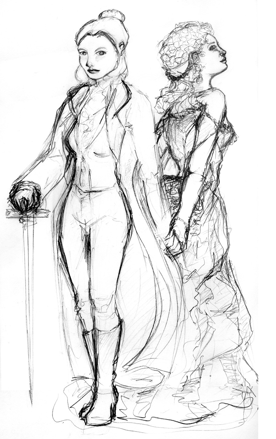
 Dkelabirath — Eva - sketch
Published: 2010-03-22 17:27:53 +0000 UTC; Views: 751; Favourites: 8; Downloads: 9
Redirect to original
Description
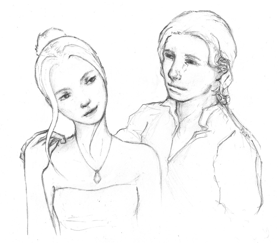
My Ventrue character, Eva Kopacek, for the "Before and After the Embrace" competition.This is just a sketch. I was thinking of refining the lines and then colouring it or shading with pencil, but then I *spilt orange juice all over it* so I decided instead to scan it in and use it as a reference.
Now that I've drawn the 'past' version on the right, I feel the 'Kindred' version looks a little unrealistic. Maybe the proportions are wrong, or just not enough detail?
Please let me know what you think, so I know if anything needs changing before I work on it!
Related content


Comments: 27


Thank you
This one chibi is getting so much more attention than my group of Chibis.. even though the group includes a better version of this one! I wonder why?
👍: 0 ⏩: 1

lol, i don;t know but this one is great
")
👍: 0 ⏩: 1
 (Smile)")

Awesome! Great scetch!
--
I know you're up to something...
👍: 0 ⏩: 1
Thanks
It has its problems, but I liked it.
👍: 0 ⏩: 0

Ah, ye old spill-something-on-the-sketch routine. I know that one well 
What you could try, assuming you actually want to work on this, is printing it out in high contrast to bring out the contour and retracing it from the printed sketch. It's neither clean nor perfect, but it could work.
Anyway, the sketch itself isn't bad, though the roughness shows, especially the lower portions, hands most prominently. Also, the proportions, as you've already pointed out yourself. It's not the head-torso ratio that's wonky, however, it's the arm length. While people obviously do have varying builds, the hands don't usually reach the middle of your thigh while standing upright. Your characters do, however, hence the slightly awkward feel to it.
Should you not want to alter the hand placement, you could attempt to make the legs slightly longer, which will alleviate the problem somewhat, although the overall figure will become a tad childlike.
Apart from the above, the sword-bearing version does have nice facial features and silhouette, and the general idea and composition are likable.
/end caffeine rant
peace
👍: 0 ⏩: 1
Thanks very much for taking a look - it is very definitely rough sketch, and although I loke the silhouettes I'd have to work it up a lot. Thanks for the advice regarding high contrast, I might try something similar. I think the real problem is the torso length myself, her torso is too small which makes her head larger and her arms longer, so I guess that might be it.
👍: 0 ⏩: 0


Well, I wouldn't say the head is too big is she's a short woman. The "proportional height" of people usually ranges from 6-8 heads, depending on the actual height and headsize, yadayada. She's about 6,5 (with heels, of course, but still). I think it makes her look short, but not out of proportion (I like short women). If you want to shrink her head, I don't think you should overdo it!
I can see she is slim, but I think giving her a bit more... substance(?), mostly leg- and bottom-wise wouldn't hurt her. Leg-wise, as I was really fond of the waist on the rightmost one. Also, her back is lovely.
Anyway, if you hadn't pointed the proportions out, I wouldn't really have noticed it much. I did notice the eye on the "past version" though, and I think it looks too much like an eye from a front view and not a profile view.
Eyes look a bit cut off half when drawn in profile (mostly): [link]
Some eyes doesn't as much, but you understand me : )
Aaaanyway. In spite of my "do this and that"-ish words, I really like the picture, and would be happy if I could have it in the Ventrue group gallery.
Shame with the juice, too! I think it would've done really good with clean pencil lines + photoshop colour. What sort of colours did you plan to use?
👍: 0 ⏩: 2
Thank you for actually requesting my work for the gallery.. it made me feel so happy and wanted
👍: 0 ⏩: 0
Thank you for all your comments! In spite of really liking LeftWoman, I do feel she's just not accurate. The larger heads are a little stylistic, but RightWoman works as a whole..
As for the eye, it's actually not a profile shot! What, you say? Yes, indeed! I forgot to draw in her other eye and cheeck.. she's meant to be turning round and looking at her future self (so the eye is right but the rest isn't). However I like her face, what to do..
Thank you for the kind words
👍: 0 ⏩: 1
It's a very nice picture. I'm all excited for you to finish it.
*laugh* Now I'll consider that possibility whenever I see an eye like that on a profile face. It's the face that's wrong, not the eye! Her face definitely LOOKS pictured from a profile view (apart from the eye) and if I were you, I wouldn't change that much. I like that she's facing to the right (Let's call right the past) while the other woman is facing to the left (let's call left the future). RightWoman is facing the path, but glancing towards the future. If you turned her head to more of a front-view, I think her whole direction would change, making the picture less balanced and dynamic. A more profily (perhaps slightly turned towards the camera *snicker*), right directed face can still glance backwards, right? Perhaps she can't see the person behind her, but for a spectator, it would certainly look like she is, indeed, looking at whoever is there.
Messy comment galore.
👍: 0 ⏩: 0

strange proportion of head to body,
nice anyway, the second person have a amazing cloths
👍: 0 ⏩: 1
Yes, I think I need to make the head smaller. Thank you
👍: 0 ⏩: 1


gee... I don't know, it's practically perfect... um, well you could maybe define the left arm (right, from the artist's perspective) on the girl in the front, and maybe embellish the sword with like a fancy handle or something. I don't know what much I can say, because it's better than anything I could ever draw!! 

👍: 0 ⏩: 1
Yep, I do need to change that arm, I think, thank you
Keep practising, don't be disheartened! I see work I feel subdued by all the time..
👍: 0 ⏩: 1
Ok!! You ARE amazing though!!

👍: 0 ⏩: 1
Thank you - that's really nice to say! Thanks for favouriting it too
Do you have any ideas how I could improve the composition or anything else in this initial drawing?
👍: 0 ⏩: 0

Awesome picture - don't forget add it to the group!
👍: 0 ⏩: 1
Thanks!
I wanted to colour it, or redo the lines in Photoshop to make it stylised rather than sketchy.
However my Tablet did not work earler
We prayed about it and I will try again later - hopefully it'll work again, if God wills it.
 - :(")
👍: 0 ⏩: 0
Also, the scan quality is poor, which is a shame as it's really made the contrasts stand out too far. I'm at home on crutches so I can't get into the art school and use their beautiful scanner.
👍: 0 ⏩: 0