HOME | DD
 dpcdpc11 —
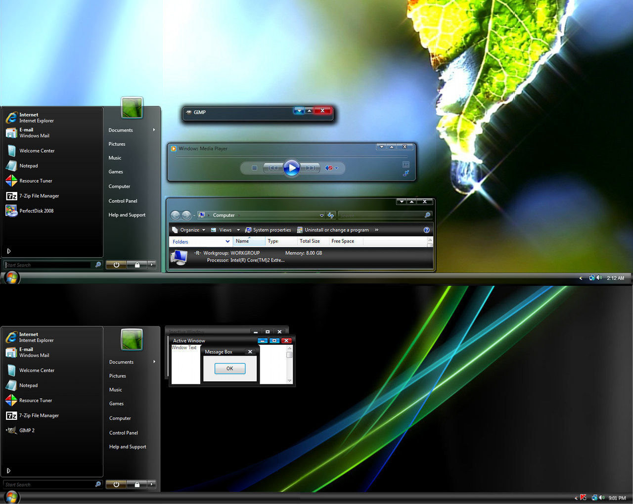
Leaf Visual Style for Windows7
by-nc-nd
dpcdpc11 —
Leaf Visual Style for Windows7
by-nc-nd

Published: 2011-03-02 05:35:50 +0000 UTC; Views: 504327; Favourites: 1541; Downloads: 163159
Redirect to original
Description
Get my latest Windows 10 themes: gumroad.com/dpcdpc11The much awaited Leaf Visual Style for Windows 7 is here!
6 SUBTHEMES INCLUDED: top, top-small-fonts, bottom, bottom-small-fonts + an extra variation of the bottom versions: Bottom Flat (normal and small fonts)!!!! Plus the same cool versions have now a new variation with changed window caption buttons!
View in action here: dpcdpc11.deviantart.com/art/Fr…
Note: if you like this theme, would you be willing to donate a mere 0.5€ as a symbol of your appreciation for me? If you are interested please click here: www.paypal.com/cgi-bin/webscr?…
UPDATE 14:
- NEW VARIATIONS!!! I've got bored of the caption buttons so I made another set of caption buttons which come as a extra versions of the same styles as before. Hope you like them! You can check'em out in a fresh screenshot here: dpcdpc11.deviantart.com/art/Le…
UPDATE 13:
- fixed the height of the All Programs section in Start Menu
UPDATE 12:
- another annoying bug that gave me 2 sleepless nights is finally fixed! I'm talking about the exaggerated height of menu and toolbar in Open and Libre Office. Users... enjoy!
UPDATE 11:
- the much awaited fix for the autoscroll mouse cursor in Firefox is here! It was the damn tooltip PNG in Explorer causing all the hassle. Glad I've finally fixed it! Still trying to fix the huge height of the button/toolbar of Open/Libre Office 3.3
UPDATE 10:
- finally fixed the More Options popup menu in Explorer. Thanks to solmiler
UPDATE 9:
- changed the selected item image in explorer and also the text color from white to black. The white text color was the same as in the details of items when searching in windows explorer which was pretty annoying, for someone using windows explorer.
- I've included another version in the package: bottom flat. What's that all about? It's a previous version of the taskbar which I like and kept alive. It's flat like you guessed and does not have that inner dark gradient that the normal version has. This works perfect on flat minimalistic wallpapers!
UPDATE 8:
- finally fixed the buggy display of fonts in microsoft office 2010 tabs. Thanks to jhanford for the suggestion!
Update 7
- Yes, another update... but it's a GOOD update!
- improved the Small Fonts versions: thinner window frames and also thinner scrollbars. Since some people have small resolutions on their display, I though this change would improve their experience and productivity using this theme, since the desktop space is so limited. Enjoy!
Update 6
- fixed the undetermined progress bar... try checking for windows updates and you'll see what I mean! Thanks to iBest for the bug reporting!
Update 5
- made some small modifications to the bottom taskbar version... added a pale dark gradient to give it a little depth. This will be more visible on simple wallpapers.
Update 4
- fixed the bottom taskbar... now it's smooth as silk!
- removed the aero reflections... now the taskbar and the window frames are all cleaned (thanks to troubada for pointing this out).
Update 3
- added SMALL FONTS version for Bottom and Top taskbar placement. The new font used is called Aller but since I don't have the License to distribute it, I can't include it in the package. Fortunately you can download it for free here: www.daltonmaag.com/Aller_Std_F…
Update 2
- added bottom version for the people who use their taskbar on the bottom. It's slightly different from the one on the top but I hope you like it!
Update 1
- fixed the extended start menu (thanks to sergiogarcia for the bug report!)
Package includes:
- 6 Theme versions: Top, Top Small Fonts, Bottom, Bottom Small Fonts + an extra variation of the bottom versions: Bottom Flat! What's that all about? It's a previous version of the taskbar which I like and kept alive. It's flat like you guessed and does not have that inner dark gradient that the normal version has. This works perfect on flat minimalistic wallpapers!
- Plus the same cool versions have now a new variation with changed window caption buttons!
- Fonts need to make it work perfectly, except Aller... read bellow!
- Explorer Navigation Buttons
- Windows Start Button: dpcdpc11.deviantart.com/art/Le…
Not in the package:
- Aller Font Family needed for the Small Fonts versions. Available for download here: www.daltonmaag.com/Aller_Std_F…
- gdipp - the tinny app that makes your fonts clear and smooth like those in Linux Distros. It's available in 32 and 64 bit flavors. Download here: code.google.com/p/gdipp/downlo…
How to:
1. Patch your system files and install the required fonts!
Be sure to patch your system files before you can use 3rd party windows themes. Use this tool to do it: www.windows7download.com/win7-…
Install the fonts found in the folder "Resources/Fonts"
2. Install the theme?
Copy the content of each folder inside the Theme folder to: "C:\Windows\Resources\Themes\" (Asuming that you're Windows 7 is installed on partition C)
3. Change the start orb?
Use Windows 7 Start Button Changer to change the start orb. You can find the needed tool here: www.door2windows.com/windows-7…
Launch Windows 7 Start Button Changer and choose the BMP from the "Resources/Start Orb - Leaf" folder and you're done!
4. Change the Windows Navigation buttons?
Use Windows 7 Navigation Buttons Customizer to change the Windows Navigation Buttons, resources available in the folder "Resources/Navigation Buttons"
Download the tool here: www.door2windows.com/windows-7…
5. Smooth Fonts like in OSX or Linux?
Use gdipp, the little app which changes you font rendering engine to make the fonts look smooth just like, or almost like in Linux or MacOS. Download here: code.google.com/p/gdipp/downlo…
Credits:
Thanks to jsz for the wallpaper used in the preview: jsz.deviantart.com/art/Maple-L…
Thanks for downloading!!!
Related content


Comments: 831

those icons are not in the package, they are part of Token icon pack which you can find here on dA. here's how you pin them to the taskbar: create a shortcut to your app for exmple firefox, place the shortcut where ever you want, right click the shortcut>properties>change icon, choose the firefox icon from the token pack, and finaly drag the shortcut to the taskbar. thats it! dunno how you did it but this is the best way to do it.
👍: 0 ⏩: 1

Oh thank you! that made all the difference, this looks so dang nice now. i wanna test out other themes but this looks so darn good, I don't wanna mess with it. my wife loves it as well.
👍: 0 ⏩: 1
happy to hear that... give my regards to your wife! glad I can make someone enjoy their experience on the PC.
👍: 0 ⏩: 0

I love It 
 (Smile)")

👍: 0 ⏩: 1
i dont understand what you mean my friend.. can you be more explicit please?
👍: 0 ⏩: 0

Very nice, thank you for sharing.
👍: 0 ⏩: 1

Simply beautiful VS.
I love it and i love the way you fix the bugs. So I'll just donate 0,5 euros for your work.
Please, can you fix this bug:
Running Windows Update, the searching indicator when the program searches for updates (that line) is not present.
You can't tell if it is searching or not until the result appears. So, please if you can, fix this , too.
Best of luck !
👍: 0 ⏩: 2
hey man... try the theme now... I've fixed the undetermined progress bar. Hope you like it!
Notice: in windows updates the animation is not that smooth but I can't really do anything about it... in other programs it looks smooth... I could "fix" if I would make the progress bar a grey gradient or something like the original bar in Aero theme, but them it wouldn't fit with my theme. I think it looks pretty good right now... waiting for you feedback.
👍: 0 ⏩: 1
Thanks a lot man.
This is what i wanted. It's perfect now.
As i was saying before, i love the work and hope you'll get better in the future (better payment) ...
Best of luck !
👍: 0 ⏩: 1
thanks for the wishes! glad you like it!
👍: 0 ⏩: 0
thanks for pointing that out... must have slipped me!
I'll tackle the problem tonight and see what I can do about it.
also thanks in advanced for the donation... I really appreciate people who care for others! it's not easy living with 200Euros/per month so every penny are welcome!
👍: 0 ⏩: 0


well done mate, you've nearly hit 3,000 downloads in 2 days
👍: 0 ⏩: 1
thanks... I'm surprised myself!
👍: 0 ⏩: 0
")
hope you have the latest version... cause I've updated some things!
👍: 0 ⏩: 1

yeah i have the 4th update downloaded but i like the reflections in the previous though^^
👍: 0 ⏩: 0

thank you for the updates. downloading now. gonna try them later, though.
👍: 0 ⏩: 1

My favourite at this moment. Realy, realy great work!
👍: 0 ⏩: 0

OMG!!! New small font is looking so Great!!!! I love everything all!!! Thanks for sharing this awesome theme!!!
👍: 0 ⏩: 1
i cant download the start orb install program, rapidshare wont let me, says its been downloaded too many times.
👍: 0 ⏩: 1
Works like a champ! it looks heavenly, thank you!
👍: 0 ⏩: 1

i personally like the theme with the original font here a screeny: [link]
and also a screeny for small font: [link]
i didn't use gdipp coz don't know how to set-up, instead i use gdi++.
(if by any means you have time can i have a instructions on how to set-up gdipp, if the result is more nice than gdi++?)
👍: 0 ⏩: 1
can't compare gdi++ with gdipp.. gdipp uses the Linux rendering engine so fonts will look almost perfect.
No need for configuration... you install it and you will it running in the Windows Services list... so you don't have to worry about settings or anything else!
👍: 0 ⏩: 0

I really like the new small fonts version... keep this great work! What is "gdipp"???
👍: 0 ⏩: 1
[link] here you go... all you need to know about gdipp... in one sentence: if you ever used linux, than you must have noticed the smooth fonts... gdipp bring you that smoothness in windows!
👍: 0 ⏩: 0

Nice work on the updates. However, i still think the font is too big on the small fonts version to be honest try a size 9 or 8 perhaps
👍: 0 ⏩: 1
too big? odd.. link a screenshot please... cause this font is really small! it's a 9px size btw.
👍: 0 ⏩: 1
Here's an example: [link]
👍: 0 ⏩: 1
that doesn't look big to me! the heading in the explorer is not controlled by the theme... use gdipp with this theme and the font will look much much better!
👍: 0 ⏩: 1
Well in my opinion, it's rather big. But doesn't matter, i can always edit the font size myself for my own use
👍: 0 ⏩: 0


"don't listen to that "troubada", he's just jealous that no one commented or even fave his/her works."
What the HELL are you talking about Bakukang? You have no clue as to what my intent is. I was really trying to help him out with his visual style. Like I said, I like the VS a lot, it was just a couple of little things I thought could use some improvement, and considering the recent updates it looks like there is some substance to that. I admire the skill of people making VS's, I have edited some and by doing so have realized how much work it is and what a labor of love it is. So keep your ignorant comments to yourself please.
As far as the gdipp thing, the last reply was actually to an older post of mine, so I got what you were saying, but the order of replies on dA throws me off sometimes, I'm sure I'm not alone in that. I did just try it, and yes it works great for your VS. But at the same time it does some weird stuff to the font displaying in my word processors and in other places, so I cannot use it as a default option for my system, sadly. But yes I've noticed how those lines come into existence with gradients created in Photoshop, I have experienced that many a time myself when trying to make a dark wall or something like that. I want to say that one of the solutions I found was to either *create* the gradient on a very high res image, and then resize it according to you needs -- or create the gradient in a vector-based app and then export it as png.
👍: 0 ⏩: 1
I know that messages on DA are displaying like crazy... I didn't even get notified about your previous reply... anyway, about gdipp: has a problem with monospace fonts, the way to fix that is to replace the font used in your editor (dreamwaver, notepad++, flash cs5 etc) with a freetype Monospace font, I'm using Droid Mono Sans which works perfectly! Dunno what word processor are you using but for me works fine in the M$ office 2010. Hope that helps! But to answer your previous question: no, there's no way to change the large fonts in the style. I kow theoretically they are Headers and should change when I change the font for the Header1 and 2 but the Visual Styles in Win7 don't want to play nice, either that or Windows Style Builder need a new version! So the font used in those Headers is the font used in Windows Explorer window.
Now about the gradient, like I said before, in Photoshop the gradient looks great, even after I export to PNG... the PNG looks great but when I import it into Windows Style Builder and apply it to the Visual Style then it looks like crap... was a real pain to make the top taskbar look like it is right now... I'll experiment some more tweaks in PS and maybe I'll get something better out.
I also wanted to release the bottom version because people were becoming restless... imagine that I went to bed at 9 AM and woke up right now at 2PM.
So I'll see what I can do about it.
👍: 0 ⏩: 1
Well, the problematic font was Times New Roman (12pt) which I have as default font.
As for the gradient, is it not possible to just reverse the image resource you have for the top taskbar? Just flip it? Otherwise I would love for it to look like the window title bar, it looks very nice that way too.
The reflection stripes in the stream png were really conflicting with the rough taskbar gradient, so I ended up removing the reflections from the png. I found I could not export and edit and save with Resource Hacker like I've done before, so I had to edit the image part from Style Builder instead, which worked fine. I replaced all custom fonts with Segoe UI -- I know, not very artistic, but I need it to work with default Windows services/features. But yes, the taskbar really need to at least be smooth for the bottom taskbar version to look nice. Thanks.
👍: 0 ⏩: 1
tried to reverse the gradient on the taskbar but that didn't work out.. looked hideous!
I dunno exactly what reflection stripes are you talking about... I have no such thing on the taskbar.
I will have another shot at smoothing the bottom taskbar tonight.. but I'm happy you made the style work for you in the end!
👍: 0 ⏩: 1
You know that in msstyles there is a big png called "STREAM", right? You can save it from Resource Hacker (STREAM - 971 - 0). It's basically a big transparent png that contains the caption buttons, reflection background, wait cursor animation, etc. With StyleBuilder you don't see it as one file but you can see/edit the parts. But with Resource Hacker you can save the entire stream png. When you save it, and open it in Photoshop, on the top will be the reflection texture. But you can't see it when it's transparent, only when you create a black (or dark) file of the same size and drag and drop the trans png over it, will you see the texture there. That reflection texture is what I'm seeing in the taskbar, etc.
To show you, here is your stream png overlayed on black background. Notice the top part, can you see the texture? That is what I ended up removing via Style Builder as reshacker couldn't do it for some reason. But in StyleBuilder you cannot edit the whole png at once, but instead it will show you the individual parts like caption buttons, reflection, cursor animation, etc.
[link]
So I cleared that top part in StyleBuilder. If you're not aware of those diagonal lines I imagine you must have used an existing stream png or else it would not be there. But yes, it does show through the taskbar for me, and I'm not sure why it doesn't for you.
👍: 0 ⏩: 1
now I see what you mean... could not see them because of the wallpaper!
I found the reflection in Style Builder... edited the 5 PNGs by clearing their content and the reflection lines were still visible.
I got rid of them finally by assigning the Value 0 to the OPACITY property of each PNG.
I'll upload a revised version of the theme in 5 mins.
thanks for the heads ups!
👍: 0 ⏩: 0
any preview for the bottom version because i'm at the office and only using XP.
👍: 0 ⏩: 2
here you go my friend... gonna reupload the package in a moment adding also the small fonts version for top and bottom taskbar.
Preview: [link]
👍: 0 ⏩: 2
thanks, i'll be using it for a long time, gonna update my themes when i got back home. don't listen to that "troubada", he's just jealous that no one commented or even fave his/her works.
👍: 0 ⏩: 1
dunno if it's jealousy or something but he's right about the lines on the bottom taskbar... it's something I don't know how to fix... in Photoshop looks nice and clean, but when applied to the taskbar the image looks crappy... guess it's Microshit's way of telling us themes to stay out of this and go skin something else!
👍: 0 ⏩: 0
The Aller font does not look good if you open Computer (My Computer) and see the font used for "Hard Disk Drives" and "Devices with Removable Storage". It looks all jagged in that location. Otherwise it looks really good. Is there a way to change the font for that part only? Or is this not possible?
👍: 0 ⏩: 2
<= Prev | | Next =>