HOME | DD
 dpcdpc11 —
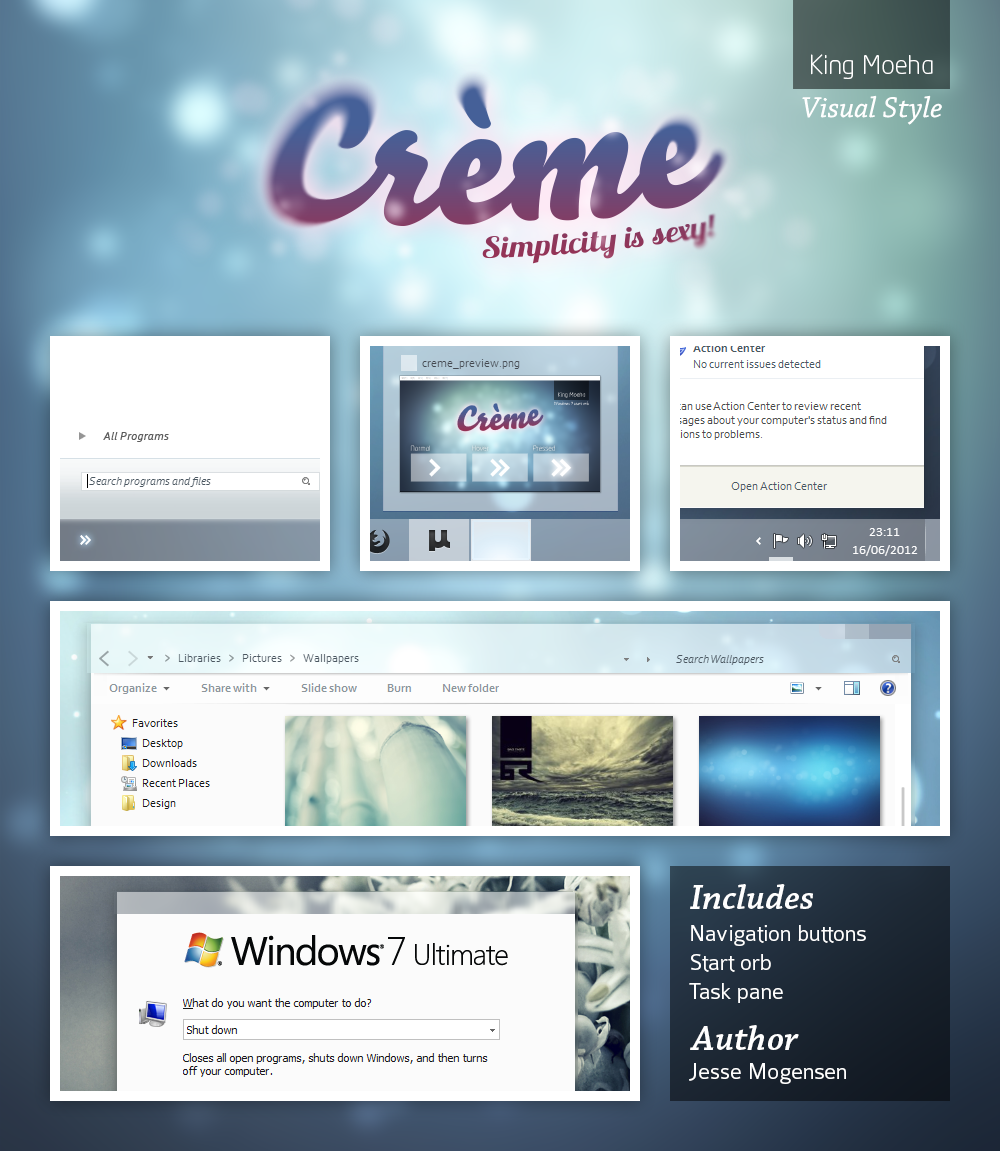
Leaf Visual Style for Windows7
by-nc-nd
dpcdpc11 —
Leaf Visual Style for Windows7
by-nc-nd

Published: 2011-03-02 05:35:50 +0000 UTC; Views: 504331; Favourites: 1541; Downloads: 163159
Redirect to original
Description
Get my latest Windows 10 themes: gumroad.com/dpcdpc11The much awaited Leaf Visual Style for Windows 7 is here!
6 SUBTHEMES INCLUDED: top, top-small-fonts, bottom, bottom-small-fonts + an extra variation of the bottom versions: Bottom Flat (normal and small fonts)!!!! Plus the same cool versions have now a new variation with changed window caption buttons!
View in action here: dpcdpc11.deviantart.com/art/Fr…
Note: if you like this theme, would you be willing to donate a mere 0.5€ as a symbol of your appreciation for me? If you are interested please click here: www.paypal.com/cgi-bin/webscr?…
UPDATE 14:
- NEW VARIATIONS!!! I've got bored of the caption buttons so I made another set of caption buttons which come as a extra versions of the same styles as before. Hope you like them! You can check'em out in a fresh screenshot here: dpcdpc11.deviantart.com/art/Le…
UPDATE 13:
- fixed the height of the All Programs section in Start Menu
UPDATE 12:
- another annoying bug that gave me 2 sleepless nights is finally fixed! I'm talking about the exaggerated height of menu and toolbar in Open and Libre Office. Users... enjoy!
UPDATE 11:
- the much awaited fix for the autoscroll mouse cursor in Firefox is here! It was the damn tooltip PNG in Explorer causing all the hassle. Glad I've finally fixed it! Still trying to fix the huge height of the button/toolbar of Open/Libre Office 3.3
UPDATE 10:
- finally fixed the More Options popup menu in Explorer. Thanks to solmiler
UPDATE 9:
- changed the selected item image in explorer and also the text color from white to black. The white text color was the same as in the details of items when searching in windows explorer which was pretty annoying, for someone using windows explorer.
- I've included another version in the package: bottom flat. What's that all about? It's a previous version of the taskbar which I like and kept alive. It's flat like you guessed and does not have that inner dark gradient that the normal version has. This works perfect on flat minimalistic wallpapers!
UPDATE 8:
- finally fixed the buggy display of fonts in microsoft office 2010 tabs. Thanks to jhanford for the suggestion!
Update 7
- Yes, another update... but it's a GOOD update!
- improved the Small Fonts versions: thinner window frames and also thinner scrollbars. Since some people have small resolutions on their display, I though this change would improve their experience and productivity using this theme, since the desktop space is so limited. Enjoy!
Update 6
- fixed the undetermined progress bar... try checking for windows updates and you'll see what I mean! Thanks to iBest for the bug reporting!
Update 5
- made some small modifications to the bottom taskbar version... added a pale dark gradient to give it a little depth. This will be more visible on simple wallpapers.
Update 4
- fixed the bottom taskbar... now it's smooth as silk!
- removed the aero reflections... now the taskbar and the window frames are all cleaned (thanks to troubada for pointing this out).
Update 3
- added SMALL FONTS version for Bottom and Top taskbar placement. The new font used is called Aller but since I don't have the License to distribute it, I can't include it in the package. Fortunately you can download it for free here: www.daltonmaag.com/Aller_Std_F…
Update 2
- added bottom version for the people who use their taskbar on the bottom. It's slightly different from the one on the top but I hope you like it!
Update 1
- fixed the extended start menu (thanks to sergiogarcia for the bug report!)
Package includes:
- 6 Theme versions: Top, Top Small Fonts, Bottom, Bottom Small Fonts + an extra variation of the bottom versions: Bottom Flat! What's that all about? It's a previous version of the taskbar which I like and kept alive. It's flat like you guessed and does not have that inner dark gradient that the normal version has. This works perfect on flat minimalistic wallpapers!
- Plus the same cool versions have now a new variation with changed window caption buttons!
- Fonts need to make it work perfectly, except Aller... read bellow!
- Explorer Navigation Buttons
- Windows Start Button: dpcdpc11.deviantart.com/art/Le…
Not in the package:
- Aller Font Family needed for the Small Fonts versions. Available for download here: www.daltonmaag.com/Aller_Std_F…
- gdipp - the tinny app that makes your fonts clear and smooth like those in Linux Distros. It's available in 32 and 64 bit flavors. Download here: code.google.com/p/gdipp/downlo…
How to:
1. Patch your system files and install the required fonts!
Be sure to patch your system files before you can use 3rd party windows themes. Use this tool to do it: www.windows7download.com/win7-…
Install the fonts found in the folder "Resources/Fonts"
2. Install the theme?
Copy the content of each folder inside the Theme folder to: "C:\Windows\Resources\Themes\" (Asuming that you're Windows 7 is installed on partition C)
3. Change the start orb?
Use Windows 7 Start Button Changer to change the start orb. You can find the needed tool here: www.door2windows.com/windows-7…
Launch Windows 7 Start Button Changer and choose the BMP from the "Resources/Start Orb - Leaf" folder and you're done!
4. Change the Windows Navigation buttons?
Use Windows 7 Navigation Buttons Customizer to change the Windows Navigation Buttons, resources available in the folder "Resources/Navigation Buttons"
Download the tool here: www.door2windows.com/windows-7…
5. Smooth Fonts like in OSX or Linux?
Use gdipp, the little app which changes you font rendering engine to make the fonts look smooth just like, or almost like in Linux or MacOS. Download here: code.google.com/p/gdipp/downlo…
Credits:
Thanks to jsz for the wallpaper used in the preview: jsz.deviantart.com/art/Maple-L…
Thanks for downloading!!!
Related content


Comments: 831

I see you're not using gdipp... without gdipp the whole font looks ugly cause of the Windows Font Rendering Engine... please use gdipp and you'll see how nice the font looks!
👍: 0 ⏩: 0

Yes, actually everywhere the Aller font is displayed big, it does not look good and is all jagged. Another example, right-click "Computer" and click "Properties". See the text that reads, "View basic information about your computer". Or open the Control Panel and see the text, "Adjust your computer's settings". All those larger font displays don't look good. But the smaller sizes look really good. Is there a way to have the larger font examples use a different font instead?
👍: 0 ⏩: 0
lol, what are you going to do, not apply it if you like it?
BTW, the bottom bar has lines in it (looks like low res gradient). Is it supposed to have that dpcd? Otherwise it's looking great (well after resizing the fonts  (Wink)")
👍: 0 ⏩: 1
about the lines on the bottom taskbar... dunno how to solve that problem for now... I'm not sure if it's the Window Style Builder or the windows interface which messes up the PNGs??? in Photoshop looks clean and nice but when applied to the taskbar it ruins the quality of the images used... if you have a solution I'm all ears!
and please use gdipp to solve the jagged fonts... said that before!
👍: 0 ⏩: 0


Love the new font....looking forward to it.
👍: 0 ⏩: 1
working on it... working on it!
👍: 0 ⏩: 0

uow... very, very beatiful theme... one of the best... just waiting for the small fonts version, when it will be released?
👍: 0 ⏩: 1
working on it as we speak... hopefully will get to finish it tonight so stay tuned!
👍: 0 ⏩: 0

Nice choice for the small font version!
Got that font on my iPhone and I love it <3
👍: 0 ⏩: 1
yes it's really beautiful! gonna go with that... I've decided!
with gdipp active looks really impressive!
tried some other fonts like: Verdana, Helvetica, Lucida Sans and Grande, Corbel, Candara, Tahoma, but they all looked sooo crippled in small size.
Found Aller and it was an instat 'Light Bulb' moment!
👍: 0 ⏩: 0

bottom version ready to download!
👍: 0 ⏩: 1

Are you kidding me? I love it!
👍: 0 ⏩: 1

I think the font size is good. Easy to an eye.
👍: 0 ⏩: 1
I think so too but some people are using really big resolutions so for them the font is too big!
👍: 0 ⏩: 0

pls try the font used in this [link]
👍: 0 ⏩: 1
I think it's using the Droid font... do you happen to know that?
you should also know that's a screenshot from Linux... the fonts looks different on Windows... the same font won't look as good on windows!
👍: 0 ⏩: 1
hmm even with gdpii ? ")
👍: 0 ⏩: 1
I'll see what I can do about that!
👍: 0 ⏩: 0
btw, I'm not trying to make your vs into something's it's not, but I would love to see a version where the taskbar looks just like the titlebar, white line on top, same grey color, no texture.
👍: 0 ⏩: 1
for the bottom use of the taskbar? cause I will also make a version with the taskbar on the bottom where the white line will be on the top.
and there's not texture on the taskbar... do you mean no gradient?
👍: 0 ⏩: 1
"cause I will also make a version with the taskbar on the bottom where the white line will be on the top."
Oh OK, I was not aware of that, thank you.
And as far as the 'texture' comment I made, sorry about that but I had a very persistent leftover from another VS mixing with yours. After a reboot the texture is gone. But yes, I guess I would like it a bit better for the light elements in the taskbar to be a bit dimmer, because on dark backgrounds it stands out too much, but that maybe because it's 'upside-down'
👍: 0 ⏩: 2
are you currently using the taskbar on the bottom right now?
In the bottom taskbar version the gradient will be in the same direction... would you like it to be a bit darker on the bottom?
👍: 0 ⏩: 0
EDIT: yes, I just tried the taskbar on top and it looks really good, so I can't wait for the bottom version
👍: 0 ⏩: 1
hey friend! try the new bottom version! it's ready!
👍: 0 ⏩: 0
I've been able to reduce the font sizes for this VS. If the creator wants I can post it or I can send him the edited msstyles. It basically just reduces most of the font sizes by 1 size.
👍: 0 ⏩: 1
thanks for doing that but for most user it won't be enough and many ask to change the Ubuntu font with something else.
and from my experience the ubuntu font doesn't look good reduced by 1... link up a screenshot to see the result.
👍: 0 ⏩: 2
OK, I sent you another link, this time I also reduced the font size for context menus.
👍: 0 ⏩: 0
pls send me the screen + msstyles ")
👍: 0 ⏩: 0


Brilliant!!! but I hope the font size is a little bit smaller than now... (Smile)")
👍: 0 ⏩: 1
will do that... small fonts version is coming soon!
👍: 0 ⏩: 0

really nice........... i like it.....im using it now.....
👍: 0 ⏩: 1

do you have any previews so we can see what the rest of the theme looks like (scrollbars, start menu, etc)?
👍: 0 ⏩: 1
nope... that's the beauty of it! try it! it wont hurt your PC and it's free! so you have nothing to loose if you try it!
👍: 0 ⏩: 0

i have use you VS, my resolution is 1280x1024, in this resolution, the font is great, but i'm not using GDIPP, but instead i use the older version the gdi++.
question, is there any difference in using gdipp & gdi++?
coz when i try to install gdipp, i wasn't able to find the installation directory for it.
maybe i need more help or some pointers.
👍: 0 ⏩: 1
gdipp is something else... check their website for the whole explanation and comparison to gdi++ which I've also use before: [link]
can't compare the two software... gdipp uses the native Linux rendering font engine which will make your fonts smooth as silk... try it! but before remove gdi++.
make sure u install the correct version: x64 for the x64 OS and x86 for the x86 OS.
👍: 0 ⏩: 0

Really great theme. Only complaint is .............................. yes the fonts are to big, its unusable for me at the moment with my resolution but I read below your going to add a smaller font so i'll wait 4 that.
👍: 0 ⏩: 1
<= Prev | | Next =>