HOME | DD
 dpcdpc11 — Simplify 8 Dark Point WIP 01
by-nc-nd
dpcdpc11 — Simplify 8 Dark Point WIP 01
by-nc-nd
#flat #linux #mac #osx #windows #windows8theme #flatdesign #minimalistic #simplify #theme #visualstyle #windows8
Published: 2014-09-27 02:47:54 +0000 UTC; Views: 4645; Favourites: 19; Downloads: 125
Redirect to original
Description
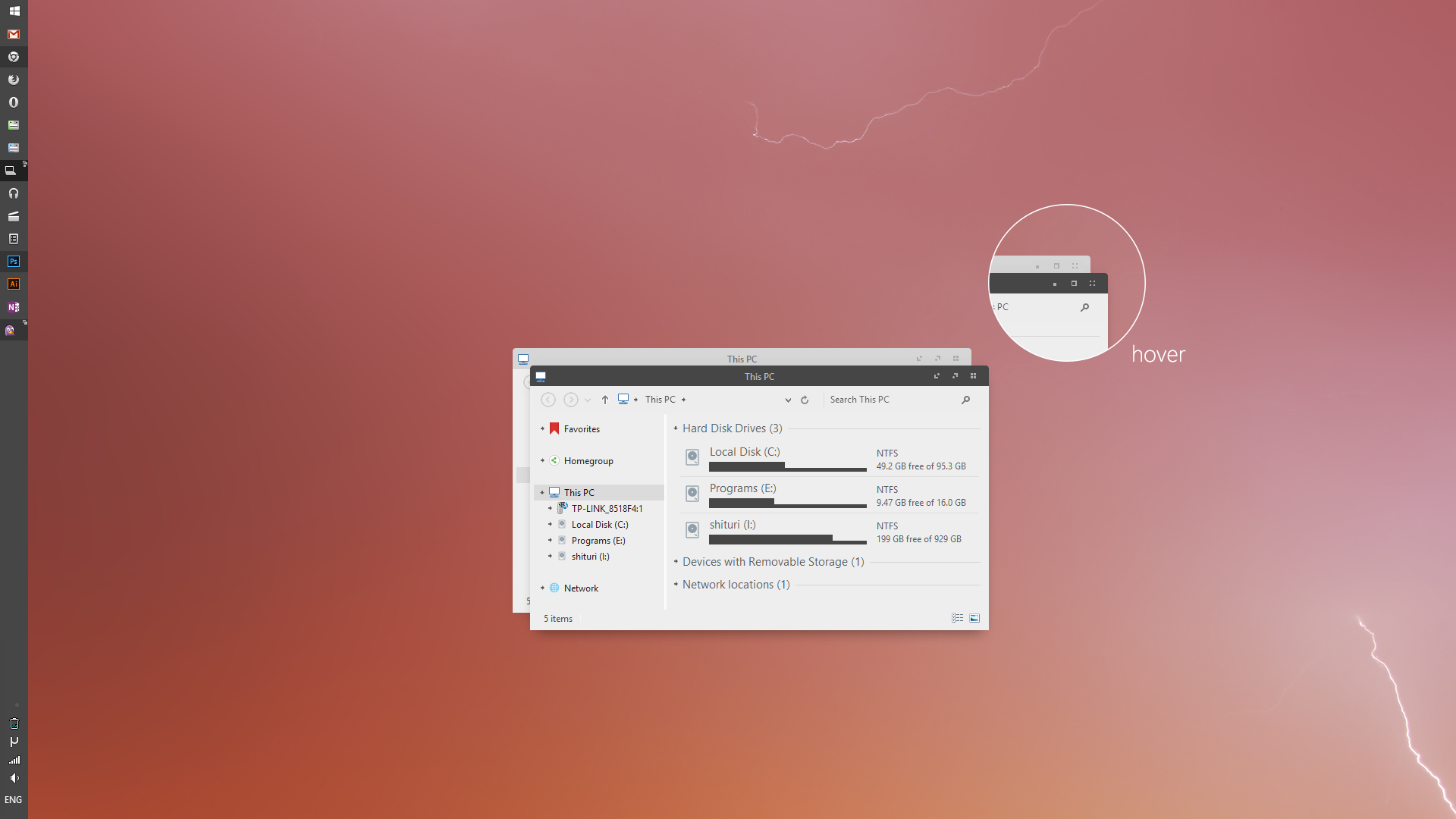
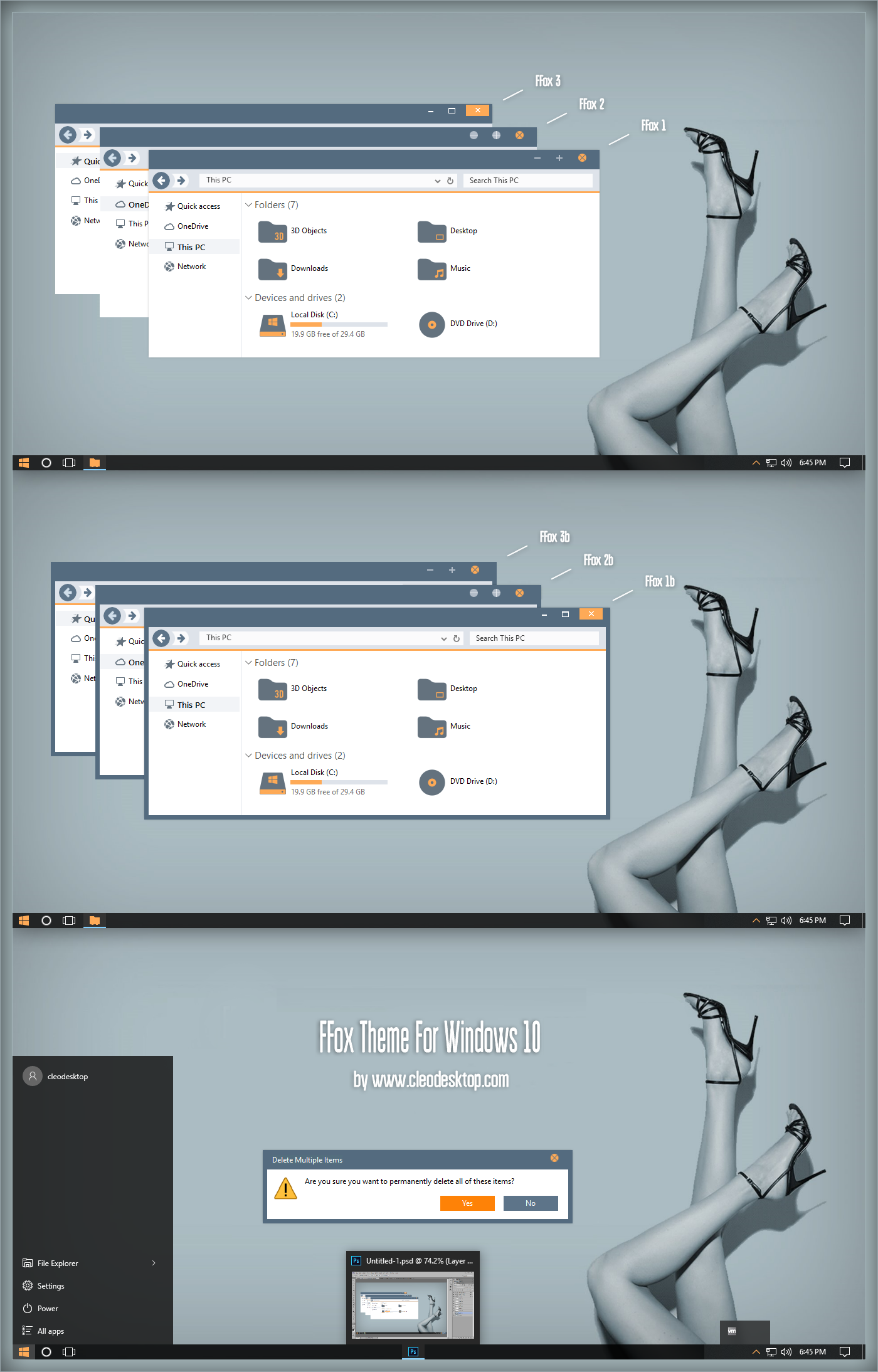
Working an a new mod for my Simplify 8 theme.Here you can see me testing some new caption buttons and multiple windows symbols in the taskbar.
You can also checkout the Caption Buttons animation here: Simplify 8 Dark Point Caption Buttons in Action
Wallpaper used: Nature Strikes by Dan Dragos
Your feedback is always welcome so please leave your comments bellow.
and of course hit the button if you like it!
Thanks in advance!
Related content


Comments: 38


here u go: dpcdpc11.deviantart.com/art/Si…
👍: 0 ⏩: 0

Could i get a link boss? it looks like a really nice theme.
👍: 0 ⏩: 1


It's already released. Check your notes!
👍: 0 ⏩: 1

Nice work! Wish you had a variant with your Mavericks colors and no round corners - everything edges.
👍: 0 ⏩: 1
Thanks. I'm not a fan of square stuff.. it gives me an unfriendly and cold feeling. It's not a coincidence apple is using rounded corners all over their UI. Rounded stuff makes users feel more comfortable in general. Microsoft should do their study better.
👍: 0 ⏩: 1
Edges give you an unfriendly and cold feeling? I'm opposite to that effect. I also doubt that there is any psychological or other medical research to prove the theory that "round" edges "makes users feel more comfortable." If anything it's a users preference, no offense, I like your themes and round corners are something to get use to but I just believe round edges aren't very clean or precise. Microsoft had done round corners in Vista and W7.
Apple and their UI, totally different than Windows. I enjoy OSX, it's clean and crisp, besides I miss my MBP and having the ability to move about and complete homework. Mac round edges are ok, but in Windows... I've got to have edges. That's my personal opinion, not telling you what to do. ")
I'd personally change the edges if I really have to, but for some reason after saving edits within VSB (WSB) and adding them to the Windows resources, Windows will not load that msstyle.
")
👍: 0 ⏩: 1
I've read a number of books on graphic and logo design mentioning the use of squares and rounded shapes in symbols to convey a certain feeling to the user associating rounded shapes to friendliness and vice versa. I most certainly didn't invent this.
👍: 0 ⏩: 1
I'm interested in reading the books. Do the authors cite credible sources in APA?
👍: 0 ⏩: 1
Here's an interesting article on this subject for example www.creativebloq.com/logo-desi…
👍: 0 ⏩: 1
Well, it's a good "article" but none of the statements are backed up with credible scientific evidence. All that is stated in that article is all based upon assumption. I'll only believe it if there is solid evidence to prove the point, and I doubt there is other than the opinions of others.
👍: 0 ⏩: 1
you're kidding right? we're talking about design and shit here... like most art forms this is really subjective and you want scientific evidence? come one man... you're not serious or you just want to stretch this conversation without any reason?
if you want to talk about design and stuff in depth please drop me a note or something.
👍: 0 ⏩: 1
Well, you're (they're) claiming that people show positive personalities over round shapes vs shapes that have characteristics that display a clean and crisp look, which in fact is a theory and not a fact. You need scientific studies in order to back up any type of theoretical statements, otherwise they're assumptions based on personal ideologies and taste. No, I am not joking... I study psychology and just because some art book or blog claims something that is factual doesn't mean that it is. Where is the scientific research to support these statements?!
👍: 0 ⏩: 1
Was it really that hard to send me a note my friend? Or you just like to read between the lines? Why? Is it laziness or something? Check your notes for my reply.
👍: 0 ⏩: 0

how do you get slim vertical taskbar using small icons?
👍: 0 ⏩: 1
the same way you do it with Maverick... it's right there in the Maverick "how to":
use 7+ Taskbar Tweaker . Right click on the tray icon>advanced settings and set the no_width_limit = 1
👍: 0 ⏩: 0

Really like this over the previous. This one has sparked my interest.
I hate the round corners ")
👍: 0 ⏩: 1
thanks for your feedback! make sure you also check out the animation of the caption buttons: dpcdpc11.deviantart.com/art/Si…
the icons in explorer is an iPack created by neiio: neiio.deviantart.com/art/numix…
as for the rounded corners... I don't enjoy squared corners too much because they give me a negative, aggressive feeling and I've created the theme to not get in the way of the users.
👍: 0 ⏩: 0

happy to hear that! thanks for the feedback!
👍: 0 ⏩: 0

If we already bought Simplify 8 would we get this as well? xD
👍: 0 ⏩: 1


It looks cool!
I love the minimalism of this.
What i would love to see is a different explorer window.
And what i mean by this is that i would like to see the various places in explorer (commandbar-navigation panel etc ) to be different from the other.
Like keep this greyish colour in navigation panel but the rest of the window (items view) make it white for example.
i love the caption buttons though!They remind me the era of xp customizing!
👍: 0 ⏩: 1
Thank for you feedback! Do you have an example of such a theme?
You mean something like this: fav.me/d7xf43l or this fav.me/d7rd4n0 ?
Both these examples use WinaeroGlass to remove the window frames and I don't want to force the user to use WinaeroGlass because it's not a stable program.
👍: 0 ⏩: 1
I agree with winaeroglass.I don't use it too.
More like your Maverick theme.
But i understand now that you don't want your themes to have borders.
I never have a problem with them.
And to be clear i don't suggest to make it like that.Just sharing opinions for variations of this style!
P.S I haven't bought any of your style yet.Unemployment here is so fuckin high so...
But i will when i have the chance!Keep up the good work!
👍: 0 ⏩: 1
I just tried tiny border with my Simplify theme but it doesn't make any difference... just as I thought... I made Simplify 8 use the thinnest borders possible.
You can now try all my win 8 theme... please check your notes!
I know you didn't suggest that I copy other themes, I was just trying to understand what you mean giving you visual exemples.
👍: 0 ⏩: 0

I may be slow, but I don't understand how these buttons are behaving on hover...
👍: 0 ⏩: 1
The magic happens live where the buttons go from the regular view into the hover state through an animation. Not sure how to record and post that animation of each button.
I think I should make an animated gif or something but dunno how.
👍: 0 ⏩: 1
Use an app to record your screen while you are doing it. Would love to see it...
👍: 0 ⏩: 1
Here you go: dpcdpc11.deviantart.com/art/Si…
👍: 0 ⏩: 1
 (Smile)")