HOME | DD
 drcloud — Nettle
Published: 2009-03-19 02:04:43 +0000 UTC; Views: 8281; Favourites: 396; Downloads: 482
Redirect to original
Description
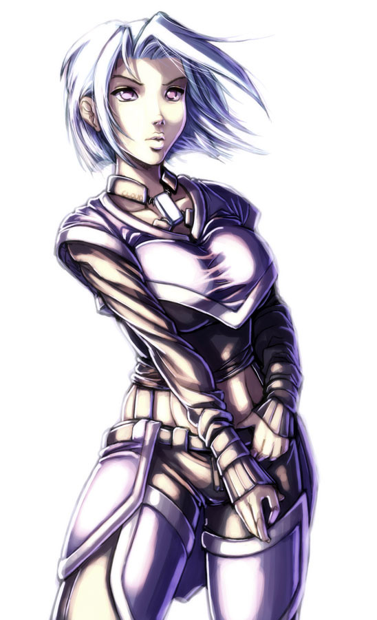
Duddle 51.For some reason I seem to be getting less and less satisfied with my pictures with each passing day. I take solace in the fact that they always seem to look 10 times cooler in the little thumbnaily preview thing, at least.
I was going to name this picture after a song but then I forgot what the song was. Sums it up really XD
Related content


Comments: 22

*Jaw drops for a moment* this is a very good picture lol, i approve!
👍: 0 ⏩: 0

... maybe it's just me, but it appears her arm is too skinny.
👍: 0 ⏩: 1

It's not just you - I think it's also a bit short, which is one of the things that bothered me about it X3
👍: 0 ⏩: 1
 (Smile)")


Really? I think this one's great! Love the mouth, and the eyes.
Ooo, the breasts are great too, and that necklace thing.
...and the costume. I like it! Do more of this character please!
👍: 0 ⏩: 0

This one is quite amazing.. lots of detail for a "doodle"
👍: 0 ⏩: 0

Stunning work! love the face and the coloring and everything!
👍: 0 ⏩: 0

What's not to be satisfied with? Your work always looks great to me. You're too hard on yourself!
")
👍: 0 ⏩: 0


I seriously hope I can one day color a piece as good as you do, tell me, things like highlighting/color theory are second nature to you right? =]
👍: 0 ⏩: 0


i've been following your work now for years and it's steadily improved. You tend to do lots of images with blown out colors though.
It's certainly a cool effect, but some variance wouldn't hurt.
other than that, a fine 'duddle' as you call it.
👍: 0 ⏩: 1
You make a good point. I think that it's my default (and thus lazy) colouring choice, and mixing it up a bit would be A Good Thing (tm)
At least that gives me a starting point for tomorrow. Coming up with ideas seems to be the hardest thing sometimes XD
👍: 0 ⏩: 1
i'm game for brainstorming. Ideas come to me reasonably easy, though you'd have to cut through the chaff in some cases. Cheesecake, lots of it.
👍: 0 ⏩: 0

