HOME | DD
 dyemooch — Smokescreen Human Form
Published: 2003-02-09 15:29:34 +0000 UTC; Views: 3838; Favourites: 95; Downloads: 339
Redirect to original
Description
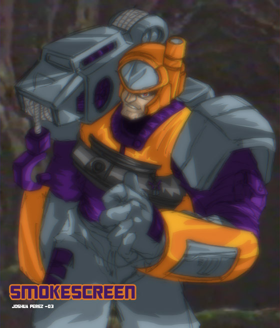
BOOOB THE BUILDER! Can we fix it? BOOOOB THE BUILDER! YES WE CAN!!!...that's what I think about when I see this one. Maybe I should made him.........better....hehe. It's Smokescreen though....even though I think Hasbro shoulda called him Hoist...or Grapple....
Smokescreen (c) Hasbro/Takara
Human Form (c) me-ish
edit: THIS DESIGN SUCKS
Related content


Comments: 17

He did end up being called Hoist, in the series, Megatron blasts him and the damage is so bad, they have to take his Spark out of his body and construct a new one. In his new body, he called himself Hoist instead of Smokescreen. Megatron also renamed himself Glavatron when he was badly damaged and then healed by the Minicons who also gave him a new paint job.
👍: 0 ⏩: 1

This is something I know already. This image was done back when Armada was still airing and before Smokescreen was damaged.
👍: 0 ⏩: 1

THis is pretty good, pity his first toy was so crappy!
BTW, why can't I find the rest of these human ARMADA transformers anywhere in your gallery?
👍: 0 ⏩: 1
I see...
I thought that they looked pretty good. Why did you stop making them?
👍: 0 ⏩: 1
I have a bad habit of losing steam on projects like this in favor of other projects that suddenly pop into my head. I just lost steam on this- I plan on revisiting this idea at some point and making changes to the designs I've already done, though. It won't be any time too soon, though- I have a lot of work to take care of c:
👍: 0 ⏩: 0

I heart Smokescreen. He's my absolute favorite Armada character
👍: 0 ⏩: 1
Really? XD You are one awesome person then. I've never known anyone to willingly like the guy. I mean, I don't hate him or nuttin- just never met an open Armada Smokescreen fan. YOU WIN! : D!
👍: 0 ⏩: 1
Yay! Now all i need to do is win the Bumblebee Camaro contest, and I'm set for life xD
👍: 0 ⏩: 0


>.> Now have "Bob the Builder" in my head. LOL another great pic Xd
👍: 0 ⏩: 0

Bob the builder? nah, try *snort* Rescue Hero... eheh.... hehehe... he reminds me of the one dude... that had the wierd name... whatever. but god... I could see him as a rescue hero guy, just like HS94 said... oh wow... *snickers*
Anyway, I like what you did with his design. Very rugged looking, mostly because of his face... its awesome. 
👍: 0 ⏩: 0

when I see him I see a rescue hero dude...lmao that;s the only song that goes through my head....XD
👍: 0 ⏩: 0

I rather like the ethereal-like blur that's on the image, as well as the remaining pencil lines. If the pencil lines are completely removed in some cases, it tends to make the image look a bit to superficial. Like...more computer, less human. Great job on designing his facial structure. It really fits him !
")
👍: 0 ⏩: 0

Very nice! Altough it`s a bit to blurry. you should have put the pencil lines on one layer and taken them away after a while and rather add sharp details with the paintbrush.
👍: 0 ⏩: 0