HOME | DD
 e12dollarz — Scram Practice 5.0
Published: 2008-06-04 05:34:51 +0000 UTC; Views: 837; Favourites: 22; Downloads: 14
Redirect to original
Description
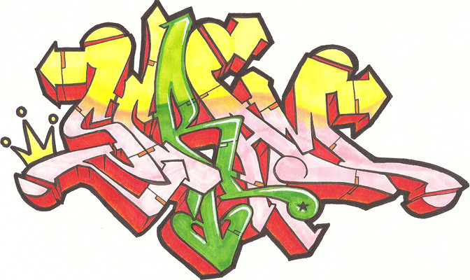
Meh... Still needs some work. Not entirely pleased with the colors here, but thought I'd post it anyway.Related content


Comments: 18


I agree with a few people here! The style is looking sweet!  (Smile)")
 (Wink)")
👍: 0 ⏩: 0

Raise that M up a little off the A cause that addon off the last bar of the M is a little squished. That said, I think version one will have a serious competition... Don't worry about the fill. I think it's quite solid and for a practice piece it's more then you need. I really like the one off color letter. Throwback to the days of racking paint.
I also agree with SHIXE about the heart form, with all the other elements you got going it's not needed.
👍: 0 ⏩: 1

Oh man, seriously dude you are a breath of fresh air. I need more people to give solid crits like you do. My final piece blows this one away. I'm not looking to win. I'm looking to DOMINATE!
👍: 0 ⏩: 0


3D worked well on this, although the R seem's out of preportion with
the rest of the letters, but all in all a fairly beasty preduction, well done.
.WerT.
👍: 0 ⏩: 0

IMO i think the 'R' is Fresh as hell.... flow is good...
👍: 0 ⏩: 1

I can see you still have the skeleton of the previous one but added 3D and put the crowd to the left, also the connection between the A and M is slightly different, anyway, in my opinion, not your best try.
👍: 0 ⏩: 1
I agree. Not a big fan of this one.
👍: 0 ⏩: 1
Yeah, just one more thing, could use something to fill that space on top and the end of the piece, feels like something is missing there if we focus on the whole, anyway, you'll win the battle no matther what, lolol
Keep it up bro!!!
👍: 0 ⏩: 1
I dunno, I'm up against some stiff competition this time. If I can't nail this down it could go to anybody.
👍: 0 ⏩: 1
Yup, that's good, battles have been rising in quality lately
Good luck man!
👍: 0 ⏩: 0

nice sketch. but i would do it without the heart-arrow under the R. rest is fresh...
👍: 0 ⏩: 0

Yer arrows is looking sick, and the piece finally has killer flow. You don't really look at the extensions as seprate from the letters. Keep it up
👍: 0 ⏩: 0
