HOME | DD
 e3rian —
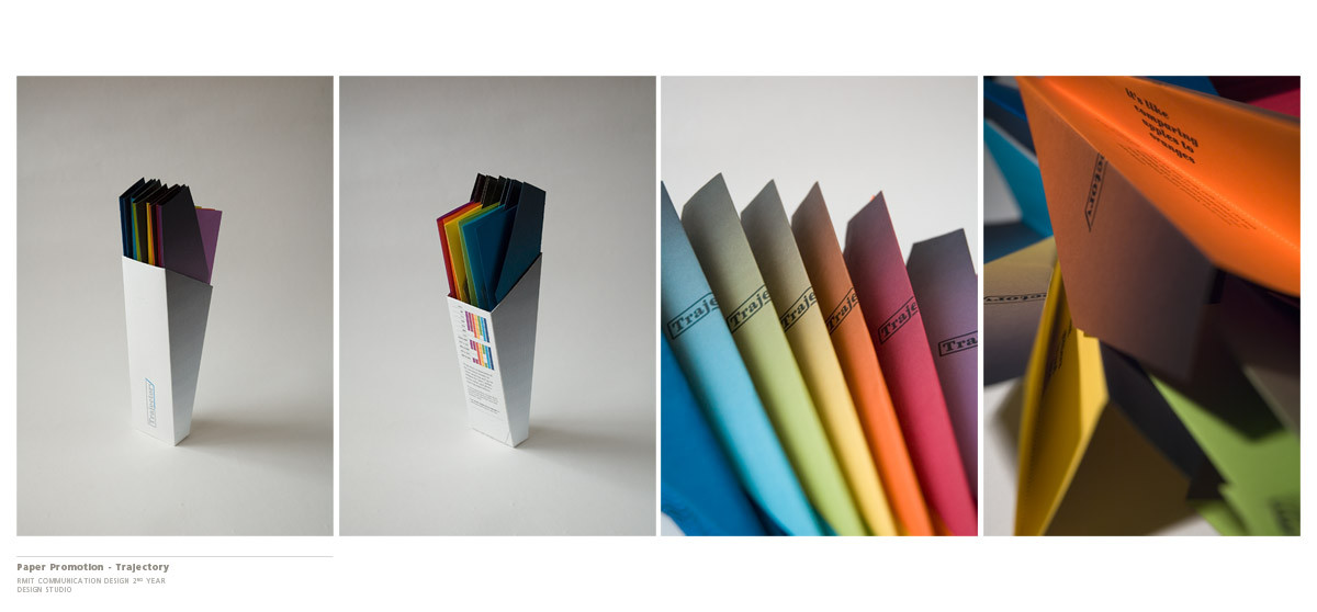
Trajectory - Paper Promotion
e3rian —
Trajectory - Paper Promotion
Published: 2006-11-07 01:39:53 +0000 UTC; Views: 42989; Favourites: 460; Downloads: 224
Redirect to original
Description
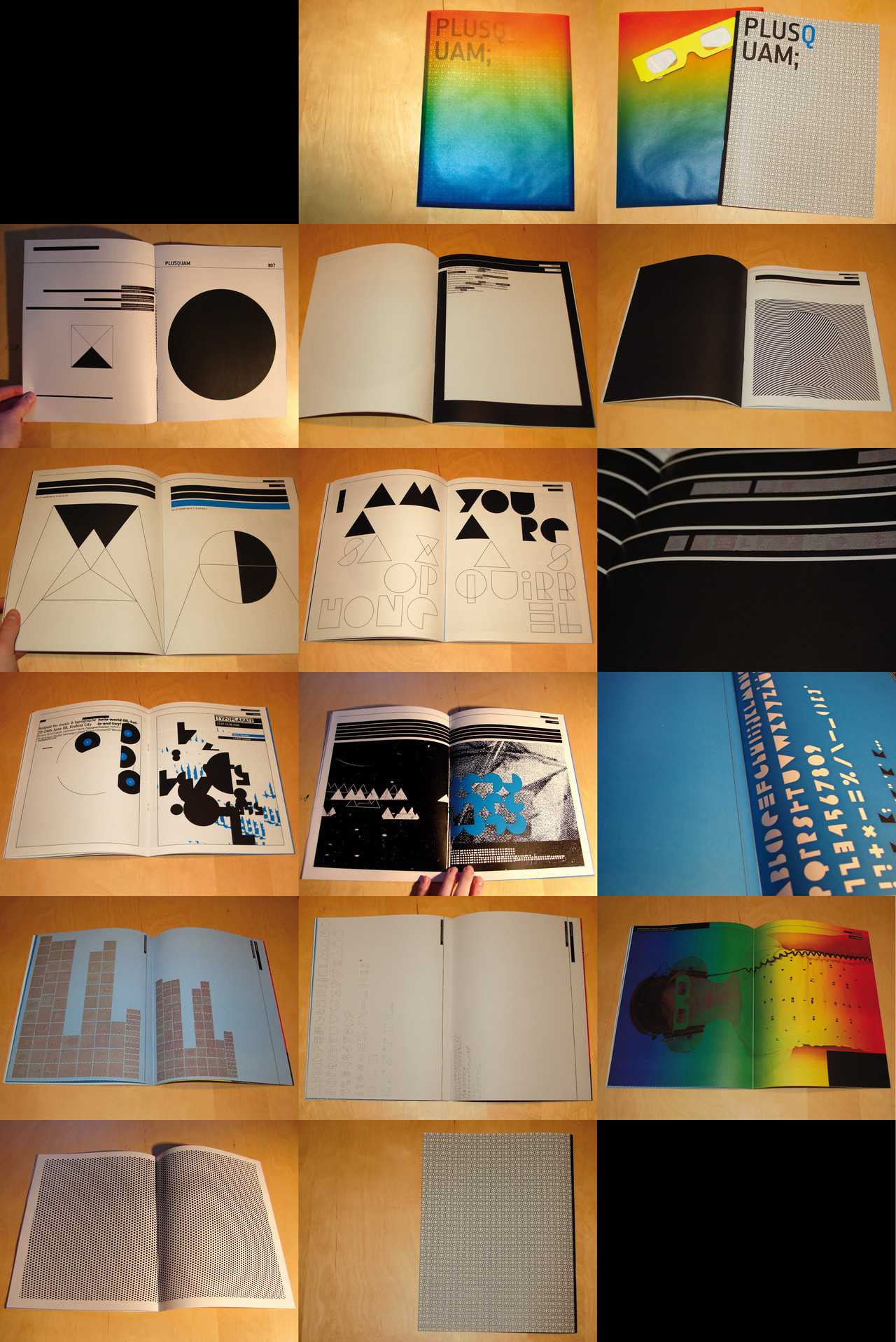
Trajectory - University Project, Design StudioMock project, Paper Promotion - colour stock
This was quite fun, I had to debate with myself what stock to use first but once I settled it was smooth sailing - minus the stress and not-enough-hours-in-one-day during these last few weeks of the year.
I would attempt to put down some description of the design process, just to make the entire project look more complete and offer some helpful tips - because I can surely do with some helpful tips, *hint hint.
There were basically three areas to consider, and each of them could act as a starting point for the project. The name and logo of the promotion, the form and shape of the promotion and the imagery and illustration that would be used by the promotion. Its usually good to start really wide, research what stocks are available, have a look at other paper promotions around, find some inspiration from your own sources etc. I narrowed down my choice of stock first, then it was onto the form of the promotion - paper planes seemed like a natural choice to me, fun and engaging. This part took around a week in between working through other projects, a little procrastination on my end, but that's life

Next it was onto the name and logo, this took a lot longer, I kept working on it for the duration of the project. Name changes came about, and therefore logo changes as well - its to be expected because your first idea may be the best, but the visual style of it needs time to mature. In the case of this project, every step got progressively harder as links needed to be drawn between each of the different parts so that the final piece would be a whole rather than good, but fragmented ideas. The imagery was the hardest to achieve, I have trouble defining what I wanted to put onto the planes. I knew patterns would be used, but I just couldn't put my finger on what I needed to illustrate.
The phase of research kicks in whenever you're stuck, its also helpful to uncover new information for bits that you have deemed finish - things can always be improved!
With around a week left, the wavelengths of the colours was what I have settled with. In the time left, everything needed to come together, mocking up, fine-tuning, printing, folding, cutting, gluing - its a mighty fine line to be doing things like that so close to the deadline - but sometimes its unavoidable - so its a matter of putting yourself under stress and pressure to see how well you cope.
Hopefully that paints a little more of the picture of how this was made, that writing was a bit rough but it should get the point across. If you have any questions relating to it, leave a comment and I'll try to answer as best as I can.
Related content


Comments: 53

Haha, I'm going to RMIT 2nd year 2nd semester now - searched for inspiration and found this.
Very very nice work! Love it. But can't take too heavily on inspiration from this since it's already been done at RMIT.
 (Wink)")
")
👍: 0 ⏩: 0

One of the better paper promos I've seen, very innovative. Kudos.
👍: 0 ⏩: 0


this has a really nice aesthetic. it has a nice concept which is also fresh and unique, and has been executed well.
the logo could possibly have worked harder.
well done.
👍: 0 ⏩: 0

very well done....I ma impressed. I think the photography is amazing as well. Did you do it yourself?
👍: 0 ⏩: 1

Yes, the photography too.
Thank you for being impressed
 (Smile)")
👍: 0 ⏩: 0


As a fellow design student (who always had a soft pot for packaging deisgn---as well as a bit of a struggle), I gotta say this: bravo!
👍: 0 ⏩: 1
Thank you, alas packaging doesn't hold my interest as much as publication
👍: 0 ⏩: 1
Editorial work is good. It's the area I wanna work on. Packaging's sorta like my 'recreational' area. I don't think I'll get to work on it professionally. I can see why you love publishing, though.
👍: 0 ⏩: 0

Brilliant piece of design there; it's very imaginative, has a great sense of style with the lines you've used, and the way the colours work with the plain box and background is superb.
The photography has captured this really well.
👍: 0 ⏩: 0

Excellent Friend
It's Lovely and Creative
Thanks for Sharing your trial in such detailed lines.
Regards
👍: 0 ⏩: 0


hi.. i was wondering how you photographed your comps? Any tips? im sort of in the beginning of the graphic design program @ my school, and i got a portfolio review coming up. Dont wanna hire any photographers so just trying to find out how to go about it..got any tips?
👍: 0 ⏩: 1
Hmm, its a little hard to describe without seeing it or explaining with a diagram - but the setup is quite simple.
Put a chair by the window (preferably with a back) lay some sort of board on the seat and the against the back - this is so that the item can sit/stand flat and also to get a curve in the background sheet.
Wait for some sunlight (not directly onto your setup) and shoot! If its a little cloudy, perhaps place a piece of white card/board opposite the window to reflect some light back onto the item.
I suggest if you have an dslr, use it, if you're not sure how to use it, google it a little and it should be simple enough. If you have a simple compact digital, it should still be fine - just slightly less control.
Hope that helps
👍: 0 ⏩: 0


i do love the way it came out though. the colors really pop =]
👍: 0 ⏩: 0

Great Desciption and insite on this project. Your end product is very attractive.... beautiful.
👍: 0 ⏩: 0


Thats an awesome packaging idea! It reminds me of the Young Enterprise project I had to do on a school day trip... make paper planes and market them to 'companies' I really like the box, its almost like the plane has done a nose-dive into ones desk
I hope your tutors liked it too! ... and if they didnt... well youve still got the DD 


👍: 0 ⏩: 0

absolutly awesome story/description, and a final product to finish it off. Wicked!!! BOO YA!!!
👍: 0 ⏩: 0

as a current second year graphic design student who is cursing their lack of concept for a forthcoming negotiated brief, i both commend and envy you.
everything good design should consider and contain is present within this. it's novel. it's informative. the branding ties in very well with the marketing. and most importantly, it hits the potential client with something all design should strive towards...a sense of humor, fun, and exictement. just from seeing the photos, i want to see it first-hand...i want to see how the planes fit into the very neatly designed box, how well they fly, what imagery/information is on the box/planes, and crucially, concerning your product...i want to know more about the paper.
i love this. if you have got this done since the start of term, kudos to you. i'ts a work of genius.
👍: 0 ⏩: 0

I think it _looks_ great. But I'm curious about a couple of things, if it's a promotion, who are you promoting it to?
Paper always kinda struck me as a fairly specialist product, sure we all use it, but how many of us actually care what brand of paper we use? We buy what's cheapest - or what feels and looks the best if we're really going to think about it. In my experience of course. I suppose you'd really need a reason to buy a specific brand/make. Perhaps you were working on a large project and you wanted to make sure all your paper matched? Perhaps you just have a favourite you've used for years and the idea of trying something else seems odd?
Not that I'm getting at anything. It's just what looking at it made me think. Who 'buys' paper? Perhaps there are databases and quality standards for it? People that run Arts & Crafts shops probably just _know_ what the best paper is. For what they're using it for.
Trajectory.
👍: 0 ⏩: 1
Usually these promotion packages would be sent to art directors at studios (or at their requests) This way, they can have them on hand to have a look and feel and show to their clients if they want to use it for certain projects.
They'll also be sent to printers (as mentioned by another who works at a print shop) so that they know what to do with the stock when the designers requests to print on it.
The average person wouldn't care for anything thats not A4, let along what stock it comes in

👍: 0 ⏩: 1
your reply is "Hidden By Owner".
Makes things somewhat difficult. ;x
👍: 0 ⏩: 0

How come I never got to do these types of project while I was studying design in college?! That's so freaking cool! Amazing use of color, stock, text, and space. Simple and straighforward. A job well done!
👍: 0 ⏩: 0

thank you for sharing us the very detail description, learned many things from it
👍: 0 ⏩: 1
I'm glad you did, sometimes the process is much more interesting than the outcome
👍: 0 ⏩: 1
? you wrote something that i cant c
👍: 0 ⏩: 0


Oh my, how original !! I love the coloooooors !!!! 


👍: 0 ⏩: 0


👍: 0 ⏩: 0

The real message in this one is in the second frame, the writing at the bottom says "If you can read this you should be working for the government."
I'm just joking, its a very well made design. Definetly deserves the DD!
👍: 0 ⏩: 1
How'd you guess? Have you called already?
Thank you very much!
👍: 0 ⏩: 1
I didn't guess... my inside intelligence at the government told me... its part of our operation to nuetralise them via this campai.... wait... shh... you never heard that >_> I never plotted conspiracy again no governement that isn't going to take place on new years... never... never I say!
👍: 0 ⏩: 0

I think this is awesome. I work in a print shop. I think the samples wouldn't stay in the box very long. We would be flying them at each other in no time.
This would work great for print ads and giveaways, but for practicality you would probably want to add an old stand by on the box to show customers.

👍: 0 ⏩: 1
Hehe, "the samples wouldn't stay in the box very long" that's exactly what my lecturer said
A stand by on the box? I'm not exactly sure that I understand

👍: 0 ⏩: 1
A stand-by. Meaning some sort of assembly of the paper samples that might actually make it to the customers hands with stocks available, sizes, etc.
👍: 0 ⏩: 0

The box and the folds, the bright colours invite curiousity, the paper planes answer it with delight.
"There were basically three areas to consider, and each of them could act as a starting point for the project. The name and logo of the promotion, the form and shape of the promotion and the imagery and illustration that would be used by the promotion."
I'm surprised you thought of this as the starting point, to me it seemed more like you began wtih what you thought would conjure up the experience you intended (before even clearing communicating the company and product), since you say you started with planes because they were 'fun'.
Did you deliberately start with a concept of the experience you intended to create?
👍: 0 ⏩: 1
Apologies for my delayed reply ")
Its a hard one you ask, we were asked to come up with the product and also the "company", so it wasn't really as restrictive as it usually is. We could explain things away easily, to me, communicating the company was not the most important role of this project.
You're even confusing me now, after two weeks! It's hard to put it down to why exactly I started with the planes concept. It came within a mess of brainstorming within the first few weeks of receiving the brief, it was basically finding the most creative and viable solution and making other things work around it.
It might sound a little dodgy but that is usually the case, and I'm not saying I didn't change anything and that everything just worked straight away (as I have alluded in the description)
Man, you ask some tough questions but thank you for the comment, I appreciate it, takes me out of my holiday slumber
👍: 0 ⏩: 0


I really like this, the mock up is great and very innovative. The colours lush. I love your working process as well.
👍: 0 ⏩: 1
Thank you, haven't seen you in a while!
👍: 0 ⏩: 0
| Next =>