HOME | DD
 e3rian —
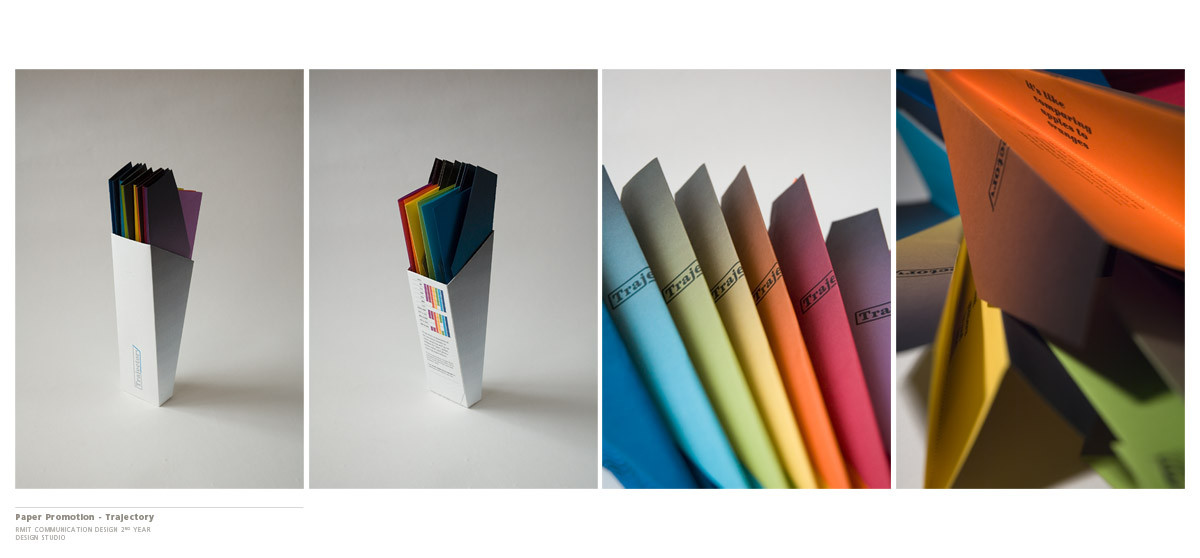
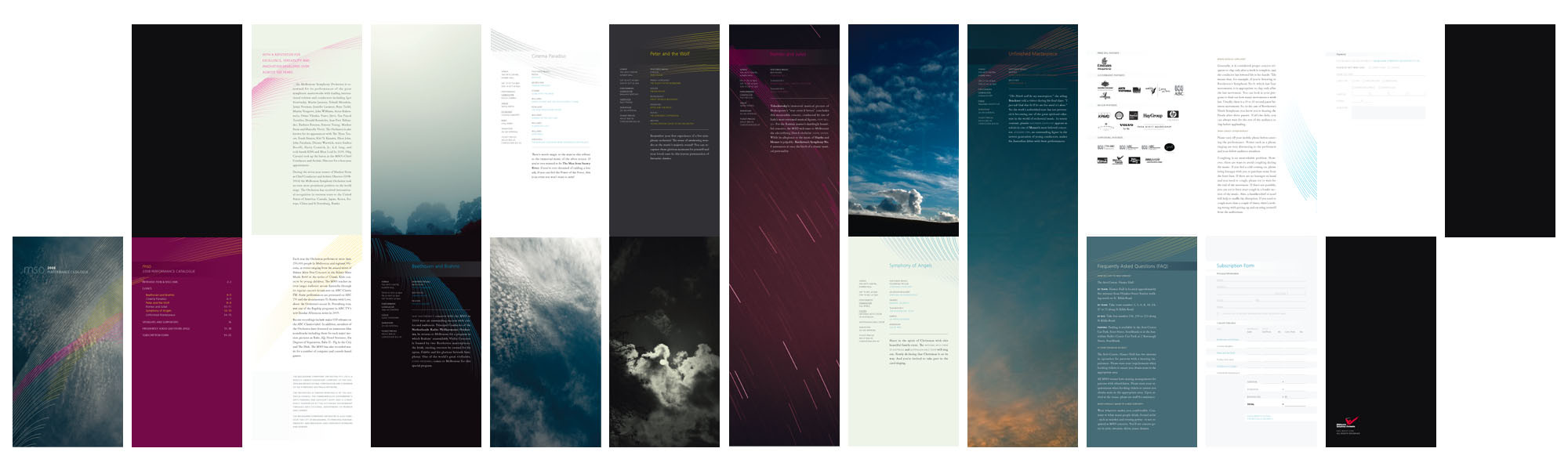
Trajectory - Paper Promotion
e3rian —
Trajectory - Paper Promotion
Published: 2006-11-07 01:39:53 +0000 UTC; Views: 42945; Favourites: 460; Downloads: 224
Redirect to original
Description
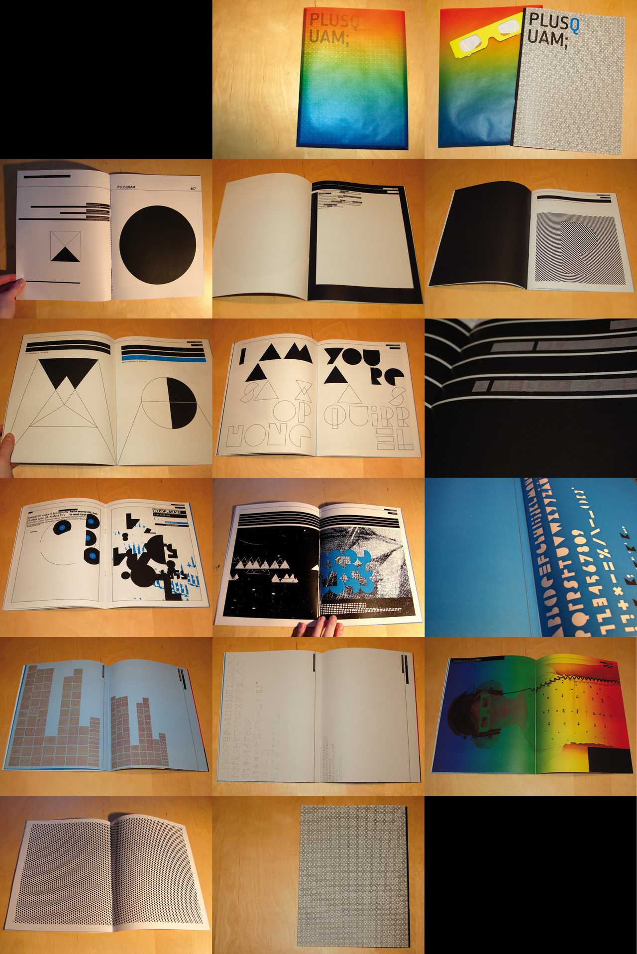
Trajectory - University Project, Design StudioMock project, Paper Promotion - colour stock
This was quite fun, I had to debate with myself what stock to use first but once I settled it was smooth sailing - minus the stress and not-enough-hours-in-one-day during these last few weeks of the year.
I would attempt to put down some description of the design process, just to make the entire project look more complete and offer some helpful tips - because I can surely do with some helpful tips, *hint hint.
There were basically three areas to consider, and each of them could act as a starting point for the project. The name and logo of the promotion, the form and shape of the promotion and the imagery and illustration that would be used by the promotion. Its usually good to start really wide, research what stocks are available, have a look at other paper promotions around, find some inspiration from your own sources etc. I narrowed down my choice of stock first, then it was onto the form of the promotion - paper planes seemed like a natural choice to me, fun and engaging. This part took around a week in between working through other projects, a little procrastination on my end, but that's life

Next it was onto the name and logo, this took a lot longer, I kept working on it for the duration of the project. Name changes came about, and therefore logo changes as well - its to be expected because your first idea may be the best, but the visual style of it needs time to mature. In the case of this project, every step got progressively harder as links needed to be drawn between each of the different parts so that the final piece would be a whole rather than good, but fragmented ideas. The imagery was the hardest to achieve, I have trouble defining what I wanted to put onto the planes. I knew patterns would be used, but I just couldn't put my finger on what I needed to illustrate.
The phase of research kicks in whenever you're stuck, its also helpful to uncover new information for bits that you have deemed finish - things can always be improved!
With around a week left, the wavelengths of the colours was what I have settled with. In the time left, everything needed to come together, mocking up, fine-tuning, printing, folding, cutting, gluing - its a mighty fine line to be doing things like that so close to the deadline - but sometimes its unavoidable - so its a matter of putting yourself under stress and pressure to see how well you cope.
Hopefully that paints a little more of the picture of how this was made, that writing was a bit rough but it should get the point across. If you have any questions relating to it, leave a comment and I'll try to answer as best as I can.
Related content


Comments: 53

I personally like it. I ended up having to chase after the image in the "new" bin just to keep up with it when I glanced over it the first time.
The colors and the sharp edges give it that really clean modern look that appeals to most--as well as myself. The only issue I had which can either add to its appeal or take from it is the difficulty in reading certain aspects of it. I realize this is a smaller version of the original, but the off angle that the words "Its like comparing apples to oranges" took me three pass overs to first notice, and then an additional minute or two after to read it. I realize it isn't the important part of the piece and was amusing when I did finally catch it, so it's really a toss up in my book.
I did like it though, it looks excellent. Very nice job!
👍: 0 ⏩: 1

It was never an intention to show specific content of it with the product shots except for the name of the promotion, but you make a good point and I will note myself whenever I take some product shots again - so thank you for that!
If I have time, I might add the layouts of the planes and the packaging to answer the content side of it.
Thank you very much for your time

👍: 0 ⏩: 0