HOME | DD
 ECP-Pro — Designwade

Published: 2011-02-06 13:53:52 +0000 UTC; Views: 13368; Favourites: 170; Downloads: 717
Redirect to original
Description
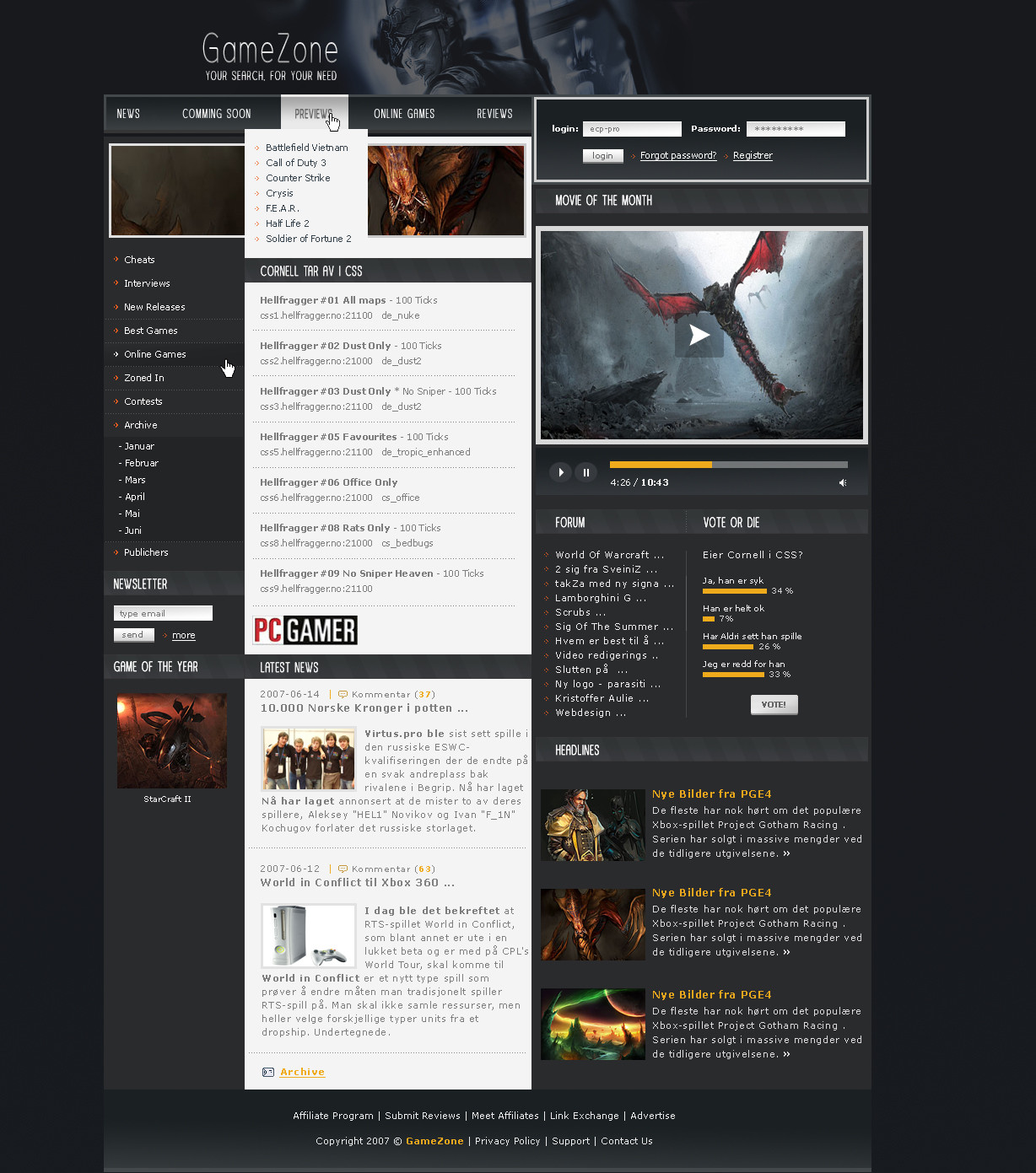
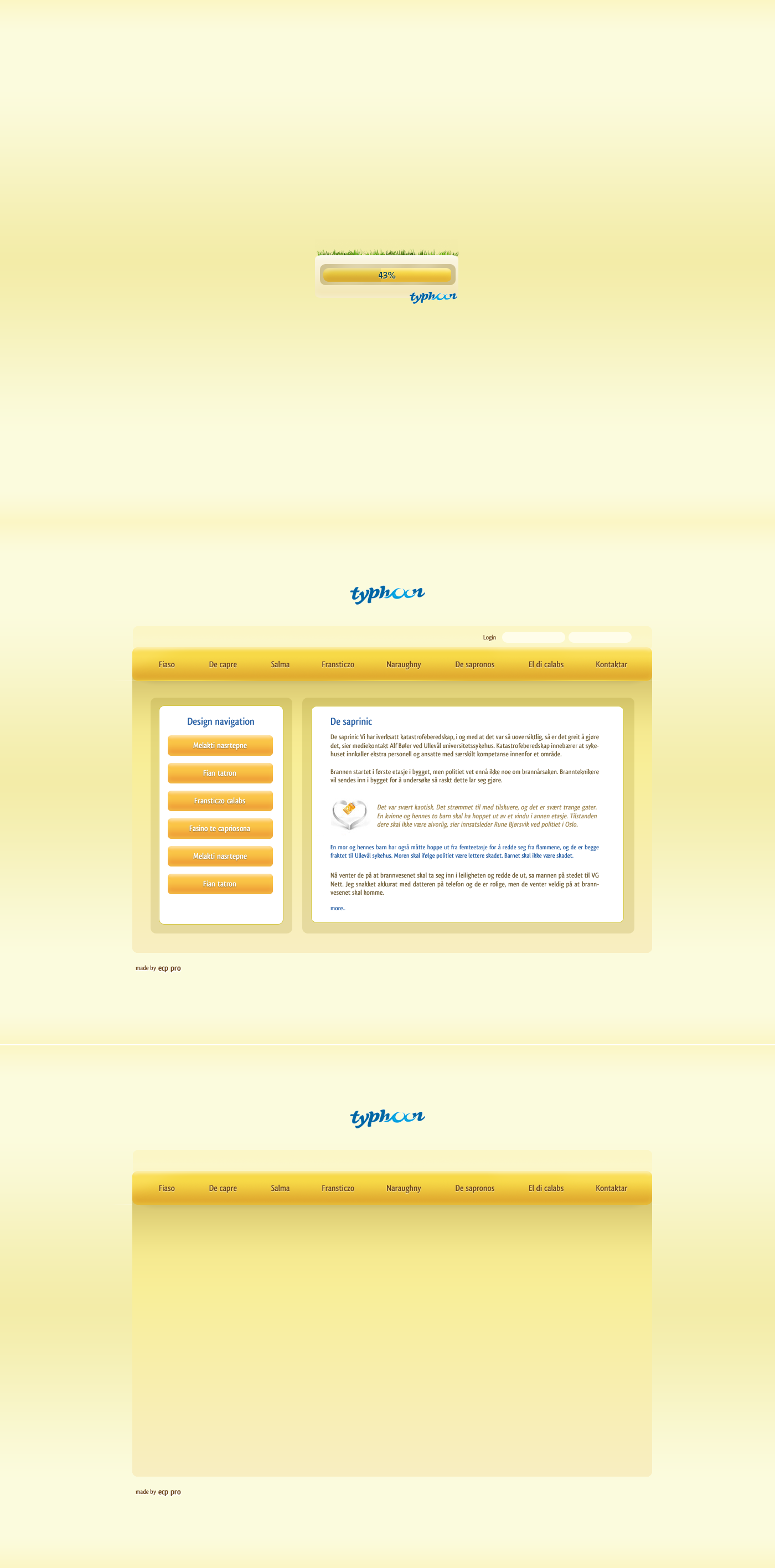
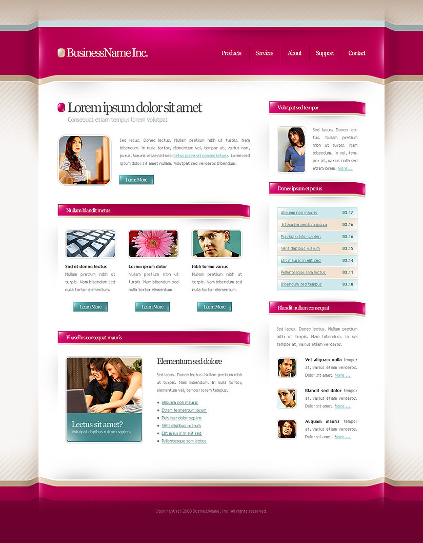
Designwade 2010For sale
Logotype is not mine
Comments?
 (Smile)")
Related content


Comments: 28


Very nice work. Well Done.
May I ask where you got the wood panel texture in your footer?
👍: 0 ⏩: 0
Very nice work. Well Done!
May I ask where you got the wood panel texture in your footer?
👍: 0 ⏩: 0


A bit too inspired by hinok, I think.
He's got one of the most unique styles so when you try and replicate it, even just a little bit, it feels like an imitation.
👍: 0 ⏩: 1

He has a copyright on this style? Style been copied over and over again mate. Dont think someone or something has a copyright on a style.
👍: 0 ⏩: 1

95% of DA designs looks similar to another hehe  (Wink)")
👍: 0 ⏩: 1
Exactly. And we cant sit here claim copyright of a style or a color comb. or anything like that. These days it is so many designs out, there will always be a insperation source, unwillingly or whatever. As long as we dont rip eachothers work totally, we shouldnt complain. All respect to Hinok for maybe creating this style, but it's no such thing as a copyright of a style.
👍: 0 ⏩: 0


And there is the Museo again ")

Really inspiring wireframe! Good structure.
👍: 0 ⏩: 1
I actually dont think I used museo in this one
👍: 0 ⏩: 1


why are you so good? it makes me little bit jealous! definitely +fav
just dont understand coffee texture there .)
👍: 0 ⏩: 0


I like it very much but I agree with badboythemer. I would use only one or two textures for effect. Maybe the coffee and leather one. Footer with wood could be done with leather or coffee texture
👍: 0 ⏩: 0

Damn this is very good design!! I recommend using [link] to get more exposure for your work or websites!!
👍: 0 ⏩: 0


Nice one mate, but not a huge fan of some of the textures and pattens used in this
I think they detract from the layout to much, but the content and use of white space is fucking impeccable
")
👍: 0 ⏩: 0


this is another great design from you
👍: 0 ⏩: 0

Looks grate, like the coffee beans pattern also the wooden footer looks grate. All together makes very cool design!
👍: 0 ⏩: 0

very nice im tryin gto but never have any idea to how to start and make one
im following lessons now for coding them
but like t odesign also
")
👍: 0 ⏩: 0