HOME | DD
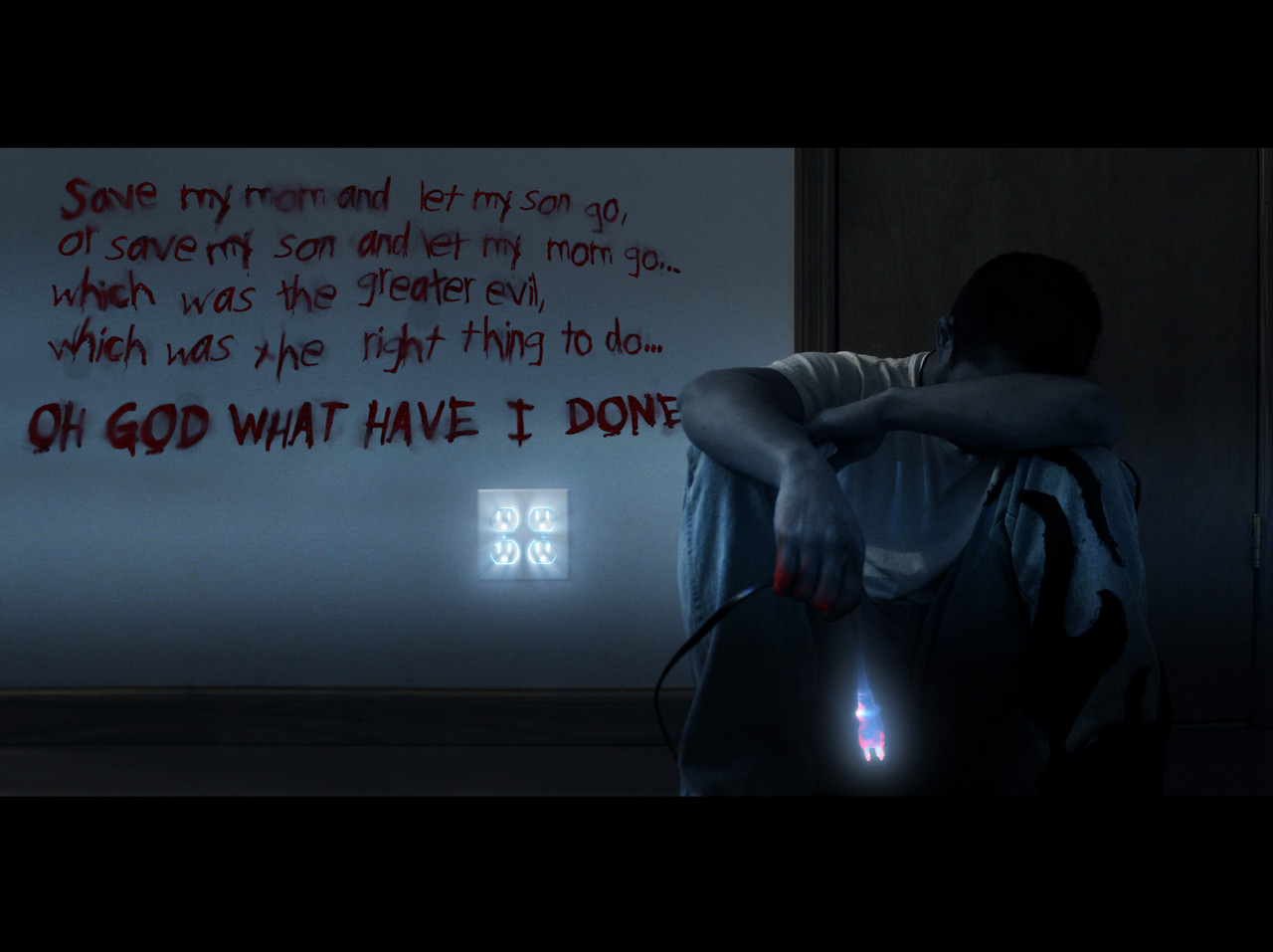
 EdgeFx1 — What have I done...
Published: 2009-05-01 03:20:06 +0000 UTC; Views: 2463; Favourites: 45; Downloads: 4
Redirect to original
Description
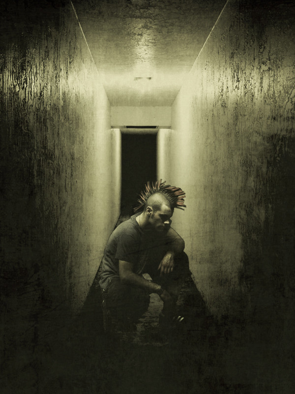
What have I Done...Which one is the less greater evil... oh god, why this decision ...
~~~~~~~~~~~~~~~~~~
so this is my first entry for the good vs evil themed contest from Wacom, do you guys think its better with out the text? or with, lemme know your thoughts and ideas and critiques.
Edge.
UPDATE so since alot of peopel thoguht i intentionallymade the wordsto be on the wall, but they werent, i decided to go back and make a change, to the best of my abilities, i tried to make it look liek i wrote it on the wall with blood, l et me know whats youguys think this time
Related content


Comments: 63


I think the blood text is kinda confusing to me at first (let go=live, or save=live?), but reading the comments help me to understand this piece better.
The blood doesn't look that realistic to me though. 
I've been watching your art for years, and I could tell that this one is good but definitely not the best ones.  (Smile)")
Xyirx
👍: 0 ⏩: 1

this was out of boredom really waitign onthe REAL entry for th econtest to come to fluitian
liek i sai di never meant for the text to be on the all itself, i always meant for it to just float ontop of th eimage, but then i sia dlemem tryand do it so it loosk leik tis on the wall, thoguh true i did kinda half ass it, i never expected this to ge tmuch attention at all though... wai ttill yousee my next entry  (Wink)")
👍: 0 ⏩: 1


edge that's deep, i like the emotion you capture in the shooy.
👍: 0 ⏩: 1

")


All the blood effects add a lot of dark feel to the pic. I like it!
👍: 0 ⏩: 1

oh yeah i like this better written in blood on the wall! 
👍: 0 ⏩: 1
hmm blood drips eh............................
👍: 0 ⏩: 1

yeah its my take on good vs evil mayeb not directly but enuff to make one go "damn..."

👍: 0 ⏩: 0

")

Gyaah~! It looks WAY better like this! Awesome job on embedding it in the wall <3
👍: 0 ⏩: 1

def with the text. it helps the viewer to understand the guys struggle. Nice job
👍: 0 ⏩: 1


Keep the text. Without it, it doesn't really portray anything that says good or evil. Either way, it is awesome and well composed. The text just gives it an edge than any villian would put someone through.
Your girlfriend... or this bus of children? You lover... or your partner? The criminals on the other boat, or our boat of decent good people?
I screams of an evil at work and the good, being the person making the choice, is forced to decide. Since things aren't hollywood, you can't have both. Truly, without the words, you're looking more at someone regretting unplugging something.
Either way, the question still goes on without answers and inspires new questions? What was the plug to? What choice did they make? Why are the feeling regret? All awhile, you know they are also thinking of what they could have done to avoid the conflict.
👍: 0 ⏩: 1
well i didn tmean to make ti soudn liek and epic good and evil thing, just a simple decision that is coiled aroudn a horrible outcome either way, but im gla dyou liek it
👍: 0 ⏩: 1
LOL, maybe I just think about things too deeply.
I like the edit. While the color suits blood, I don't know if the font face really would resemble someone writing in blood. Strickly from a historical/statistical standpoint, most people write in blood using their fingers and the font doesn't really leave a rounded finger-print effect. Sloppy, smudged, and larger as it goes down suits though.
👍: 0 ⏩: 1
i know :'( lol i cant find a descent font to use hahhaaa, if u knwo of one id be glad to redo it
👍: 0 ⏩: 1
I saw one once upon a time in a themed font set. I forget the name unfortunately, but one of the horror ones did include a font that was straight out of horror films. That was some time ago though. I doubt it still exists.
👍: 0 ⏩: 0


A really powerful entry, although there should be a space after the comma (after 'evil'
👍: 0 ⏩: 1
ther eis a comma, how eve ri did kinda bunch it too close togeahter, in anycase im gonn change the text a bit everyoen seems to mistaken the text for beign on the wlal of the pic when it isnt, but i thinkits a good idea anyway
👍: 0 ⏩: 0

Very nice!
I think that in this situation the son would be saved, most likely because the mother would be like ''It's ok son...go save your child...''
At least that's what I think.
👍: 0 ⏩: 1
i dunno lol there sum dumb selfish mothers out there
👍: 0 ⏩: 1

I dig the text.... adds emo ness to it, but it's kinda straight forward in a way where nothing more needs to be said, I was just left thinking, damn... he's in a fucked situation... so I liked it... nicely done yo! ^_^
👍: 0 ⏩: 1
he'z? that sme in the pic!!!!!@@@#%~@!$@
👍: 0 ⏩: 0

i like it, but i agree, the writting isnt all that realistic, it stands out too much in my opinion, taking out your attencion from the rest of the image.
👍: 0 ⏩: 1
i actuallynever meant for th ewrittignto be on the wall at all, it was sota suppsoe otbe "ontop" of the image, but youknwo what, i may go abck and change it sicne everyoen seems ot tink its on the wall and such, its relalynot such a bad idea at all though
👍: 0 ⏩: 0

i like it with text, but for some reason my brain wants to think the text is written on the wall, but it doesn't look like it is....so i'm wondering what it would look like if the text looked like it was written on the wall....
👍: 0 ⏩: 1
| Next =>