HOME | DD
 ehecu — retrospect 'dot' com
Published: 2006-07-29 01:40:18 +0000 UTC; Views: 32691; Favourites: 282; Downloads: 1696
Redirect to original
Description
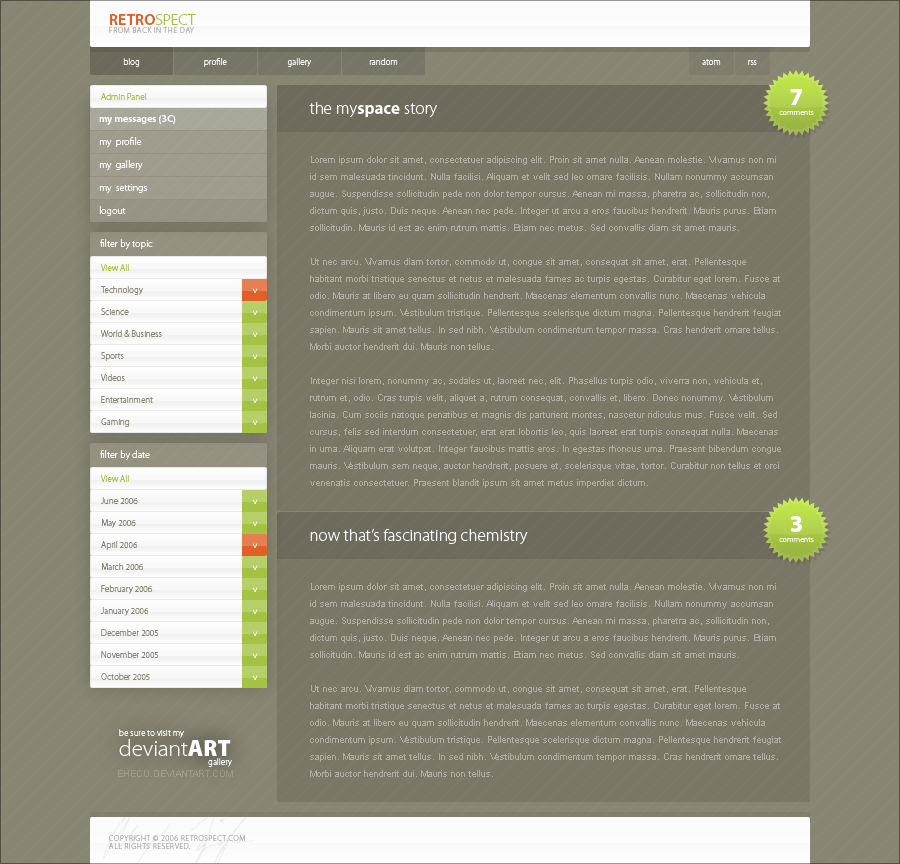
because let's face it, the past is where it's atRelated content


Comments: 95

Myriad Pro of various weights, mostly light.
Thanks for the comment!
👍: 0 ⏩: 2

ah.... $230 .. too much for me. heh
👍: 0 ⏩: 0
I thought so. thank you... do you live in the northeast by any chance?
👍: 0 ⏩: 1


can this design be used on [link] ?
i have this blog right now [link]
👍: 0 ⏩: 1
")


so simple, so clean, so amazing!
love it! definitely +fav.
👍: 0 ⏩: 0


simply gorgeous, the website looks awesme... simple, delicated, stylish
👍: 0 ⏩: 0

Great work, seriously beautiful. How did you achieve the glow on the buttons? for instance on the JUNE 2006, that looks bright on top and shadowed on the bottom. What software do you use? (I know these are a lot of questions for anyone's patience but I'm just trying to learn. And what better place to learn that where people shine like you do on this marvelous piece of work) 

👍: 0 ⏩: 1
All my designs are made in Photoshop CS2.
The glossy effect can be achieved in a number of different ways. The easiest way uses a light gray Color Overlay and a low-opacity, white Inner Shadow (size 0, 90 degree angle, distance equal to roughly half the height of whatever object you're working with). The more complex way (as seen in Retrospect) uses the same basic method, but instead of a Color Overlay, it uses a 3-point Gradient Overlay - The first (0%) is white, the second (50%) is a mid-light shade of gray, and the third (100%) is white again. You can adjust the opacity of the Inner Shadow and darkness of the second point to achieve your desired gloss strength. I would also suggest that you use a 1px gray stroke (the shade of which can vary) when using the latter technique.
Another good example of the gradient method is Apple.com, which uses the effect for its primary and secondary navigation.
Hope that helped, and thanks for the kind words
 (Smile)")
👍: 0 ⏩: 1
OMG Thank you SO MUCH for the info, I couldn't posibly ask for anything more. I'll start practicing 

👍: 0 ⏩: 1

LOVE it, great job!!!! The choice of colours , transparency of the layers and the patterns is very whats desired today. Good work!
👍: 0 ⏩: 0


ok, finally i've found a page one could put in designer's manual!
so minimal, yet so hot, so user (and bandwidth obliously) friendly!
i try to find any flaw here, but fail! 'flawless' is what i'd call this design! congratulations.
* great idea with the comment number indicator! makes one wanna actually comment...
")
👍: 0 ⏩: 1
Thank yeh
Sorry I can't get around to replying to every comment, but rest assured, I appreciate all the support I get from you guys!
👍: 0 ⏩: 1

very clean
simple but good looking
wouldn't change a thing

👍: 0 ⏩: 0

Beautiful layout, I hope the font size is not too small...
👍: 0 ⏩: 0

Great! the colours work, and are easy on the eyes, the navagation looks simple to use, the only thing you might want to change is the body text colour, it looks a bit hard to read, but i'd have to see it in my webbrowser to comment on that aspect appropriatly.
The Verdict:
👍: 0 ⏩: 0


I absolutely love it... great colors great layout
 (Wink)")
👍: 0 ⏩: 0


Clean and simple, very nice. The concept of the transparency is nuts.
👍: 0 ⏩: 0


Very very cool, love the colours and just the way everything blends together so nicely.
The transparency is brilliant.
Amazing work!

👍: 0 ⏩: 0
<= Prev |