HOME | DD
 ehecu — retrospect 'dot' com
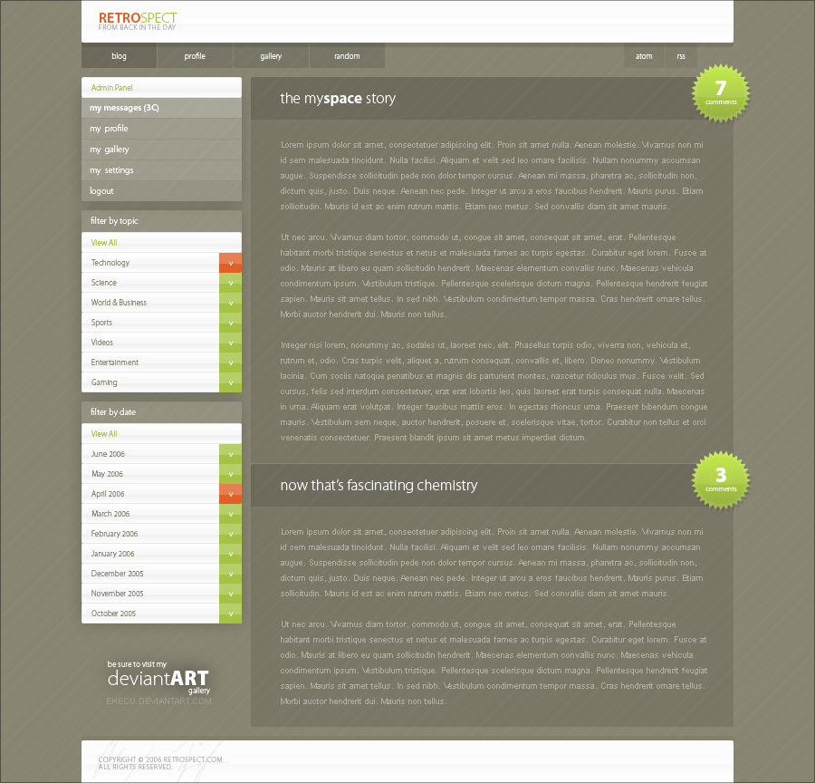
Published: 2006-07-29 01:40:18 +0000 UTC; Views: 32691; Favourites: 282; Downloads: 1696
Redirect to original
Description
because let's face it, the past is where it's atRelated content


Comments: 95

Extremly small text, or maybe it's resized? Anyhow, it looks sweet
👍: 0 ⏩: 0


[link]
What about that, did you allow him to do that?
👍: 0 ⏩: 0


I really like your template mate. I want to use it with my site, but I don't know how to edit it. If possible, would you be interested in making a slightly edited version of this for me?
If so please contact me through stu92lives@hotmail.co.uk - cheers.
👍: 0 ⏩: 0

Love it !!!
but it would be a nightmare to try coding this (plain fonts on transparent layouts = aaarrghhh) but it's really inspiring
👍: 0 ⏩: 0

Awesome ")
 (Smile)")
👍: 0 ⏩: 0

could i make something similar to your design but with different colors and sizes?
I love the design btw!
👍: 0 ⏩: 0


Not sure quite what to say on that one... Obviously pretty heavily inspired, but not close enough that I could justifiably do something about it. Thanks for pointing that out though
👍: 0 ⏩: 0

B.E.A.UTIFUL!!! 
👍: 0 ⏩: 0

really nice design!
cant find anything to fault here at all, everything blends well!
👍: 0 ⏩: 0


Hello. First of all I must say, great designs! Keep working in such way!
I want ask you about one thing what do you think about making a wordpress theme from your The Retrospect design? I like it very much and could do all coding. Of course the theme would have proper credits...
👍: 0 ⏩: 1
No, for the time being Retrospect is not being distributed.
Thanks for your interest though
👍: 0 ⏩: 0


I wish I had your skills!
I also wish I knew how to code, lol!
Even if this was available as one of your uncoded templates, I would die trying to code it!
👍: 0 ⏩: 0

hey man did you see this? [link] did he ripped it or is it available as a template or someting? Great layout btw
👍: 0 ⏩: 1
That would be a rip actually... Thanks for informing me
👍: 0 ⏩: 1
no problem, i like the layout very much and i hate ppl with no imatination which then just rip things from good designers.
👍: 0 ⏩: 0
love this one, i like the color combination very much very good job
👍: 0 ⏩: 0

very nice colours and composition ... but the font is too small for my blind eyes
👍: 0 ⏩: 0

i just say in one line "simplicity is beauty".
nice work.
👍: 0 ⏩: 0

I love the simplicity of this one. The "pure-css" look
👍: 0 ⏩: 0


Great job in every aspect, dude. Love how glossy and stylish everything looks!
👍: 0 ⏩: 0


Amazing. Clean, professional, great colors, and all that.
A definite 
👍: 0 ⏩: 0

I like this, it's very clean. The green, orange, and white contrast nicely with the brown background.
👍: 0 ⏩: 0

1 question, how do you get the stars like that, PS only has 2 presets that kinda suc and i cant imitate tht effect using the star tool in illustrator, did u hand make them
👍: 0 ⏩: 1
They are one of Photoshop's presets.
👍: 0 ⏩: 0

i dont know how you do it.
i like all your templates.
but it looks plain as well as sleek and professional
proper slickin' website design
👍: 0 ⏩: 0

this is so sexy, i didn't realise i couldn't read the copy text because it was so small! I was too busy drooling
👍: 0 ⏩: 0


Very nice, some of the text seems a little small however.
👍: 0 ⏩: 0


wow likin this one ..simple clean and super awesome.. nice work
👍: 0 ⏩: 0


wow.. fantastic layout!!! great transparancy color... how u get that idea?

👍: 0 ⏩: 1
Most of my ideas spring from spontaneity - Sorry I can't give you a better answer!
👍: 0 ⏩: 0

beautiful, minimalistic design. Nice use of colors as well... May I ask... what font is used for the headers (where it says "the myspace story")?
👍: 0 ⏩: 1
| Next =>