HOME | DD
 El3ment4l — Epic Stand Template
Published: 2007-02-05 21:48:55 +0000 UTC; Views: 4257; Favourites: 18; Downloads: 232
Redirect to original
Description
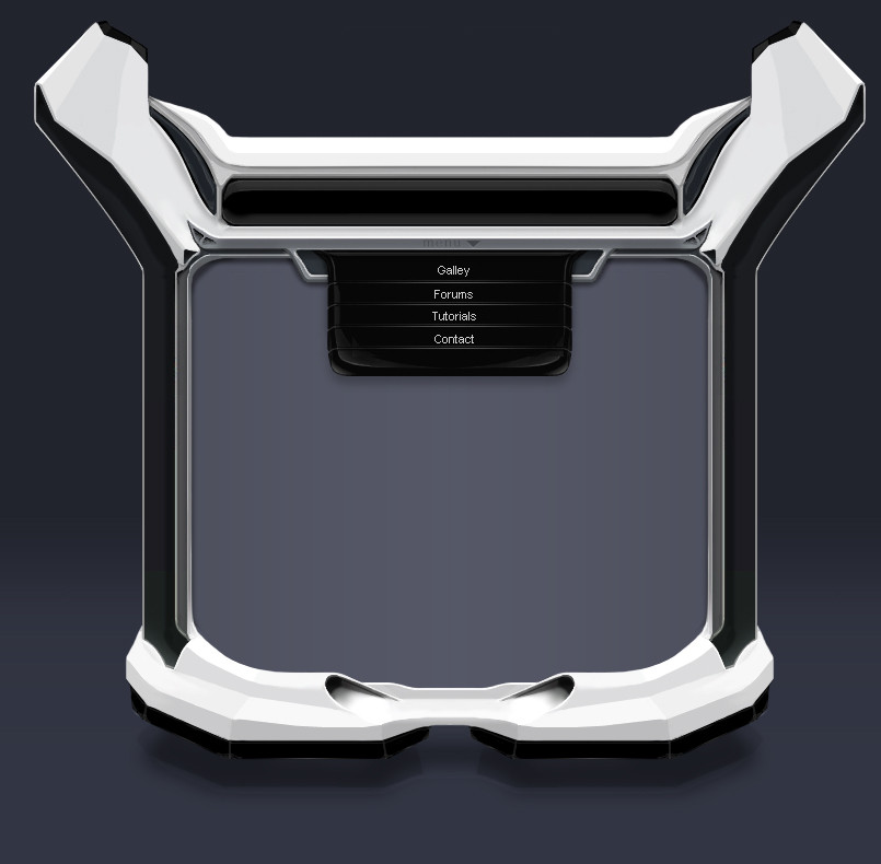
About a week ago, I realized that I hadn't made anything in a long time. And that it was about time that I crack open PS again (got the cs3 beta).Se here it is, a new brushed template.
-About 10 layers in total (The template, menu, background... well... make that like 3 layers actually)
- 6/7 hours of work, not including breaks. (Had a lot of fixes to do)
So my biggest challenge was trying no to copy Jeff I ended up using a few of his ideas, and turning them into my own. So the template itself definitely inspired by him
")
Related content


Comments: 36

")

Little late on the comment but everything looks great except for Gallery being spelled wrong. you have it as Galley.
👍: 0 ⏩: 1

oh i'll have to fix that then. i didnt think anyone would notice
👍: 0 ⏩: 0

 (Smile)")

nice job u keep getting better keep practicing the highlights and such.
👍: 0 ⏩: 1
yea i realize that. i can really see my progress if i organize my folder of stuff "by date" lol
thanks
👍: 0 ⏩: 0


THANK YOU. lol i've been waiting for someone to tell me that.
👍: 0 ⏩: 1

yo,
the header is really good. The top sides are strange, but good work
👍: 0 ⏩: 1
yeh, well, i thought it may be better if it was less generic and flat
👍: 0 ⏩: 0

looks greta , but i love the nav the most , well done.
👍: 0 ⏩: 1
hehe i can see there are a lot of people who like the nav, and a lot of people who dont. i guess it depends on the style of the artist.
👍: 0 ⏩: 1

and from me also the comment
changing the form... nice ^^
👍: 0 ⏩: 0
 (Wink)")
not too sure what you mean here, but thanks anyways
👍: 0 ⏩: 1

i mean that a new, you know, kind of design, same technic.
👍: 0 ⏩: 1
oh ok. yea it is. thx for the comment
👍: 0 ⏩: 0


As i said on Mished, i love the drop-down menu, nice job.
👍: 0 ⏩: 0

you need text work on ever thing, and great work on your brushing
👍: 0 ⏩: 2
Yea im in search of professional help
")
👍: 0 ⏩: 0

I actually thing the text looks pretty good
Maybe just a little bit smaller, like 2 pts.
👍: 0 ⏩: 0

wow. a Fav from Demondan. never saw that one coming! thx for the comment sguys
👍: 0 ⏩: 0


Top-part and menu background kicks ass!
But...
The menu text sucks and the bottom could need some work.
But overall it's great.
👍: 0 ⏩: 1
lol the bottom is blocky, cuz i rushed it a little.
and i suck with fonts
thanks
👍: 0 ⏩: 0


